Sidebar
A composable, themeable and customizable sidebar component.
Installation
ng g @spartan-ng/cli:ui sidebarnx g @spartan-ng/cli:ui sidebarimport { DestroyRef, ElementRef, HostAttributeToken, Injector, PLATFORM_ID, effect, inject, makeEnvironmentProviders, runInInjectionContext, type EnvironmentProviders } from '@angular/core';
import { OVERLAY_DEFAULT_CONFIG } from '@angular/cdk/overlay';
import { clsx, type ClassValue } from 'clsx';
import { isPlatformBrowser } from '@angular/common';
import { provideSpartanHlm } from '@spartan-ng/helm/utils';
import { twMerge } from 'tailwind-merge';
export function hlm(...inputs: ClassValue[]) {
return twMerge(clsx(inputs));
}
// Global map to track class managers per element
const elementClassManagers = new WeakMap<HTMLElement, ElementClassManager>();
// Global mutation observer for all elements
let globalObserver: MutationObserver | null = null;
const observedElements = new Set<HTMLElement>();
interface ElementClassManager {
element: HTMLElement;
sources: Map<number, { classes: Set<string>; order: number }>;
baseClasses: Set<string>;
isUpdating: boolean;
nextOrder: number;
hasInitialized: boolean;
restoreRafId: number | null;
/** Transitions are suppressed until the first effect writes correct classes */
transitionsSuppressed: boolean;
/** Original inline transition value to restore after suppression (empty string = none was set) */
previousTransition: string;
/** Original inline transition priority to preserve !important when restoring */
previousTransitionPriority: string;
}
let sourceCounter = 0;
/**
* This function dynamically adds and removes classes for a given element without requiring
* the a class binding (e.g. `[class]="..."`) which may interfere with other class bindings.
*
* 1. This will merge the existing classes on the element with the new classes.
* 2. It will also remove any classes that were previously added by this function but are no longer present in the new classes.
* 3. Multiple calls to this function on the same element will be merged efficiently.
*/
export function classes(computed: () => ClassValue[] | string, options: ClassesOptions = {}) {
runInInjectionContext(options.injector ?? inject(Injector), () => {
const elementRef = options.elementRef ?? inject(ElementRef);
const platformId = inject(PLATFORM_ID);
const destroyRef = inject(DestroyRef);
const baseClasses = inject(new HostAttributeToken('class'), { optional: true });
const element = elementRef.nativeElement;
// Create unique identifier for this source
const sourceId = sourceCounter++;
// Get or create the class manager for this element
let manager = elementClassManagers.get(element);
if (!manager) {
// Initialize base classes from variation (host attribute 'class')
const initialBaseClasses = new Set<string>();
if (baseClasses) {
toClassList(baseClasses).forEach((cls) => initialBaseClasses.add(cls));
}
manager = {
element,
sources: new Map(),
baseClasses: initialBaseClasses,
isUpdating: false,
nextOrder: 0,
hasInitialized: false,
restoreRafId: null,
transitionsSuppressed: false,
previousTransition: '',
previousTransitionPriority: '',
};
elementClassManagers.set(element, manager);
// Setup global observer if needed and register this element
setupGlobalObserver(platformId);
observedElements.add(element);
// Suppress transitions until the first effect writes correct classes and
// the browser has painted them. This prevents CSS transition animations
// during hydration when classes change from SSR state to client state.
if (isPlatformBrowser(platformId)) {
manager.previousTransition = element.style.getPropertyValue('transition');
manager.previousTransitionPriority = element.style.getPropertyPriority('transition');
element.style.setProperty('transition', 'none', 'important');
manager.transitionsSuppressed = true;
}
}
// Assign order once at registration time
const sourceOrder = manager.nextOrder++;
function updateClasses(): void {
// Get the new classes from the computed function
const newClasses = toClassList(computed());
// Update this source's classes, keeping the original order
manager!.sources.set(sourceId, {
classes: new Set(newClasses),
order: sourceOrder,
});
// Update the element
updateElement(manager!);
// Re-enable transitions after the first effect writes correct classes.
// Deferred to next animation frame so the browser paints the class change
// with transitions disabled first, then re-enables them.
if (manager!.transitionsSuppressed) {
manager!.transitionsSuppressed = false;
manager!.restoreRafId = requestAnimationFrame(() => {
manager!.restoreRafId = null;
restoreTransitionSuppression(manager!);
});
}
}
// Register cleanup with DestroyRef
destroyRef.onDestroy(() => {
if (manager!.restoreRafId !== null) {
cancelAnimationFrame(manager!.restoreRafId);
manager!.restoreRafId = null;
}
if (manager!.transitionsSuppressed) {
manager!.transitionsSuppressed = false;
restoreTransitionSuppression(manager!);
}
// Remove this source from the manager
manager!.sources.delete(sourceId);
// If no more sources, clean up the manager
if (manager!.sources.size === 0) {
cleanupManager(element);
} else {
// Update element without this source's classes
updateElement(manager!);
}
});
/**
* We need this effect to track changes to the computed classes. Ideally, we would use
* afterRenderEffect here, but that doesn't run in SSR contexts, so we use a standard
* effect which works in both browser and SSR.
*/
effect(updateClasses);
});
}
function restoreTransitionSuppression(manager: ElementClassManager): void {
const prev = manager.previousTransition;
if (prev) {
manager.element.style.setProperty('transition', prev, manager.previousTransitionPriority || undefined);
} else {
manager.element.style.removeProperty('transition');
}
}
// eslint-disable-next-line @typescript-eslint/no-wrapper-object-types
function setupGlobalObserver(platformId: Object): void {
if (isPlatformBrowser(platformId) && !globalObserver) {
// Create single global observer that watches the entire document
globalObserver = new MutationObserver((mutations) => {
for (const mutation of mutations) {
if (mutation.type === 'attributes' && mutation.attributeName === 'class') {
const element = mutation.target as HTMLElement;
const manager = elementClassManagers.get(element);
// Only process elements we're managing
if (manager && observedElements.has(element)) {
if (manager.isUpdating) continue; // Ignore changes we're making
// Update base classes to include any externally added classes
const currentClasses = toClassList(element.className);
const allSourceClasses = new Set<string>();
// Collect all classes from all sources
for (const source of manager.sources.values()) {
for (const className of source.classes) {
allSourceClasses.add(className);
}
}
// Any classes not from sources become new base classes
manager.baseClasses.clear();
for (const className of currentClasses) {
if (!allSourceClasses.has(className)) {
manager.baseClasses.add(className);
}
}
updateElement(manager);
}
}
}
});
// Start observing the entire document for class attribute changes
globalObserver.observe(document, {
attributes: true,
attributeFilter: ['class'],
subtree: true, // Watch all descendants
});
}
}
function updateElement(manager: ElementClassManager): void {
if (manager.isUpdating) return; // Prevent recursive updates
manager.isUpdating = true;
// Handle initialization: capture base classes after first source registration
if (!manager.hasInitialized && manager.sources.size > 0) {
// Get current classes on element (may include SSR classes)
const currentClasses = toClassList(manager.element.className);
// Get all classes that will be applied by sources
const allSourceClasses = new Set<string>();
for (const source of manager.sources.values()) {
source.classes.forEach((className) => allSourceClasses.add(className));
}
// Only consider classes as "base" if they're not produced by any source
// This prevents SSR-rendered classes from being preserved as base classes
currentClasses.forEach((className) => {
if (!allSourceClasses.has(className)) {
manager.baseClasses.add(className);
}
});
manager.hasInitialized = true;
}
// Get classes from all sources, sorted by registration order (later takes precedence)
const sortedSources = Array.from(manager.sources.entries()).sort(([, a], [, b]) => a.order - b.order);
const allSourceClasses: string[] = [];
for (const [, source] of sortedSources) {
allSourceClasses.push(...source.classes);
}
// Combine base classes with all source classes, ensuring base classes take precedence
const classesToApply =
allSourceClasses.length > 0 || manager.baseClasses.size > 0
? hlm([...allSourceClasses, ...manager.baseClasses])
: '';
// Apply the classes to the element
if (manager.element.className !== classesToApply) {
manager.element.className = classesToApply;
}
manager.isUpdating = false;
}
function cleanupManager(element: HTMLElement): void {
// Remove from global tracking
observedElements.delete(element);
elementClassManagers.delete(element);
// If no more elements being tracked, cleanup global observer
if (observedElements.size === 0 && globalObserver) {
globalObserver.disconnect();
globalObserver = null;
}
}
interface ClassesOptions {
elementRef?: ElementRef<HTMLElement>;
injector?: Injector;
}
// Cache for parsed class lists to avoid repeated string operations
const classListCache = new Map<string, string[]>();
function toClassList(className: string | ClassValue[]): string[] {
// For simple string inputs, use cache to avoid repeated parsing
if (typeof className === 'string' && classListCache.has(className)) {
return classListCache.get(className)!;
}
const result = clsx(className)
.split(' ')
.filter((c) => c.length > 0);
// Cache string results, but limit cache size to prevent memory growth
if (typeof className === 'string' && classListCache.size < 1000) {
classListCache.set(className, result);
}
return result;
}
/**
* Provides default configuration for Spartan Helm components.
*
* This utility configures the Angular CDK overlay to disable the `usePopover`
* behavior introduced in Angular 21, which causes CDK overlay-based components
* (sheets, dialogs, tooltips, etc.) to render above `position: fixed` elements
* like `<hlm-toaster>`.
*
* @returns {EnvironmentProviders} Environment providers to be added to the application config.
*
* @example
* ```ts
* // app.config.ts
*
*
* export const appConfig: ApplicationConfig = {
* providers: [
* provideSpartanHlm(),
* // ... other providers
* ],
* };
* ```
*/
export function provideSpartanHlm(): EnvironmentProviders {
return makeEnvironmentProviders([
{
provide: OVERLAY_DEFAULT_CONFIG,
useValue: { usePopover: false },
},
]);
}import { BrnTooltip, BrnTooltipPosition, provideBrnTooltipDefaultOptions } from '@spartan-ng/brain/tooltip';
import { ChangeDetectionStrategy, Component, DOCUMENT, DestroyRef, Directive, Injectable, InjectionToken, PLATFORM_ID, REQUEST, afterNextRender, booleanAttribute, computed, effect, inject, input, signal, type Signal, type ValueProvider } from '@angular/core';
import { DEFAULT_TOOLTIP_CONTENT_CLASSES, DEFAULT_TOOLTIP_SVG_CLASS, tooltipPositionVariants } from '@spartan-ng/helm/tooltip';
import { HlmButton, provideBrnButtonConfig } from '@spartan-ng/helm/button';
import { HlmInput } from '@spartan-ng/helm/input';
import { HlmSeparator } from '@spartan-ng/helm/separator';
import { HlmSheetImports } from '@spartan-ng/helm/sheet';
import { HlmSkeletonImports } from '@spartan-ng/helm/skeleton';
import { NgIcon, provideIcons } from '@ng-icons/core';
import { NgTemplateOutlet, isPlatformServer } from '@angular/common';
import { classes, hlm } from '@spartan-ng/helm/utils';
import { cva } from 'class-variance-authority';
import { lucidePanelLeft } from '@ng-icons/lucide';
import { type BooleanInput } from '@angular/cdk/coercion';
import { type ClassValue } from 'clsx';
@Directive({
selector: '[hlmSidebarContent],hlm-sidebar-content',
host: {
'data-slot': 'sidebar-content',
'data-sidebar': 'content',
},
})
export class HlmSidebarContent {
constructor() {
classes(
() =>
'no-scrollbar gap-0 flex min-h-0 flex-1 flex-col overflow-auto group-data-[collapsible=icon]:overflow-hidden',
);
}
}
@Directive({
selector: '[hlmSidebarFooter],hlm-sidebar-footer',
host: {
'data-slot': 'sidebar-footer',
'data-sidebar': 'footer',
},
})
export class HlmSidebarFooter {
constructor() {
classes(() => 'gap-2 p-2 flex flex-col');
}
}
@Directive({
selector: 'button[hlmSidebarGroupAction]',
host: {
'data-slot': 'sidebar-group-action',
'data-sidebar': 'group-action',
},
})
export class HlmSidebarGroupAction {
constructor() {
classes(
() =>
'text-sidebar-foreground ring-sidebar-ring hover:bg-sidebar-accent hover:text-sidebar-accent-foreground absolute end-3 top-3.5 w-5 rounded-md p-0 focus-visible:ring-2 [&>ng-icon]:text-[length:--spacing(4)] flex aspect-square items-center justify-center outline-hidden transition-transform group-data-[collapsible=icon]:hidden after:absolute after:-inset-2 md:after:hidden [&>ng-icon]:shrink-0',
);
}
}
@Directive({
selector: 'div[hlmSidebarGroupContent]',
host: {
'data-slot': 'sidebar-group-content',
'data-sidebar': 'group-content',
},
})
export class HlmSidebarGroupContent {
constructor() {
classes(() => 'text-sm w-full');
}
}
@Directive({
selector: 'div[hlmSidebarGroupLabel], button[hlmSidebarGroupLabel]',
host: {
'data-slot': 'sidebar-group-label',
'data-sidebar': 'group-label',
},
})
export class HlmSidebarGroupLabel {
constructor() {
classes(() => 'text-sidebar-foreground/70 ring-sidebar-ring h-8 rounded-md px-2 text-xs font-medium transition-[margin,opacity] duration-200 ease-linear group-data-[collapsible=icon]:-mt-8 group-data-[collapsible=icon]:opacity-0 focus-visible:ring-2 [&>ng-icon]:text-[length:--spacing(4)] flex shrink-0 items-center outline-hidden [&>ng-icon]:shrink-0');
}
}
@Directive({
selector: '[hlmSidebarGroup],hlm-sidebar-group',
host: {
'data-slot': 'sidebar-group',
'data-sidebar': 'group',
},
})
export class HlmSidebarGroup {
constructor() {
classes(() => 'p-2 relative flex w-full min-w-0 flex-col');
}
}
@Directive({
selector: '[hlmSidebarHeader],hlm-sidebar-header',
host: {
'data-slot': 'sidebar-header',
'data-sidebar': 'header',
},
})
export class HlmSidebarHeader {
constructor() {
classes(() => 'gap-2 p-2 flex flex-col');
}
}
@Directive({
selector: 'input[hlmSidebarInput]',
hostDirectives: [HlmInput],
host: {
'data-slot': 'sidebar-input',
'data-sidebar': 'input',
},
})
export class HlmSidebarInput {
constructor() {
classes(() => 'bg-background h-8 w-full shadow-none');
}
}
@Directive({
selector: 'main[hlmSidebarInset]',
host: { 'data-slot': 'sidebar-inset' },
})
export class HlmSidebarInset {
constructor() {
classes(() => 'bg-background md:peer-data-[variant=inset]:m-2 md:peer-data-[variant=inset]:ms-0 md:peer-data-[variant=inset]:rounded-xl md:peer-data-[variant=inset]:shadow-sm md:peer-data-[variant=inset]:peer-data-[state=collapsed]:ms-2 relative flex w-full flex-1 flex-col');
}
}
@Directive({
selector: 'button[hlmSidebarMenuAction]',
host: {
'data-slot': 'sidebar-menu-action',
'data-sidebar': 'menu-action',
},
})
export class HlmSidebarMenuAction {
public readonly showOnHover = input<boolean, BooleanInput>(false, { transform: booleanAttribute });
constructor() {
classes(() => [
'text-sidebar-foreground ring-sidebar-ring hover:bg-sidebar-accent hover:text-sidebar-accent-foreground peer-hover/menu-button:text-sidebar-accent-foreground absolute end-1 top-1.5 aspect-square w-5 rounded-md p-0 peer-data-[size=default]/menu-button:top-1.5 peer-data-[size=lg]/menu-button:top-2.5 peer-data-[size=sm]/menu-button:top-1 focus-visible:ring-2 [&>ng-icon]:text-[length:--spacing(4)] flex items-center justify-center outline-hidden transition-transform group-data-[collapsible=icon]:hidden after:absolute after:-inset-2 md:after:hidden [&>ng-icon]:shrink-0',
this.showOnHover() &&
'peer-data-active/menu-button:text-sidebar-accent-foreground group-focus-within/menu-item:opacity-100 group-hover/menu-item:opacity-100 aria-expanded:opacity-100 md:opacity-0',
]);
}
}
@Directive({
selector: '[hlmSidebarMenuBadge],hlm-sidebar-menu-badge',
host: {
'data-slot': 'sidebar-menu-badge',
'data-sidebar': 'menu-badge',
},
})
export class HlmSidebarMenuBadge {
constructor() {
classes(
() =>
'text-sidebar-foreground peer-hover/menu-button:text-sidebar-accent-foreground peer-data-active/menu-button:text-sidebar-accent-foreground pointer-events-none absolute end-1 h-5 min-w-5 rounded-md px-1 text-xs font-medium peer-data-[size=default]/menu-button:top-1.5 peer-data-[size=lg]/menu-button:top-2.5 peer-data-[size=sm]/menu-button:top-1 flex items-center justify-center tabular-nums select-none group-data-[collapsible=icon]:hidden',
);
}
}
const sidebarMenuButtonVariants = cva(
'ring-sidebar-ring hover:bg-sidebar-accent hover:text-sidebar-accent-foreground active:bg-sidebar-accent active:text-sidebar-accent-foreground data-active:bg-sidebar-accent data-active:text-sidebar-accent-foreground data-open:hover:bg-sidebar-accent data-open:hover:text-sidebar-accent-foreground gap-2 rounded-md p-2 text-start text-sm transition-[width,height,padding] group-has-data-[sidebar=menu-action]/menu-item:pe-8 group-data-[collapsible=icon]:size-8! group-data-[collapsible=icon]:p-2! focus-visible:ring-2 data-active:font-medium peer/menu-button group/menu-button flex w-full items-center overflow-hidden outline-hidden disabled:pointer-events-none disabled:opacity-50 aria-disabled:pointer-events-none aria-disabled:opacity-50 [&_ng-icon]:shrink-0 [&_ng-icon]:text-[length:--spacing(4)] [&>span:last-child]:truncate',
{
variants: {
variant: {
default: 'hover:bg-sidebar-accent hover:text-sidebar-accent-foreground',
outline: 'bg-background hover:bg-sidebar-accent hover:text-sidebar-accent-foreground shadow-[0_0_0_1px_var(--sidebar-border)] hover:shadow-[0_0_0_1px_var(--sidebar-accent)]',
},
size: {
default: 'h-8 text-sm',
sm: 'h-7 text-xs',
lg: 'h-12 text-sm group-data-[collapsible=icon]:p-0!',
},
},
defaultVariants: {
variant: 'default',
size: 'default',
},
},
);
@Directive({
selector: 'button[hlmSidebarMenuButton], a[hlmSidebarMenuButton]',
providers: [
provideBrnTooltipDefaultOptions({
showDelay: 150,
hideDelay: 0,
tooltipContentClasses: DEFAULT_TOOLTIP_CONTENT_CLASSES,
svgClasses: DEFAULT_TOOLTIP_SVG_CLASS,
arrowClasses: (position: BrnTooltipPosition) => hlm(tooltipPositionVariants({ position })),
position: 'right',
}),
],
hostDirectives: [
{
directive: BrnTooltip,
inputs: ['brnTooltip: tooltip'],
},
],
host: {
'data-slot': 'sidebar-menu-button',
'data-sidebar': 'menu-button',
'[attr.data-size]': 'size()',
'[attr.data-active]': 'isActive()',
'(click)': 'onClick()',
},
})
export class HlmSidebarMenuButton {
private readonly _config = injectHlmSidebarConfig();
private readonly _sidebarService = inject(HlmSidebarService);
private readonly _brnTooltip = inject(BrnTooltip);
public readonly variant = input<'default' | 'outline'>('default');
public readonly size = input<'default' | 'sm' | 'lg'>('default');
public readonly isActive = input<boolean, BooleanInput>(false, { transform: booleanAttribute });
public readonly closeMobileSidebarOnClick = input<boolean, BooleanInput>(
this._config.closeMobileSidebarOnMenuButtonClick,
{ transform: booleanAttribute },
);
protected readonly _isTooltipHidden = computed(
() => this._sidebarService.state() !== 'collapsed' || this._sidebarService.isMobile(),
);
constructor() {
classes(() => sidebarMenuButtonVariants({ variant: this.variant(), size: this.size() }));
effect(() => this._brnTooltip.mutableTooltipDisabled.set(this._isTooltipHidden()));
}
protected onClick(): void {
if (this.closeMobileSidebarOnClick()) {
this._sidebarService.setOpenMobile(false);
}
}
}
@Directive({
selector: 'li[hlmSidebarMenuItem]',
host: {
'data-slot': 'sidebar-menu-item',
'data-sidebar': 'menu-item',
},
})
export class HlmSidebarMenuItem {
constructor() {
classes(() => 'group/menu-item relative');
}
}
@Component({
selector: 'hlm-sidebar-menu-skeleton,div[hlmSidebarMenuSkeleton]',
imports: [HlmSkeletonImports],
changeDetection: ChangeDetectionStrategy.OnPush,
host: {
'data-slot': 'sidebar-menu-skeleton',
'data-sidebar': 'menu-skeleton',
},
template: `
@if (showIcon()) {
<hlm-skeleton data-sidebar="menu-skeleton-icon" class="size-4 rounded-md" />
} @else {
<hlm-skeleton
data-sidebar="menu-skeleton-text"
class="h-4 max-w-(--skeleton-width) flex-1"
[style.--skeleton-width]="_width"
/>
}
`,
})
export class HlmSidebarMenuSkeleton {
public readonly showIcon = input<boolean, BooleanInput>(false, { transform: booleanAttribute });
protected readonly _width = `${Math.floor(Math.random() * 40) + 50}%`;
constructor() {
classes(() => 'h-8 gap-2 rounded-md px-2 flex items-center');
}
}
@Directive({
selector: 'a[hlmSidebarMenuSubButton], button[hlmSidebarMenuSubButton]',
host: {
'data-slot': 'sidebar-menu-sub-button',
'data-sidebar': 'menu-sub-button',
'[attr.data-active]': 'isActive()',
'[attr.data-size]': 'size()',
'(click)': 'onClick()',
},
})
export class HlmSidebarMenuSubButton {
private readonly _sidebarService = inject(HlmSidebarService);
private readonly _config = injectHlmSidebarConfig();
public readonly closeMobileSidebarOnClick = input<boolean, BooleanInput>(
this._config.closeMobileSidebarOnMenuButtonClick,
{ transform: booleanAttribute },
);
public readonly size = input<'sm' | 'md'>('md');
public readonly isActive = input<boolean, BooleanInput>(false, { transform: booleanAttribute });
constructor() {
classes(
() =>
'text-sidebar-foreground ring-sidebar-ring hover:bg-sidebar-accent hover:text-sidebar-accent-foreground active:bg-sidebar-accent active:text-sidebar-accent-foreground [&>svg]:text-sidebar-accent-foreground data-active:bg-sidebar-accent data-active:text-sidebar-accent-foreground h-7 gap-2 rounded-md px-2 focus-visible:ring-2 data-[size=md]:text-sm data-[size=sm]:text-xs [&>ng-icon]:text-[length:--spacing(4)] flex min-w-0 -translate-x-px items-center overflow-hidden outline-hidden group-data-[collapsible=icon]:hidden disabled:pointer-events-none disabled:opacity-50 aria-disabled:pointer-events-none aria-disabled:opacity-50 [&>ng-icon]:shrink-0 [&>span:last-child]:truncate',
);
}
protected onClick(): void {
if (this.closeMobileSidebarOnClick()) {
this._sidebarService.setOpenMobile(false);
}
}
}
@Directive({
selector: 'li[hlmSidebarMenuSubItem]',
host: {
'data-slot': 'sidebar-menu-sub-item',
'data-sidebar': 'menu-sub-item',
},
})
export class HlmSidebarMenuSubItem {
constructor() {
classes(() => 'group/menu-sub-item relative');
}
}
@Directive({
selector: 'ul[hlmSidebarMenuSub]',
host: {
'data-slot': 'sidebar-menu-sub',
'data-sidebar': 'menu-sub',
},
})
export class HlmSidebarMenuSub {
constructor() {
classes(() => 'border-sidebar-border mx-3.5 translate-x-px gap-1 border-s px-2.5 py-0.5 group-data-[collapsible=icon]:hidden rtl:-translate-x-px flex min-w-0 flex-col');
}
}
@Directive({
selector: 'ul[hlmSidebarMenu]',
host: {
'data-slot': 'sidebar-menu',
'data-sidebar': 'menu',
},
})
export class HlmSidebarMenu {
constructor() {
classes(() => 'gap-0 flex w-full min-w-0 flex-col');
}
}
@Directive({
selector: 'button[hlmSidebarRail]',
host: {
'data-sidebar': 'rail',
'data-slot': 'sidebar-rail',
'[attr.aria-label]': 'ariaLabel()',
tabindex: '-1',
'(click)': 'onClick()',
},
})
export class HlmSidebarRail {
private readonly _sidebarService = inject(HlmSidebarService);
public readonly ariaLabel = input<string>('Toggle Sidebar', { alias: 'aria-label' });
constructor() {
classes(() => [
'hover:after:bg-sidebar-border absolute inset-y-0 z-20 hidden w-4 transition-all ease-linear group-data-[side=left]:-right-4 group-data-[side=right]:left-0 after:absolute after:inset-y-0 after:start-1/2 after:w-[2px] sm:flex ltr:-translate-x-1/2 rtl:-translate-x-1/2',
'in-data-[side=left]:cursor-w-resize in-data-[side=right]:cursor-e-resize',
'[[data-side=left][data-state=collapsed]_&]:cursor-e-resize [[data-side=right][data-state=collapsed]_&]:cursor-w-resize',
'hover:group-data-[collapsible=offcanvas]:bg-sidebar group-data-[collapsible=offcanvas]:translate-x-0 group-data-[collapsible=offcanvas]:after:left-full',
'[[data-side=left][data-collapsible=offcanvas]_&]:-right-2',
'[[data-side=right][data-collapsible=offcanvas]_&]:-left-2',
]);
}
protected onClick(): void {
this._sidebarService.toggleSidebar();
}
}
@Directive({
selector: '[hlmSidebarSeparator],hlm-sidebar-separator',
hostDirectives: [HlmSeparator],
host: {
'data-slot': 'sidebar-separator',
'data-sidebar': 'separator',
},
})
export class HlmSidebarSeparator {
constructor() {
classes(() => 'bg-sidebar-border mx-2 w-auto');
}
}
@Component({
// eslint-disable-next-line @angular-eslint/component-selector
selector: 'button[hlmSidebarTrigger]',
imports: [NgIcon],
providers: [provideIcons({ lucidePanelLeft }), provideBrnButtonConfig({ variant: 'ghost', size: 'icon-sm' })],
changeDetection: ChangeDetectionStrategy.OnPush,
hostDirectives: [{ directive: HlmButton, inputs: ['variant', 'size'] }],
host: {
'data-slot': 'sidebar-trigger',
'data-sidebar': 'trigger',
'(click)': '_onClick()',
},
template: `
<ng-icon name="lucidePanelLeft" />
<span class="sr-only">{{ srOnlyText() }}</span>
`,
})
export class HlmSidebarTrigger {
private readonly _sidebarService = inject(HlmSidebarService);
public readonly srOnlyText = input<string>('Toggle Sidebar');
protected _onClick(): void {
this._sidebarService.toggleSidebar();
}
}
@Directive({
selector: '[hlmSidebarWrapper],hlm-sidebar-wrapper',
host: {
'data-slot': 'sidebar-wrapper',
'[style.--sidebar-width]': 'sidebarWidth()',
'[style.--sidebar-width-icon]': 'sidebarWidthIcon()',
},
})
export class HlmSidebarWrapper {
private readonly _config = injectHlmSidebarConfig();
public readonly sidebarWidth = input<string>(this._config.sidebarWidth);
public readonly sidebarWidthIcon = input<string>(this._config.sidebarWidthIcon);
constructor() {
classes(() => 'group/sidebar-wrapper has-data-[variant=inset]:bg-sidebar flex min-h-svh w-full');
}
}
export type SidebarVariant = 'sidebar' | 'floating' | 'inset';
@Injectable({ providedIn: 'root' })
export class HlmSidebarService {
private readonly _platformId = inject(PLATFORM_ID);
private readonly _request = inject(REQUEST, { optional: true });
private readonly _config = injectHlmSidebarConfig();
private readonly _document = inject(DOCUMENT);
private readonly _window = this._document.defaultView;
private readonly _open = signal<boolean>(true);
private readonly _openMobile = signal<boolean>(false);
private readonly _isMobile = signal<boolean>(false);
private readonly _variant = signal<SidebarVariant>('sidebar');
private _mediaQuery: MediaQueryList | null = null;
public readonly open: Signal<boolean> = this._open.asReadonly();
public readonly openMobile: Signal<boolean> = this._openMobile.asReadonly();
public readonly isMobile: Signal<boolean> = this._isMobile.asReadonly();
public readonly variant: Signal<SidebarVariant> = this._variant.asReadonly();
public readonly state = computed<'expanded' | 'collapsed'>(() => (this._open() ? 'expanded' : 'collapsed'));
constructor() {
const destroyRef = inject(DestroyRef);
this.restoreStateFromCookie();
afterNextRender(() => {
if (!this._window || typeof this._window.matchMedia !== 'function') return;
// Initialize MediaQueryList
this._mediaQuery = this._window.matchMedia(`(max-width: ${this._config.mobileBreakpoint})`);
this._isMobile.set(this._mediaQuery.matches);
// Add media query listener
const mediaQueryHandler = (e: MediaQueryListEvent) => {
this._isMobile.set(e.matches);
// If switching from mobile to desktop, close mobile sidebar
if (!e.matches) this._openMobile.set(false);
};
this._mediaQuery.addEventListener('change', mediaQueryHandler);
// Add keyboard shortcut listener
const keydownHandler = (event: KeyboardEvent) => {
if (event.key === this._config.sidebarKeyboardShortcut && (event.ctrlKey || event.metaKey)) {
event.preventDefault();
this.toggleSidebar();
}
};
this._window.addEventListener('keydown', keydownHandler);
// Add resize listener with debounce
let resizeTimeout: number;
const resizeHandler = () => {
if (!this._window) return;
if (resizeTimeout) this._window.clearTimeout(resizeTimeout);
resizeTimeout = this._window.setTimeout(() => {
if (this._mediaQuery) this._isMobile.set(this._mediaQuery.matches);
}, 100);
};
this._window.addEventListener('resize', resizeHandler);
// Cleanup listeners on destroy
destroyRef.onDestroy(() => {
if (!this._window) return;
if (this._mediaQuery) this._mediaQuery.removeEventListener('change', mediaQueryHandler);
this._window.removeEventListener('keydown', keydownHandler);
this._window.removeEventListener('resize', resizeHandler);
if (resizeTimeout) this._window.clearTimeout(resizeTimeout);
});
});
}
public setOpen(open: boolean): void {
this._open.set(open);
this._document.cookie = `${this._config.sidebarCookieName}=${open}; path=/; max-age=${this._config.sidebarCookieMaxAge}`;
}
public setOpenMobile(open: boolean): void {
if (this._isMobile()) {
this._openMobile.set(open);
}
}
public setVariant(variant: SidebarVariant): void {
this._variant.set(variant);
}
public toggleSidebar(): void {
if (this._isMobile()) {
this._openMobile.update((value) => !value);
} else {
this.setOpen(!this._open());
}
}
private restoreStateFromCookie(): void {
const cookieString = isPlatformServer(this._platformId)
? this._request?.headers.get('cookie')
: this._document.cookie;
if (!cookieString) return;
const prefix = `${this._config.sidebarCookieName}=`;
const cookieValue = cookieString
.split(';')
.map((c) => c.trim())
.find((c) => c.startsWith(prefix))
?.slice(prefix.length);
if (cookieValue !== undefined) {
this._open.set(cookieValue === 'true');
}
}
}
export interface HlmSidebarConfig {
sidebarWidth: string;
sidebarWidthMobile: string;
sidebarWidthIcon: string;
sidebarCookieName: string;
sidebarCookieMaxAge: number;
sidebarKeyboardShortcut: string;
mobileBreakpoint: string;
closeMobileSidebarOnMenuButtonClick: boolean;
}
const defaultConfig: HlmSidebarConfig = {
sidebarWidth: '16rem',
sidebarWidthMobile: '18rem',
sidebarWidthIcon: '3rem',
sidebarCookieName: 'sidebar_state',
sidebarCookieMaxAge: 60 * 60 * 24 * 7, // 7 days in seconds
sidebarKeyboardShortcut: 'b',
mobileBreakpoint: '768px',
closeMobileSidebarOnMenuButtonClick: false,
};
const HlmSidebarConfigToken = new InjectionToken<HlmSidebarConfig>('HlmSidebarConfig');
export function provideHlmSidebarConfig(config: Partial<HlmSidebarConfig>): ValueProvider {
return { provide: HlmSidebarConfigToken, useValue: { ...defaultConfig, ...config } };
}
export function injectHlmSidebarConfig(): HlmSidebarConfig {
return inject(HlmSidebarConfigToken, { optional: true }) ?? defaultConfig;
}
@Component({
selector: 'hlm-sidebar',
imports: [NgTemplateOutlet, HlmSheetImports],
changeDetection: ChangeDetectionStrategy.OnPush,
host: {
'[attr.data-slot]': '_dataSlot()',
'[attr.data-state]': '_dataState()',
'[attr.data-collapsible]': '_dataCollapsible()',
'[attr.data-variant]': '_dataVariant()',
'[attr.data-side]': '_dataSide()',
},
template: `
<ng-template #contentContainer>
<ng-content />
</ng-template>
@if (collapsible() === 'none') {
<ng-container *ngTemplateOutlet="contentContainer"></ng-container>
} @else if (_sidebarService.isMobile()) {
<hlm-sheet
[side]="side()"
[state]="_sidebarService.openMobile() ? 'open' : 'closed'"
(stateChanged)="_sidebarService.setOpenMobile($event === 'open')"
>
<hlm-sheet-content
*hlmSheetPortal="let ctx"
data-slot="sidebar"
data-sidebar="sidebar"
data-mobile="true"
class="bg-sidebar text-sidebar-foreground h-svh w-(--sidebar-width) p-0 [&>button]:hidden"
[style.--sidebar-width]="sidebarWidthMobile()"
>
<div class="flex h-full w-full flex-col">
<ng-container *ngTemplateOutlet="contentContainer" />
</div>
</hlm-sheet-content>
</hlm-sheet>
} @else {
<!-- Sidebar gap on desktop -->
<div data-slot="sidebar-gap" [class]="_sidebarGapComputedClass()"></div>
<div data-slot="sidebar-container" [attr.data-side]="_dataSide()" [class]="_sidebarContainerComputedClass()">
<div data-sidebar="sidebar" data-slot="sidebar-inner" class="bg-sidebar group-data-[variant=floating]:ring-sidebar-border group-data-[variant=floating]:rounded-lg group-data-[variant=floating]:shadow-sm group-data-[variant=floating]:ring-1 flex size-full flex-col">
<ng-container *ngTemplateOutlet="contentContainer" />
</div>
</div>
}
`,
})
export class HlmSidebar {
protected readonly _sidebarService = inject(HlmSidebarService);
private readonly _config = injectHlmSidebarConfig();
public readonly sidebarWidthMobile = input<string>(this._config.sidebarWidthMobile);
public readonly side = input<'left' | 'right'>('left');
public readonly variant = input<SidebarVariant>(this._sidebarService.variant());
public readonly collapsible = input<'offcanvas' | 'icon' | 'none'>('offcanvas');
protected readonly _sidebarGapComputedClass = computed(() =>
hlm(
'transition-[width] duration-200 ease-linear relative w-(--sidebar-width) bg-transparent',
'group-data-[collapsible=offcanvas]:w-0',
'group-data-[side=right]:rotate-180',
this.variant() === 'floating' || this.variant() === 'inset'
? 'group-data-[collapsible=icon]:w-[calc(var(--sidebar-width-icon)+(--spacing(4)))]'
: 'group-data-[collapsible=icon]:w-(--sidebar-width-icon)',
),
);
public readonly sidebarContainerClass = input<ClassValue>('');
protected readonly _sidebarContainerComputedClass = computed(() =>
hlm(
'fixed inset-y-0 z-10 hidden h-svh w-(--sidebar-width) transition-[left,right,width] duration-200 ease-linear data-[side=left]:left-0 data-[side=left]:group-data-[collapsible=offcanvas]:left-[calc(var(--sidebar-width)*-1)] data-[side=right]:right-0 data-[side=right]:group-data-[collapsible=offcanvas]:right-[calc(var(--sidebar-width)*-1)] md:flex',
this.variant() === 'floating' || this.variant() === 'inset'
? 'p-2 group-data-[collapsible=icon]:w-[calc(var(--sidebar-width-icon)+(--spacing(4))+2px)]'
: 'group-data-[collapsible=icon]:w-(--sidebar-width-icon) group-data-[side=left]:border-r group-data-[side=right]:border-l',
this.sidebarContainerClass(),
),
);
protected readonly _dataSlot = computed(() => {
return !this._sidebarService.isMobile() ? 'sidebar' : undefined;
});
private readonly _collapsibleAndNonMobile = computed(() => {
return this.collapsible() !== 'none' && !this._sidebarService.isMobile();
});
protected readonly _dataState = computed(() => {
return this._collapsibleAndNonMobile() ? this._sidebarService.state() : undefined;
});
protected readonly _dataCollapsible = computed(() => {
if (this._collapsibleAndNonMobile()) {
return this._sidebarService.state() === 'collapsed' ? this.collapsible() : '';
}
return undefined;
});
protected readonly _dataVariant = computed(() => {
return this._collapsibleAndNonMobile() ? this.variant() : undefined;
});
protected readonly _dataSide = computed(() => {
return this._collapsibleAndNonMobile() ? this.side() : undefined;
});
constructor() {
// Sync variant input with service
effect(() => {
this._sidebarService.setVariant(this.variant());
});
classes(() => {
if (this.collapsible() === 'none') {
return hlm('bg-sidebar text-sidebar-foreground flex h-svh w-(--sidebar-width) flex-col');
} else if (this._sidebarService.isMobile()) {
return '';
} else {
return hlm('group peer text-sidebar-foreground hidden md:block');
}
});
}
}
export const HlmSidebarImports = [
HlmSidebar,
HlmSidebarContent,
HlmSidebarFooter,
HlmSidebarGroup,
HlmSidebarGroupAction,
HlmSidebarGroupContent,
HlmSidebarGroupLabel,
HlmSidebarHeader,
HlmSidebarInput,
HlmSidebarInset,
HlmSidebarMenu,
HlmSidebarMenuSkeleton,
HlmSidebarMenuAction,
HlmSidebarMenuBadge,
HlmSidebarMenuButton,
HlmSidebarMenuItem,
HlmSidebarMenuSub,
HlmSidebarMenuSubButton,
HlmSidebarRail,
HlmSidebarSeparator,
HlmSidebarTrigger,
HlmSidebarWrapper,
HlmSidebarMenuSubItem,
] as const;import { BrnTooltip, BrnTooltipPosition, provideBrnTooltipDefaultOptions } from '@spartan-ng/brain/tooltip';
import { ChangeDetectionStrategy, Component, DOCUMENT, DestroyRef, Directive, Injectable, InjectionToken, PLATFORM_ID, REQUEST, afterNextRender, booleanAttribute, computed, effect, inject, input, signal, type Signal, type ValueProvider } from '@angular/core';
import { DEFAULT_TOOLTIP_CONTENT_CLASSES, DEFAULT_TOOLTIP_SVG_CLASS, tooltipPositionVariants } from '@spartan-ng/helm/tooltip';
import { HlmButton, provideBrnButtonConfig } from '@spartan-ng/helm/button';
import { HlmInput } from '@spartan-ng/helm/input';
import { HlmSeparator } from '@spartan-ng/helm/separator';
import { HlmSheetImports } from '@spartan-ng/helm/sheet';
import { HlmSkeletonImports } from '@spartan-ng/helm/skeleton';
import { NgIcon, provideIcons } from '@ng-icons/core';
import { NgTemplateOutlet, isPlatformServer } from '@angular/common';
import { classes, hlm } from '@spartan-ng/helm/utils';
import { cva } from 'class-variance-authority';
import { lucidePanelLeft } from '@ng-icons/lucide';
import { type BooleanInput } from '@angular/cdk/coercion';
import { type ClassValue } from 'clsx';
@Directive({
selector: '[hlmSidebarContent],hlm-sidebar-content',
host: {
'data-slot': 'sidebar-content',
'data-sidebar': 'content',
},
})
export class HlmSidebarContent {
constructor() {
classes(
() =>
'no-scrollbar gap-2 flex min-h-0 flex-1 flex-col overflow-auto group-data-[collapsible=icon]:overflow-hidden',
);
}
}
@Directive({
selector: '[hlmSidebarFooter],hlm-sidebar-footer',
host: {
'data-slot': 'sidebar-footer',
'data-sidebar': 'footer',
},
})
export class HlmSidebarFooter {
constructor() {
classes(() => 'gap-2 p-2 flex flex-col');
}
}
@Directive({
selector: 'button[hlmSidebarGroupAction]',
host: {
'data-slot': 'sidebar-group-action',
'data-sidebar': 'group-action',
},
})
export class HlmSidebarGroupAction {
constructor() {
classes(
() =>
'text-sidebar-foreground ring-sidebar-ring hover:bg-sidebar-accent hover:text-sidebar-accent-foreground absolute end-3 top-3.5 w-5 rounded-md p-0 focus-visible:ring-2 [&>ng-icon]:text-[length:--spacing(4)] flex aspect-square items-center justify-center outline-hidden transition-transform group-data-[collapsible=icon]:hidden after:absolute after:-inset-2 md:after:hidden [&>ng-icon]:shrink-0',
);
}
}
@Directive({
selector: 'div[hlmSidebarGroupContent]',
host: {
'data-slot': 'sidebar-group-content',
'data-sidebar': 'group-content',
},
})
export class HlmSidebarGroupContent {
constructor() {
classes(() => 'text-sm w-full');
}
}
@Directive({
selector: 'div[hlmSidebarGroupLabel], button[hlmSidebarGroupLabel]',
host: {
'data-slot': 'sidebar-group-label',
'data-sidebar': 'group-label',
},
})
export class HlmSidebarGroupLabel {
constructor() {
classes(() => 'text-sidebar-foreground/70 ring-sidebar-ring h-8 rounded-md px-2 text-xs font-medium transition-[margin,opacity] duration-200 ease-linear group-data-[collapsible=icon]:-mt-8 group-data-[collapsible=icon]:opacity-0 focus-visible:ring-2 [&>ng-icon]:text-[length:--spacing(4)] flex shrink-0 items-center outline-hidden [&>ng-icon]:shrink-0');
}
}
@Directive({
selector: '[hlmSidebarGroup],hlm-sidebar-group',
host: {
'data-slot': 'sidebar-group',
'data-sidebar': 'group',
},
})
export class HlmSidebarGroup {
constructor() {
classes(() => 'p-2 relative flex w-full min-w-0 flex-col');
}
}
@Directive({
selector: '[hlmSidebarHeader],hlm-sidebar-header',
host: {
'data-slot': 'sidebar-header',
'data-sidebar': 'header',
},
})
export class HlmSidebarHeader {
constructor() {
classes(() => 'gap-2 p-2 flex flex-col');
}
}
@Directive({
selector: 'input[hlmSidebarInput]',
hostDirectives: [HlmInput],
host: {
'data-slot': 'sidebar-input',
'data-sidebar': 'input',
},
})
export class HlmSidebarInput {
constructor() {
classes(() => 'bg-background h-8 w-full shadow-none');
}
}
@Directive({
selector: 'main[hlmSidebarInset]',
host: { 'data-slot': 'sidebar-inset' },
})
export class HlmSidebarInset {
constructor() {
classes(() => 'bg-background md:peer-data-[variant=inset]:m-2 md:peer-data-[variant=inset]:ms-0 md:peer-data-[variant=inset]:rounded-xl md:peer-data-[variant=inset]:shadow-sm md:peer-data-[variant=inset]:peer-data-[state=collapsed]:ms-2 relative flex w-full flex-1 flex-col');
}
}
@Directive({
selector: 'button[hlmSidebarMenuAction]',
host: {
'data-slot': 'sidebar-menu-action',
'data-sidebar': 'menu-action',
},
})
export class HlmSidebarMenuAction {
public readonly showOnHover = input<boolean, BooleanInput>(false, { transform: booleanAttribute });
constructor() {
classes(() => [
'text-sidebar-foreground ring-sidebar-ring hover:bg-sidebar-accent hover:text-sidebar-accent-foreground peer-hover/menu-button:text-sidebar-accent-foreground absolute end-1 top-1.5 aspect-square w-5 rounded-md p-0 peer-data-[size=default]/menu-button:top-1.5 peer-data-[size=lg]/menu-button:top-2.5 peer-data-[size=sm]/menu-button:top-1 focus-visible:ring-2 [&>ng-icon]:text-[length:--spacing(4)] flex items-center justify-center outline-hidden transition-transform group-data-[collapsible=icon]:hidden after:absolute after:-inset-2 md:after:hidden [&>ng-icon]:shrink-0',
this.showOnHover() &&
'peer-data-active/menu-button:text-sidebar-accent-foreground group-focus-within/menu-item:opacity-100 group-hover/menu-item:opacity-100 aria-expanded:opacity-100 md:opacity-0',
]);
}
}
@Directive({
selector: '[hlmSidebarMenuBadge],hlm-sidebar-menu-badge',
host: {
'data-slot': 'sidebar-menu-badge',
'data-sidebar': 'menu-badge',
},
})
export class HlmSidebarMenuBadge {
constructor() {
classes(
() =>
'text-sidebar-foreground peer-hover/menu-button:text-sidebar-accent-foreground peer-data-active/menu-button:text-sidebar-accent-foreground pointer-events-none absolute end-1 h-5 min-w-5 rounded-md px-1 text-xs font-medium peer-data-[size=default]/menu-button:top-1.5 peer-data-[size=lg]/menu-button:top-2.5 peer-data-[size=sm]/menu-button:top-1 flex items-center justify-center tabular-nums select-none group-data-[collapsible=icon]:hidden',
);
}
}
const sidebarMenuButtonVariants = cva(
'ring-sidebar-ring hover:bg-sidebar-accent hover:text-sidebar-accent-foreground active:bg-sidebar-accent active:text-sidebar-accent-foreground data-active:bg-sidebar-accent data-active:text-sidebar-accent-foreground data-open:hover:bg-sidebar-accent data-open:hover:text-sidebar-accent-foreground gap-2 rounded-md p-2 text-start text-sm transition-[width,height,padding] group-has-data-[sidebar=menu-action]/menu-item:pe-8 group-data-[collapsible=icon]:size-8! group-data-[collapsible=icon]:p-2! focus-visible:ring-2 data-active:font-medium peer/menu-button group/menu-button flex w-full items-center overflow-hidden outline-hidden disabled:pointer-events-none disabled:opacity-50 aria-disabled:pointer-events-none aria-disabled:opacity-50 [&_ng-icon]:shrink-0 [&_ng-icon]:text-[length:--spacing(4)] [&>span:last-child]:truncate',
{
variants: {
variant: {
default: 'hover:bg-sidebar-accent hover:text-sidebar-accent-foreground',
outline: 'bg-background hover:bg-sidebar-accent hover:text-sidebar-accent-foreground shadow-[0_0_0_1px_var(--sidebar-border)] hover:shadow-[0_0_0_1px_var(--sidebar-accent)]',
},
size: {
default: 'h-8 text-sm',
sm: 'h-7 text-xs',
lg: 'h-12 text-sm group-data-[collapsible=icon]:p-0!',
},
},
defaultVariants: {
variant: 'default',
size: 'default',
},
},
);
@Directive({
selector: 'button[hlmSidebarMenuButton], a[hlmSidebarMenuButton]',
providers: [
provideBrnTooltipDefaultOptions({
showDelay: 150,
hideDelay: 0,
tooltipContentClasses: DEFAULT_TOOLTIP_CONTENT_CLASSES,
svgClasses: DEFAULT_TOOLTIP_SVG_CLASS,
arrowClasses: (position: BrnTooltipPosition) => hlm(tooltipPositionVariants({ position })),
position: 'right',
}),
],
hostDirectives: [
{
directive: BrnTooltip,
inputs: ['brnTooltip: tooltip'],
},
],
host: {
'data-slot': 'sidebar-menu-button',
'data-sidebar': 'menu-button',
'[attr.data-size]': 'size()',
'[attr.data-active]': 'isActive()',
'(click)': 'onClick()',
},
})
export class HlmSidebarMenuButton {
private readonly _config = injectHlmSidebarConfig();
private readonly _sidebarService = inject(HlmSidebarService);
private readonly _brnTooltip = inject(BrnTooltip);
public readonly variant = input<'default' | 'outline'>('default');
public readonly size = input<'default' | 'sm' | 'lg'>('default');
public readonly isActive = input<boolean, BooleanInput>(false, { transform: booleanAttribute });
public readonly closeMobileSidebarOnClick = input<boolean, BooleanInput>(
this._config.closeMobileSidebarOnMenuButtonClick,
{ transform: booleanAttribute },
);
protected readonly _isTooltipHidden = computed(
() => this._sidebarService.state() !== 'collapsed' || this._sidebarService.isMobile(),
);
constructor() {
classes(() => sidebarMenuButtonVariants({ variant: this.variant(), size: this.size() }));
effect(() => this._brnTooltip.mutableTooltipDisabled.set(this._isTooltipHidden()));
}
protected onClick(): void {
if (this.closeMobileSidebarOnClick()) {
this._sidebarService.setOpenMobile(false);
}
}
}
@Directive({
selector: 'li[hlmSidebarMenuItem]',
host: {
'data-slot': 'sidebar-menu-item',
'data-sidebar': 'menu-item',
},
})
export class HlmSidebarMenuItem {
constructor() {
classes(() => 'group/menu-item relative');
}
}
@Component({
selector: 'hlm-sidebar-menu-skeleton,div[hlmSidebarMenuSkeleton]',
imports: [HlmSkeletonImports],
changeDetection: ChangeDetectionStrategy.OnPush,
host: {
'data-slot': 'sidebar-menu-skeleton',
'data-sidebar': 'menu-skeleton',
},
template: `
@if (showIcon()) {
<hlm-skeleton data-sidebar="menu-skeleton-icon" class="size-4 rounded-md" />
} @else {
<hlm-skeleton
data-sidebar="menu-skeleton-text"
class="h-4 max-w-(--skeleton-width) flex-1"
[style.--skeleton-width]="_width"
/>
}
`,
})
export class HlmSidebarMenuSkeleton {
public readonly showIcon = input<boolean, BooleanInput>(false, { transform: booleanAttribute });
protected readonly _width = `${Math.floor(Math.random() * 40) + 50}%`;
constructor() {
classes(() => 'h-8 gap-2 rounded-md px-2 flex items-center');
}
}
@Directive({
selector: 'a[hlmSidebarMenuSubButton], button[hlmSidebarMenuSubButton]',
host: {
'data-slot': 'sidebar-menu-sub-button',
'data-sidebar': 'menu-sub-button',
'[attr.data-active]': 'isActive()',
'[attr.data-size]': 'size()',
'(click)': 'onClick()',
},
})
export class HlmSidebarMenuSubButton {
private readonly _sidebarService = inject(HlmSidebarService);
private readonly _config = injectHlmSidebarConfig();
public readonly closeMobileSidebarOnClick = input<boolean, BooleanInput>(
this._config.closeMobileSidebarOnMenuButtonClick,
{ transform: booleanAttribute },
);
public readonly size = input<'sm' | 'md'>('md');
public readonly isActive = input<boolean, BooleanInput>(false, { transform: booleanAttribute });
constructor() {
classes(
() =>
'text-sidebar-foreground ring-sidebar-ring hover:bg-sidebar-accent hover:text-sidebar-accent-foreground active:bg-sidebar-accent active:text-sidebar-accent-foreground [&>svg]:text-sidebar-accent-foreground data-active:bg-sidebar-accent data-active:text-sidebar-accent-foreground h-7 gap-2 rounded-md px-2 focus-visible:ring-2 data-[size=md]:text-sm data-[size=sm]:text-xs [&>ng-icon]:text-[length:--spacing(4)] flex min-w-0 -translate-x-px items-center overflow-hidden outline-hidden group-data-[collapsible=icon]:hidden disabled:pointer-events-none disabled:opacity-50 aria-disabled:pointer-events-none aria-disabled:opacity-50 [&>ng-icon]:shrink-0 [&>span:last-child]:truncate',
);
}
protected onClick(): void {
if (this.closeMobileSidebarOnClick()) {
this._sidebarService.setOpenMobile(false);
}
}
}
@Directive({
selector: 'li[hlmSidebarMenuSubItem]',
host: {
'data-slot': 'sidebar-menu-sub-item',
'data-sidebar': 'menu-sub-item',
},
})
export class HlmSidebarMenuSubItem {
constructor() {
classes(() => 'group/menu-sub-item relative');
}
}
@Directive({
selector: 'ul[hlmSidebarMenuSub]',
host: {
'data-slot': 'sidebar-menu-sub',
'data-sidebar': 'menu-sub',
},
})
export class HlmSidebarMenuSub {
constructor() {
classes(() => 'border-sidebar-border mx-3.5 translate-x-px gap-1 border-s px-2.5 py-0.5 group-data-[collapsible=icon]:hidden rtl:-translate-x-px flex min-w-0 flex-col');
}
}
@Directive({
selector: 'ul[hlmSidebarMenu]',
host: {
'data-slot': 'sidebar-menu',
'data-sidebar': 'menu',
},
})
export class HlmSidebarMenu {
constructor() {
classes(() => 'gap-1 flex w-full min-w-0 flex-col');
}
}
@Directive({
selector: 'button[hlmSidebarRail]',
host: {
'data-sidebar': 'rail',
'data-slot': 'sidebar-rail',
'[attr.aria-label]': 'ariaLabel()',
tabindex: '-1',
'(click)': 'onClick()',
},
})
export class HlmSidebarRail {
private readonly _sidebarService = inject(HlmSidebarService);
public readonly ariaLabel = input<string>('Toggle Sidebar', { alias: 'aria-label' });
constructor() {
classes(() => [
'hover:after:bg-sidebar-border absolute inset-y-0 z-20 hidden w-4 transition-all ease-linear group-data-[side=left]:-right-4 group-data-[side=right]:left-0 after:absolute after:inset-y-0 after:start-1/2 after:w-[2px] sm:flex ltr:-translate-x-1/2 rtl:-translate-x-1/2',
'in-data-[side=left]:cursor-w-resize in-data-[side=right]:cursor-e-resize',
'[[data-side=left][data-state=collapsed]_&]:cursor-e-resize [[data-side=right][data-state=collapsed]_&]:cursor-w-resize',
'hover:group-data-[collapsible=offcanvas]:bg-sidebar group-data-[collapsible=offcanvas]:translate-x-0 group-data-[collapsible=offcanvas]:after:left-full',
'[[data-side=left][data-collapsible=offcanvas]_&]:-right-2',
'[[data-side=right][data-collapsible=offcanvas]_&]:-left-2',
]);
}
protected onClick(): void {
this._sidebarService.toggleSidebar();
}
}
@Directive({
selector: '[hlmSidebarSeparator],hlm-sidebar-separator',
hostDirectives: [HlmSeparator],
host: {
'data-slot': 'sidebar-separator',
'data-sidebar': 'separator',
},
})
export class HlmSidebarSeparator {
constructor() {
classes(() => 'bg-sidebar-border mx-2 w-auto');
}
}
@Component({
// eslint-disable-next-line @angular-eslint/component-selector
selector: 'button[hlmSidebarTrigger]',
imports: [NgIcon],
providers: [provideIcons({ lucidePanelLeft }), provideBrnButtonConfig({ variant: 'ghost', size: 'icon-sm' })],
changeDetection: ChangeDetectionStrategy.OnPush,
hostDirectives: [{ directive: HlmButton, inputs: ['variant', 'size'] }],
host: {
'data-slot': 'sidebar-trigger',
'data-sidebar': 'trigger',
'(click)': '_onClick()',
},
template: `
<ng-icon name="lucidePanelLeft" />
<span class="sr-only">{{ srOnlyText() }}</span>
`,
})
export class HlmSidebarTrigger {
private readonly _sidebarService = inject(HlmSidebarService);
public readonly srOnlyText = input<string>('Toggle Sidebar');
protected _onClick(): void {
this._sidebarService.toggleSidebar();
}
}
@Directive({
selector: '[hlmSidebarWrapper],hlm-sidebar-wrapper',
host: {
'data-slot': 'sidebar-wrapper',
'[style.--sidebar-width]': 'sidebarWidth()',
'[style.--sidebar-width-icon]': 'sidebarWidthIcon()',
},
})
export class HlmSidebarWrapper {
private readonly _config = injectHlmSidebarConfig();
public readonly sidebarWidth = input<string>(this._config.sidebarWidth);
public readonly sidebarWidthIcon = input<string>(this._config.sidebarWidthIcon);
constructor() {
classes(() => 'group/sidebar-wrapper has-data-[variant=inset]:bg-sidebar flex min-h-svh w-full');
}
}
export type SidebarVariant = 'sidebar' | 'floating' | 'inset';
@Injectable({ providedIn: 'root' })
export class HlmSidebarService {
private readonly _platformId = inject(PLATFORM_ID);
private readonly _request = inject(REQUEST, { optional: true });
private readonly _config = injectHlmSidebarConfig();
private readonly _document = inject(DOCUMENT);
private readonly _window = this._document.defaultView;
private readonly _open = signal<boolean>(true);
private readonly _openMobile = signal<boolean>(false);
private readonly _isMobile = signal<boolean>(false);
private readonly _variant = signal<SidebarVariant>('sidebar');
private _mediaQuery: MediaQueryList | null = null;
public readonly open: Signal<boolean> = this._open.asReadonly();
public readonly openMobile: Signal<boolean> = this._openMobile.asReadonly();
public readonly isMobile: Signal<boolean> = this._isMobile.asReadonly();
public readonly variant: Signal<SidebarVariant> = this._variant.asReadonly();
public readonly state = computed<'expanded' | 'collapsed'>(() => (this._open() ? 'expanded' : 'collapsed'));
constructor() {
const destroyRef = inject(DestroyRef);
this.restoreStateFromCookie();
afterNextRender(() => {
if (!this._window || typeof this._window.matchMedia !== 'function') return;
// Initialize MediaQueryList
this._mediaQuery = this._window.matchMedia(`(max-width: ${this._config.mobileBreakpoint})`);
this._isMobile.set(this._mediaQuery.matches);
// Add media query listener
const mediaQueryHandler = (e: MediaQueryListEvent) => {
this._isMobile.set(e.matches);
// If switching from mobile to desktop, close mobile sidebar
if (!e.matches) this._openMobile.set(false);
};
this._mediaQuery.addEventListener('change', mediaQueryHandler);
// Add keyboard shortcut listener
const keydownHandler = (event: KeyboardEvent) => {
if (event.key === this._config.sidebarKeyboardShortcut && (event.ctrlKey || event.metaKey)) {
event.preventDefault();
this.toggleSidebar();
}
};
this._window.addEventListener('keydown', keydownHandler);
// Add resize listener with debounce
let resizeTimeout: number;
const resizeHandler = () => {
if (!this._window) return;
if (resizeTimeout) this._window.clearTimeout(resizeTimeout);
resizeTimeout = this._window.setTimeout(() => {
if (this._mediaQuery) this._isMobile.set(this._mediaQuery.matches);
}, 100);
};
this._window.addEventListener('resize', resizeHandler);
// Cleanup listeners on destroy
destroyRef.onDestroy(() => {
if (!this._window) return;
if (this._mediaQuery) this._mediaQuery.removeEventListener('change', mediaQueryHandler);
this._window.removeEventListener('keydown', keydownHandler);
this._window.removeEventListener('resize', resizeHandler);
if (resizeTimeout) this._window.clearTimeout(resizeTimeout);
});
});
}
public setOpen(open: boolean): void {
this._open.set(open);
this._document.cookie = `${this._config.sidebarCookieName}=${open}; path=/; max-age=${this._config.sidebarCookieMaxAge}`;
}
public setOpenMobile(open: boolean): void {
if (this._isMobile()) {
this._openMobile.set(open);
}
}
public setVariant(variant: SidebarVariant): void {
this._variant.set(variant);
}
public toggleSidebar(): void {
if (this._isMobile()) {
this._openMobile.update((value) => !value);
} else {
this.setOpen(!this._open());
}
}
private restoreStateFromCookie(): void {
const cookieString = isPlatformServer(this._platformId)
? this._request?.headers.get('cookie')
: this._document.cookie;
if (!cookieString) return;
const prefix = `${this._config.sidebarCookieName}=`;
const cookieValue = cookieString
.split(';')
.map((c) => c.trim())
.find((c) => c.startsWith(prefix))
?.slice(prefix.length);
if (cookieValue !== undefined) {
this._open.set(cookieValue === 'true');
}
}
}
export interface HlmSidebarConfig {
sidebarWidth: string;
sidebarWidthMobile: string;
sidebarWidthIcon: string;
sidebarCookieName: string;
sidebarCookieMaxAge: number;
sidebarKeyboardShortcut: string;
mobileBreakpoint: string;
closeMobileSidebarOnMenuButtonClick: boolean;
}
const defaultConfig: HlmSidebarConfig = {
sidebarWidth: '16rem',
sidebarWidthMobile: '18rem',
sidebarWidthIcon: '3rem',
sidebarCookieName: 'sidebar_state',
sidebarCookieMaxAge: 60 * 60 * 24 * 7, // 7 days in seconds
sidebarKeyboardShortcut: 'b',
mobileBreakpoint: '768px',
closeMobileSidebarOnMenuButtonClick: false,
};
const HlmSidebarConfigToken = new InjectionToken<HlmSidebarConfig>('HlmSidebarConfig');
export function provideHlmSidebarConfig(config: Partial<HlmSidebarConfig>): ValueProvider {
return { provide: HlmSidebarConfigToken, useValue: { ...defaultConfig, ...config } };
}
export function injectHlmSidebarConfig(): HlmSidebarConfig {
return inject(HlmSidebarConfigToken, { optional: true }) ?? defaultConfig;
}
@Component({
selector: 'hlm-sidebar',
imports: [NgTemplateOutlet, HlmSheetImports],
changeDetection: ChangeDetectionStrategy.OnPush,
host: {
'[attr.data-slot]': '_dataSlot()',
'[attr.data-state]': '_dataState()',
'[attr.data-collapsible]': '_dataCollapsible()',
'[attr.data-variant]': '_dataVariant()',
'[attr.data-side]': '_dataSide()',
},
template: `
<ng-template #contentContainer>
<ng-content />
</ng-template>
@if (collapsible() === 'none') {
<ng-container *ngTemplateOutlet="contentContainer"></ng-container>
} @else if (_sidebarService.isMobile()) {
<hlm-sheet
[side]="side()"
[state]="_sidebarService.openMobile() ? 'open' : 'closed'"
(stateChanged)="_sidebarService.setOpenMobile($event === 'open')"
>
<hlm-sheet-content
*hlmSheetPortal="let ctx"
data-slot="sidebar"
data-sidebar="sidebar"
data-mobile="true"
class="bg-sidebar text-sidebar-foreground h-svh w-(--sidebar-width) p-0 [&>button]:hidden"
[style.--sidebar-width]="sidebarWidthMobile()"
>
<div class="flex h-full w-full flex-col">
<ng-container *ngTemplateOutlet="contentContainer" />
</div>
</hlm-sheet-content>
</hlm-sheet>
} @else {
<!-- Sidebar gap on desktop -->
<div data-slot="sidebar-gap" [class]="_sidebarGapComputedClass()"></div>
<div data-slot="sidebar-container" [attr.data-side]="_dataSide()" [class]="_sidebarContainerComputedClass()">
<div data-sidebar="sidebar" data-slot="sidebar-inner" class="bg-sidebar group-data-[variant=floating]:ring-sidebar-border group-data-[variant=floating]:rounded-lg group-data-[variant=floating]:shadow-sm group-data-[variant=floating]:ring-1 flex size-full flex-col">
<ng-container *ngTemplateOutlet="contentContainer" />
</div>
</div>
}
`,
})
export class HlmSidebar {
protected readonly _sidebarService = inject(HlmSidebarService);
private readonly _config = injectHlmSidebarConfig();
public readonly sidebarWidthMobile = input<string>(this._config.sidebarWidthMobile);
public readonly side = input<'left' | 'right'>('left');
public readonly variant = input<SidebarVariant>(this._sidebarService.variant());
public readonly collapsible = input<'offcanvas' | 'icon' | 'none'>('offcanvas');
protected readonly _sidebarGapComputedClass = computed(() =>
hlm(
'transition-[width] duration-200 ease-linear relative w-(--sidebar-width) bg-transparent',
'group-data-[collapsible=offcanvas]:w-0',
'group-data-[side=right]:rotate-180',
this.variant() === 'floating' || this.variant() === 'inset'
? 'group-data-[collapsible=icon]:w-[calc(var(--sidebar-width-icon)+(--spacing(4)))]'
: 'group-data-[collapsible=icon]:w-(--sidebar-width-icon)',
),
);
public readonly sidebarContainerClass = input<ClassValue>('');
protected readonly _sidebarContainerComputedClass = computed(() =>
hlm(
'fixed inset-y-0 z-10 hidden h-svh w-(--sidebar-width) transition-[left,right,width] duration-200 ease-linear data-[side=left]:left-0 data-[side=left]:group-data-[collapsible=offcanvas]:left-[calc(var(--sidebar-width)*-1)] data-[side=right]:right-0 data-[side=right]:group-data-[collapsible=offcanvas]:right-[calc(var(--sidebar-width)*-1)] md:flex',
this.variant() === 'floating' || this.variant() === 'inset'
? 'p-2 group-data-[collapsible=icon]:w-[calc(var(--sidebar-width-icon)+(--spacing(4))+2px)]'
: 'group-data-[collapsible=icon]:w-(--sidebar-width-icon) group-data-[side=left]:border-r group-data-[side=right]:border-l',
this.sidebarContainerClass(),
),
);
protected readonly _dataSlot = computed(() => {
return !this._sidebarService.isMobile() ? 'sidebar' : undefined;
});
private readonly _collapsibleAndNonMobile = computed(() => {
return this.collapsible() !== 'none' && !this._sidebarService.isMobile();
});
protected readonly _dataState = computed(() => {
return this._collapsibleAndNonMobile() ? this._sidebarService.state() : undefined;
});
protected readonly _dataCollapsible = computed(() => {
if (this._collapsibleAndNonMobile()) {
return this._sidebarService.state() === 'collapsed' ? this.collapsible() : '';
}
return undefined;
});
protected readonly _dataVariant = computed(() => {
return this._collapsibleAndNonMobile() ? this.variant() : undefined;
});
protected readonly _dataSide = computed(() => {
return this._collapsibleAndNonMobile() ? this.side() : undefined;
});
constructor() {
// Sync variant input with service
effect(() => {
this._sidebarService.setVariant(this.variant());
});
classes(() => {
if (this.collapsible() === 'none') {
return hlm('bg-sidebar text-sidebar-foreground flex h-svh w-(--sidebar-width) flex-col');
} else if (this._sidebarService.isMobile()) {
return '';
} else {
return hlm('group peer text-sidebar-foreground hidden md:block');
}
});
}
}
export const HlmSidebarImports = [
HlmSidebar,
HlmSidebarContent,
HlmSidebarFooter,
HlmSidebarGroup,
HlmSidebarGroupAction,
HlmSidebarGroupContent,
HlmSidebarGroupLabel,
HlmSidebarHeader,
HlmSidebarInput,
HlmSidebarInset,
HlmSidebarMenu,
HlmSidebarMenuSkeleton,
HlmSidebarMenuAction,
HlmSidebarMenuBadge,
HlmSidebarMenuButton,
HlmSidebarMenuItem,
HlmSidebarMenuSub,
HlmSidebarMenuSubButton,
HlmSidebarRail,
HlmSidebarSeparator,
HlmSidebarTrigger,
HlmSidebarWrapper,
HlmSidebarMenuSubItem,
] as const;import { BrnTooltip, BrnTooltipPosition, provideBrnTooltipDefaultOptions } from '@spartan-ng/brain/tooltip';
import { ChangeDetectionStrategy, Component, DOCUMENT, DestroyRef, Directive, Injectable, InjectionToken, PLATFORM_ID, REQUEST, afterNextRender, booleanAttribute, computed, effect, inject, input, signal, type Signal, type ValueProvider } from '@angular/core';
import { DEFAULT_TOOLTIP_CONTENT_CLASSES, DEFAULT_TOOLTIP_SVG_CLASS, tooltipPositionVariants } from '@spartan-ng/helm/tooltip';
import { HlmButton, provideBrnButtonConfig } from '@spartan-ng/helm/button';
import { HlmInput } from '@spartan-ng/helm/input';
import { HlmSeparator } from '@spartan-ng/helm/separator';
import { HlmSheetImports } from '@spartan-ng/helm/sheet';
import { HlmSkeletonImports } from '@spartan-ng/helm/skeleton';
import { NgIcon, provideIcons } from '@ng-icons/core';
import { NgTemplateOutlet, isPlatformServer } from '@angular/common';
import { classes, hlm } from '@spartan-ng/helm/utils';
import { cva } from 'class-variance-authority';
import { lucidePanelLeft } from '@ng-icons/lucide';
import { type BooleanInput } from '@angular/cdk/coercion';
import { type ClassValue } from 'clsx';
@Directive({
selector: '[hlmSidebarContent],hlm-sidebar-content',
host: {
'data-slot': 'sidebar-content',
'data-sidebar': 'content',
},
})
export class HlmSidebarContent {
constructor() {
classes(
() =>
'no-scrollbar gap-0 flex min-h-0 flex-1 flex-col overflow-auto group-data-[collapsible=icon]:overflow-hidden',
);
}
}
@Directive({
selector: '[hlmSidebarFooter],hlm-sidebar-footer',
host: {
'data-slot': 'sidebar-footer',
'data-sidebar': 'footer',
},
})
export class HlmSidebarFooter {
constructor() {
classes(() => 'gap-2 p-2 flex flex-col');
}
}
@Directive({
selector: 'button[hlmSidebarGroupAction]',
host: {
'data-slot': 'sidebar-group-action',
'data-sidebar': 'group-action',
},
})
export class HlmSidebarGroupAction {
constructor() {
classes(
() =>
'text-sidebar-foreground ring-sidebar-ring hover:bg-sidebar-accent hover:text-sidebar-accent-foreground absolute end-3 top-3.5 w-5 rounded-none p-0 focus-visible:ring-2 [&>ng-icon]:text-[length:--spacing(4)] flex aspect-square items-center justify-center outline-hidden transition-transform group-data-[collapsible=icon]:hidden after:absolute after:-inset-2 md:after:hidden [&>ng-icon]:shrink-0',
);
}
}
@Directive({
selector: 'div[hlmSidebarGroupContent]',
host: {
'data-slot': 'sidebar-group-content',
'data-sidebar': 'group-content',
},
})
export class HlmSidebarGroupContent {
constructor() {
classes(() => 'text-xs w-full');
}
}
@Directive({
selector: 'div[hlmSidebarGroupLabel], button[hlmSidebarGroupLabel]',
host: {
'data-slot': 'sidebar-group-label',
'data-sidebar': 'group-label',
},
})
export class HlmSidebarGroupLabel {
constructor() {
classes(() => 'text-sidebar-foreground/70 ring-sidebar-ring h-8 rounded-none px-2 text-xs transition-[margin,opacity] duration-200 ease-linear group-data-[collapsible=icon]:-mt-8 group-data-[collapsible=icon]:opacity-0 focus-visible:ring-2 [&>ng-icon]:text-[length:--spacing(4)] flex shrink-0 items-center outline-hidden [&>ng-icon]:shrink-0');
}
}
@Directive({
selector: '[hlmSidebarGroup],hlm-sidebar-group',
host: {
'data-slot': 'sidebar-group',
'data-sidebar': 'group',
},
})
export class HlmSidebarGroup {
constructor() {
classes(() => 'p-2 relative flex w-full min-w-0 flex-col');
}
}
@Directive({
selector: '[hlmSidebarHeader],hlm-sidebar-header',
host: {
'data-slot': 'sidebar-header',
'data-sidebar': 'header',
},
})
export class HlmSidebarHeader {
constructor() {
classes(() => 'gap-2 p-2 flex flex-col');
}
}
@Directive({
selector: 'input[hlmSidebarInput]',
hostDirectives: [HlmInput],
host: {
'data-slot': 'sidebar-input',
'data-sidebar': 'input',
},
})
export class HlmSidebarInput {
constructor() {
classes(() => 'bg-background h-8 w-full shadow-none');
}
}
@Directive({
selector: 'main[hlmSidebarInset]',
host: { 'data-slot': 'sidebar-inset' },
})
export class HlmSidebarInset {
constructor() {
classes(() => 'bg-background md:peer-data-[variant=inset]:m-2 md:peer-data-[variant=inset]:ms-0 md:peer-data-[variant=inset]:rounded-none md:peer-data-[variant=inset]:shadow-sm md:peer-data-[variant=inset]:peer-data-[state=collapsed]:ms-2 relative flex w-full flex-1 flex-col');
}
}
@Directive({
selector: 'button[hlmSidebarMenuAction]',
host: {
'data-slot': 'sidebar-menu-action',
'data-sidebar': 'menu-action',
},
})
export class HlmSidebarMenuAction {
public readonly showOnHover = input<boolean, BooleanInput>(false, { transform: booleanAttribute });
constructor() {
classes(() => [
'text-sidebar-foreground ring-sidebar-ring hover:bg-sidebar-accent hover:text-sidebar-accent-foreground peer-hover/menu-button:text-sidebar-accent-foreground absolute end-1 top-1.5 aspect-square w-5 rounded-none p-0 peer-data-[size=default]/menu-button:top-1.5 peer-data-[size=lg]/menu-button:top-2.5 peer-data-[size=sm]/menu-button:top-1 focus-visible:ring-2 [&>ng-icon]:text-[length:--spacing(4)] flex items-center justify-center outline-hidden transition-transform group-data-[collapsible=icon]:hidden after:absolute after:-inset-2 md:after:hidden [&>ng-icon]:shrink-0',
this.showOnHover() &&
'peer-data-active/menu-button:text-sidebar-accent-foreground group-focus-within/menu-item:opacity-100 group-hover/menu-item:opacity-100 aria-expanded:opacity-100 md:opacity-0',
]);
}
}
@Directive({
selector: '[hlmSidebarMenuBadge],hlm-sidebar-menu-badge',
host: {
'data-slot': 'sidebar-menu-badge',
'data-sidebar': 'menu-badge',
},
})
export class HlmSidebarMenuBadge {
constructor() {
classes(
() =>
'text-sidebar-foreground peer-hover/menu-button:text-sidebar-accent-foreground peer-data-active/menu-button:text-sidebar-accent-foreground pointer-events-none absolute end-1 h-5 min-w-5 rounded-none px-1 text-xs font-medium peer-data-[size=default]/menu-button:top-1.5 peer-data-[size=lg]/menu-button:top-2.5 peer-data-[size=sm]/menu-button:top-1 flex items-center justify-center tabular-nums select-none group-data-[collapsible=icon]:hidden',
);
}
}
const sidebarMenuButtonVariants = cva(
'ring-sidebar-ring hover:bg-sidebar-accent hover:text-sidebar-accent-foreground active:bg-sidebar-accent active:text-sidebar-accent-foreground data-active:bg-sidebar-accent data-active:text-sidebar-accent-foreground data-open:hover:bg-sidebar-accent data-open:hover:text-sidebar-accent-foreground gap-2 rounded-none p-2 text-start text-xs transition-[width,height,padding] group-has-data-[sidebar=menu-action]/menu-item:pe-8 group-data-[collapsible=icon]:size-8! group-data-[collapsible=icon]:p-2! focus-visible:ring-2 data-active:font-medium peer/menu-button group/menu-button flex w-full items-center overflow-hidden outline-hidden disabled:pointer-events-none disabled:opacity-50 aria-disabled:pointer-events-none aria-disabled:opacity-50 [&_ng-icon]:shrink-0 [&_ng-icon]:text-[length:--spacing(4)] [&>span:last-child]:truncate',
{
variants: {
variant: {
default: 'hover:bg-sidebar-accent hover:text-sidebar-accent-foreground',
outline: 'bg-background hover:bg-sidebar-accent hover:text-sidebar-accent-foreground shadow-[0_0_0_1px_var(--sidebar-border)] hover:shadow-[0_0_0_1px_var(--sidebar-accent)]',
},
size: {
default: 'h-8 text-xs',
sm: 'h-7 text-xs',
lg: 'h-12 text-xs group-data-[collapsible=icon]:p-0!',
},
},
defaultVariants: {
variant: 'default',
size: 'default',
},
},
);
@Directive({
selector: 'button[hlmSidebarMenuButton], a[hlmSidebarMenuButton]',
providers: [
provideBrnTooltipDefaultOptions({
showDelay: 150,
hideDelay: 0,
tooltipContentClasses: DEFAULT_TOOLTIP_CONTENT_CLASSES,
svgClasses: DEFAULT_TOOLTIP_SVG_CLASS,
arrowClasses: (position: BrnTooltipPosition) => hlm(tooltipPositionVariants({ position })),
position: 'right',
}),
],
hostDirectives: [
{
directive: BrnTooltip,
inputs: ['brnTooltip: tooltip'],
},
],
host: {
'data-slot': 'sidebar-menu-button',
'data-sidebar': 'menu-button',
'[attr.data-size]': 'size()',
'[attr.data-active]': 'isActive()',
'(click)': 'onClick()',
},
})
export class HlmSidebarMenuButton {
private readonly _config = injectHlmSidebarConfig();
private readonly _sidebarService = inject(HlmSidebarService);
private readonly _brnTooltip = inject(BrnTooltip);
public readonly variant = input<'default' | 'outline'>('default');
public readonly size = input<'default' | 'sm' | 'lg'>('default');
public readonly isActive = input<boolean, BooleanInput>(false, { transform: booleanAttribute });
public readonly closeMobileSidebarOnClick = input<boolean, BooleanInput>(
this._config.closeMobileSidebarOnMenuButtonClick,
{ transform: booleanAttribute },
);
protected readonly _isTooltipHidden = computed(
() => this._sidebarService.state() !== 'collapsed' || this._sidebarService.isMobile(),
);
constructor() {
classes(() => sidebarMenuButtonVariants({ variant: this.variant(), size: this.size() }));
effect(() => this._brnTooltip.mutableTooltipDisabled.set(this._isTooltipHidden()));
}
protected onClick(): void {
if (this.closeMobileSidebarOnClick()) {
this._sidebarService.setOpenMobile(false);
}
}
}
@Directive({
selector: 'li[hlmSidebarMenuItem]',
host: {
'data-slot': 'sidebar-menu-item',
'data-sidebar': 'menu-item',
},
})
export class HlmSidebarMenuItem {
constructor() {
classes(() => 'group/menu-item relative');
}
}
@Component({
selector: 'hlm-sidebar-menu-skeleton,div[hlmSidebarMenuSkeleton]',
imports: [HlmSkeletonImports],
changeDetection: ChangeDetectionStrategy.OnPush,
host: {
'data-slot': 'sidebar-menu-skeleton',
'data-sidebar': 'menu-skeleton',
},
template: `
@if (showIcon()) {
<hlm-skeleton data-sidebar="menu-skeleton-icon" class="size-4 rounded-none" />
} @else {
<hlm-skeleton
data-sidebar="menu-skeleton-text"
class="h-4 max-w-(--skeleton-width) flex-1"
[style.--skeleton-width]="_width"
/>
}
`,
})
export class HlmSidebarMenuSkeleton {
public readonly showIcon = input<boolean, BooleanInput>(false, { transform: booleanAttribute });
protected readonly _width = `${Math.floor(Math.random() * 40) + 50}%`;
constructor() {
classes(() => 'h-8 gap-2 rounded-none px-2 flex items-center');
}
}
@Directive({
selector: 'a[hlmSidebarMenuSubButton], button[hlmSidebarMenuSubButton]',
host: {
'data-slot': 'sidebar-menu-sub-button',
'data-sidebar': 'menu-sub-button',
'[attr.data-active]': 'isActive()',
'[attr.data-size]': 'size()',
'(click)': 'onClick()',
},
})
export class HlmSidebarMenuSubButton {
private readonly _sidebarService = inject(HlmSidebarService);
private readonly _config = injectHlmSidebarConfig();
public readonly closeMobileSidebarOnClick = input<boolean, BooleanInput>(
this._config.closeMobileSidebarOnMenuButtonClick,
{ transform: booleanAttribute },
);
public readonly size = input<'sm' | 'md'>('md');
public readonly isActive = input<boolean, BooleanInput>(false, { transform: booleanAttribute });
constructor() {
classes(
() =>
'text-sidebar-foreground ring-sidebar-ring hover:bg-sidebar-accent hover:text-sidebar-accent-foreground active:bg-sidebar-accent active:text-sidebar-accent-foreground [&>svg]:text-sidebar-accent-foreground data-active:bg-sidebar-accent data-active:text-sidebar-accent-foreground h-7 gap-2 rounded-none px-2 focus-visible:ring-2 data-[size=md]:text-xs data-[size=sm]:text-xs [&>ng-icon]:text-[length:--spacing(4)] flex min-w-0 -translate-x-px items-center overflow-hidden outline-hidden group-data-[collapsible=icon]:hidden disabled:pointer-events-none disabled:opacity-50 aria-disabled:pointer-events-none aria-disabled:opacity-50 [&>ng-icon]:shrink-0 [&>span:last-child]:truncate',
);
}
protected onClick(): void {
if (this.closeMobileSidebarOnClick()) {
this._sidebarService.setOpenMobile(false);
}
}
}
@Directive({
selector: 'li[hlmSidebarMenuSubItem]',
host: {
'data-slot': 'sidebar-menu-sub-item',
'data-sidebar': 'menu-sub-item',
},
})
export class HlmSidebarMenuSubItem {
constructor() {
classes(() => 'group/menu-sub-item relative');
}
}
@Directive({
selector: 'ul[hlmSidebarMenuSub]',
host: {
'data-slot': 'sidebar-menu-sub',
'data-sidebar': 'menu-sub',
},
})
export class HlmSidebarMenuSub {
constructor() {
classes(() => 'border-sidebar-border mx-3.5 translate-x-px gap-1 border-s px-2.5 py-0.5 group-data-[collapsible=icon]:hidden rtl:-translate-x-px flex min-w-0 flex-col');
}
}
@Directive({
selector: 'ul[hlmSidebarMenu]',
host: {
'data-slot': 'sidebar-menu',
'data-sidebar': 'menu',
},
})
export class HlmSidebarMenu {
constructor() {
classes(() => 'gap-0 flex w-full min-w-0 flex-col');
}
}
@Directive({
selector: 'button[hlmSidebarRail]',
host: {
'data-sidebar': 'rail',
'data-slot': 'sidebar-rail',
'[attr.aria-label]': 'ariaLabel()',
tabindex: '-1',
'(click)': 'onClick()',
},
})
export class HlmSidebarRail {
private readonly _sidebarService = inject(HlmSidebarService);
public readonly ariaLabel = input<string>('Toggle Sidebar', { alias: 'aria-label' });
constructor() {
classes(() => [
'hover:after:bg-sidebar-border absolute inset-y-0 z-20 hidden w-4 transition-all ease-linear group-data-[side=left]:-right-4 group-data-[side=right]:left-0 after:absolute after:inset-y-0 after:start-1/2 after:w-[2px] sm:flex ltr:-translate-x-1/2 rtl:-translate-x-1/2',
'in-data-[side=left]:cursor-w-resize in-data-[side=right]:cursor-e-resize',
'[[data-side=left][data-state=collapsed]_&]:cursor-e-resize [[data-side=right][data-state=collapsed]_&]:cursor-w-resize',
'hover:group-data-[collapsible=offcanvas]:bg-sidebar group-data-[collapsible=offcanvas]:translate-x-0 group-data-[collapsible=offcanvas]:after:left-full',
'[[data-side=left][data-collapsible=offcanvas]_&]:-right-2',
'[[data-side=right][data-collapsible=offcanvas]_&]:-left-2',
]);
}
protected onClick(): void {
this._sidebarService.toggleSidebar();
}
}
@Directive({
selector: '[hlmSidebarSeparator],hlm-sidebar-separator',
hostDirectives: [HlmSeparator],
host: {
'data-slot': 'sidebar-separator',
'data-sidebar': 'separator',
},
})
export class HlmSidebarSeparator {
constructor() {
classes(() => 'bg-sidebar-border mx-2 w-auto');
}
}
@Component({
// eslint-disable-next-line @angular-eslint/component-selector
selector: 'button[hlmSidebarTrigger]',
imports: [NgIcon],
providers: [provideIcons({ lucidePanelLeft }), provideBrnButtonConfig({ variant: 'ghost', size: 'icon-sm' })],
changeDetection: ChangeDetectionStrategy.OnPush,
hostDirectives: [{ directive: HlmButton, inputs: ['variant', 'size'] }],
host: {
'data-slot': 'sidebar-trigger',
'data-sidebar': 'trigger',
'(click)': '_onClick()',
},
template: `
<ng-icon name="lucidePanelLeft" />
<span class="sr-only">{{ srOnlyText() }}</span>
`,
})
export class HlmSidebarTrigger {
private readonly _sidebarService = inject(HlmSidebarService);
public readonly srOnlyText = input<string>('Toggle Sidebar');
protected _onClick(): void {
this._sidebarService.toggleSidebar();
}
}
@Directive({
selector: '[hlmSidebarWrapper],hlm-sidebar-wrapper',
host: {
'data-slot': 'sidebar-wrapper',
'[style.--sidebar-width]': 'sidebarWidth()',
'[style.--sidebar-width-icon]': 'sidebarWidthIcon()',
},
})
export class HlmSidebarWrapper {
private readonly _config = injectHlmSidebarConfig();
public readonly sidebarWidth = input<string>(this._config.sidebarWidth);
public readonly sidebarWidthIcon = input<string>(this._config.sidebarWidthIcon);
constructor() {
classes(() => 'group/sidebar-wrapper has-data-[variant=inset]:bg-sidebar flex min-h-svh w-full');
}
}
export type SidebarVariant = 'sidebar' | 'floating' | 'inset';
@Injectable({ providedIn: 'root' })
export class HlmSidebarService {
private readonly _platformId = inject(PLATFORM_ID);
private readonly _request = inject(REQUEST, { optional: true });
private readonly _config = injectHlmSidebarConfig();
private readonly _document = inject(DOCUMENT);
private readonly _window = this._document.defaultView;
private readonly _open = signal<boolean>(true);
private readonly _openMobile = signal<boolean>(false);
private readonly _isMobile = signal<boolean>(false);
private readonly _variant = signal<SidebarVariant>('sidebar');
private _mediaQuery: MediaQueryList | null = null;
public readonly open: Signal<boolean> = this._open.asReadonly();
public readonly openMobile: Signal<boolean> = this._openMobile.asReadonly();
public readonly isMobile: Signal<boolean> = this._isMobile.asReadonly();
public readonly variant: Signal<SidebarVariant> = this._variant.asReadonly();
public readonly state = computed<'expanded' | 'collapsed'>(() => (this._open() ? 'expanded' : 'collapsed'));
constructor() {
const destroyRef = inject(DestroyRef);
this.restoreStateFromCookie();
afterNextRender(() => {
if (!this._window || typeof this._window.matchMedia !== 'function') return;
// Initialize MediaQueryList
this._mediaQuery = this._window.matchMedia(`(max-width: ${this._config.mobileBreakpoint})`);
this._isMobile.set(this._mediaQuery.matches);
// Add media query listener
const mediaQueryHandler = (e: MediaQueryListEvent) => {
this._isMobile.set(e.matches);
// If switching from mobile to desktop, close mobile sidebar
if (!e.matches) this._openMobile.set(false);
};
this._mediaQuery.addEventListener('change', mediaQueryHandler);
// Add keyboard shortcut listener
const keydownHandler = (event: KeyboardEvent) => {
if (event.key === this._config.sidebarKeyboardShortcut && (event.ctrlKey || event.metaKey)) {
event.preventDefault();
this.toggleSidebar();
}
};
this._window.addEventListener('keydown', keydownHandler);
// Add resize listener with debounce
let resizeTimeout: number;
const resizeHandler = () => {
if (!this._window) return;
if (resizeTimeout) this._window.clearTimeout(resizeTimeout);
resizeTimeout = this._window.setTimeout(() => {
if (this._mediaQuery) this._isMobile.set(this._mediaQuery.matches);
}, 100);
};
this._window.addEventListener('resize', resizeHandler);
// Cleanup listeners on destroy
destroyRef.onDestroy(() => {
if (!this._window) return;
if (this._mediaQuery) this._mediaQuery.removeEventListener('change', mediaQueryHandler);
this._window.removeEventListener('keydown', keydownHandler);
this._window.removeEventListener('resize', resizeHandler);
if (resizeTimeout) this._window.clearTimeout(resizeTimeout);
});
});
}
public setOpen(open: boolean): void {
this._open.set(open);
this._document.cookie = `${this._config.sidebarCookieName}=${open}; path=/; max-age=${this._config.sidebarCookieMaxAge}`;
}
public setOpenMobile(open: boolean): void {
if (this._isMobile()) {
this._openMobile.set(open);
}
}
public setVariant(variant: SidebarVariant): void {
this._variant.set(variant);
}
public toggleSidebar(): void {
if (this._isMobile()) {
this._openMobile.update((value) => !value);
} else {
this.setOpen(!this._open());
}
}
private restoreStateFromCookie(): void {
const cookieString = isPlatformServer(this._platformId)
? this._request?.headers.get('cookie')
: this._document.cookie;
if (!cookieString) return;
const prefix = `${this._config.sidebarCookieName}=`;
const cookieValue = cookieString
.split(';')
.map((c) => c.trim())
.find((c) => c.startsWith(prefix))
?.slice(prefix.length);
if (cookieValue !== undefined) {
this._open.set(cookieValue === 'true');
}
}
}
export interface HlmSidebarConfig {
sidebarWidth: string;
sidebarWidthMobile: string;
sidebarWidthIcon: string;
sidebarCookieName: string;
sidebarCookieMaxAge: number;
sidebarKeyboardShortcut: string;
mobileBreakpoint: string;
closeMobileSidebarOnMenuButtonClick: boolean;
}
const defaultConfig: HlmSidebarConfig = {
sidebarWidth: '16rem',
sidebarWidthMobile: '18rem',
sidebarWidthIcon: '3rem',
sidebarCookieName: 'sidebar_state',
sidebarCookieMaxAge: 60 * 60 * 24 * 7, // 7 days in seconds
sidebarKeyboardShortcut: 'b',
mobileBreakpoint: '768px',
closeMobileSidebarOnMenuButtonClick: false,
};
const HlmSidebarConfigToken = new InjectionToken<HlmSidebarConfig>('HlmSidebarConfig');
export function provideHlmSidebarConfig(config: Partial<HlmSidebarConfig>): ValueProvider {
return { provide: HlmSidebarConfigToken, useValue: { ...defaultConfig, ...config } };
}
export function injectHlmSidebarConfig(): HlmSidebarConfig {
return inject(HlmSidebarConfigToken, { optional: true }) ?? defaultConfig;
}
@Component({
selector: 'hlm-sidebar',
imports: [NgTemplateOutlet, HlmSheetImports],
changeDetection: ChangeDetectionStrategy.OnPush,
host: {
'[attr.data-slot]': '_dataSlot()',
'[attr.data-state]': '_dataState()',
'[attr.data-collapsible]': '_dataCollapsible()',
'[attr.data-variant]': '_dataVariant()',
'[attr.data-side]': '_dataSide()',
},
template: `
<ng-template #contentContainer>
<ng-content />
</ng-template>
@if (collapsible() === 'none') {
<ng-container *ngTemplateOutlet="contentContainer"></ng-container>
} @else if (_sidebarService.isMobile()) {
<hlm-sheet
[side]="side()"
[state]="_sidebarService.openMobile() ? 'open' : 'closed'"
(stateChanged)="_sidebarService.setOpenMobile($event === 'open')"
>
<hlm-sheet-content
*hlmSheetPortal="let ctx"
data-slot="sidebar"
data-sidebar="sidebar"
data-mobile="true"
class="bg-sidebar text-sidebar-foreground h-svh w-(--sidebar-width) p-0 [&>button]:hidden"
[style.--sidebar-width]="sidebarWidthMobile()"
>
<div class="flex h-full w-full flex-col">
<ng-container *ngTemplateOutlet="contentContainer" />
</div>
</hlm-sheet-content>
</hlm-sheet>
} @else {
<!-- Sidebar gap on desktop -->
<div data-slot="sidebar-gap" [class]="_sidebarGapComputedClass()"></div>
<div data-slot="sidebar-container" [attr.data-side]="_dataSide()" [class]="_sidebarContainerComputedClass()">
<div data-sidebar="sidebar" data-slot="sidebar-inner" class="bg-sidebar group-data-[variant=floating]:ring-sidebar-border group-data-[variant=floating]:rounded-none group-data-[variant=floating]:shadow-sm group-data-[variant=floating]:ring-1 flex size-full flex-col">
<ng-container *ngTemplateOutlet="contentContainer" />
</div>
</div>
}
`,
})
export class HlmSidebar {
protected readonly _sidebarService = inject(HlmSidebarService);
private readonly _config = injectHlmSidebarConfig();
public readonly sidebarWidthMobile = input<string>(this._config.sidebarWidthMobile);
public readonly side = input<'left' | 'right'>('left');
public readonly variant = input<SidebarVariant>(this._sidebarService.variant());
public readonly collapsible = input<'offcanvas' | 'icon' | 'none'>('offcanvas');
protected readonly _sidebarGapComputedClass = computed(() =>
hlm(
'transition-[width] duration-200 ease-linear relative w-(--sidebar-width) bg-transparent',
'group-data-[collapsible=offcanvas]:w-0',
'group-data-[side=right]:rotate-180',
this.variant() === 'floating' || this.variant() === 'inset'
? 'group-data-[collapsible=icon]:w-[calc(var(--sidebar-width-icon)+(--spacing(4)))]'
: 'group-data-[collapsible=icon]:w-(--sidebar-width-icon)',
),
);
public readonly sidebarContainerClass = input<ClassValue>('');
protected readonly _sidebarContainerComputedClass = computed(() =>
hlm(
'fixed inset-y-0 z-10 hidden h-svh w-(--sidebar-width) transition-[left,right,width] duration-200 ease-linear data-[side=left]:left-0 data-[side=left]:group-data-[collapsible=offcanvas]:left-[calc(var(--sidebar-width)*-1)] data-[side=right]:right-0 data-[side=right]:group-data-[collapsible=offcanvas]:right-[calc(var(--sidebar-width)*-1)] md:flex',
this.variant() === 'floating' || this.variant() === 'inset'
? 'p-2 group-data-[collapsible=icon]:w-[calc(var(--sidebar-width-icon)+(--spacing(4))+2px)]'
: 'group-data-[collapsible=icon]:w-(--sidebar-width-icon) group-data-[side=left]:border-r group-data-[side=right]:border-l',
this.sidebarContainerClass(),
),
);
protected readonly _dataSlot = computed(() => {
return !this._sidebarService.isMobile() ? 'sidebar' : undefined;
});
private readonly _collapsibleAndNonMobile = computed(() => {
return this.collapsible() !== 'none' && !this._sidebarService.isMobile();
});
protected readonly _dataState = computed(() => {
return this._collapsibleAndNonMobile() ? this._sidebarService.state() : undefined;
});
protected readonly _dataCollapsible = computed(() => {
if (this._collapsibleAndNonMobile()) {
return this._sidebarService.state() === 'collapsed' ? this.collapsible() : '';
}
return undefined;
});
protected readonly _dataVariant = computed(() => {
return this._collapsibleAndNonMobile() ? this.variant() : undefined;
});
protected readonly _dataSide = computed(() => {
return this._collapsibleAndNonMobile() ? this.side() : undefined;
});
constructor() {
// Sync variant input with service
effect(() => {
this._sidebarService.setVariant(this.variant());
});
classes(() => {
if (this.collapsible() === 'none') {
return hlm('bg-sidebar text-sidebar-foreground flex h-svh w-(--sidebar-width) flex-col');
} else if (this._sidebarService.isMobile()) {
return '';
} else {
return hlm('group peer text-sidebar-foreground hidden md:block');
}
});
}
}
export const HlmSidebarImports = [
HlmSidebar,
HlmSidebarContent,
HlmSidebarFooter,
HlmSidebarGroup,
HlmSidebarGroupAction,
HlmSidebarGroupContent,
HlmSidebarGroupLabel,
HlmSidebarHeader,
HlmSidebarInput,
HlmSidebarInset,
HlmSidebarMenu,
HlmSidebarMenuSkeleton,
HlmSidebarMenuAction,
HlmSidebarMenuBadge,
HlmSidebarMenuButton,
HlmSidebarMenuItem,
HlmSidebarMenuSub,
HlmSidebarMenuSubButton,
HlmSidebarRail,
HlmSidebarSeparator,
HlmSidebarTrigger,
HlmSidebarWrapper,
HlmSidebarMenuSubItem,
] as const;import { BrnTooltip, BrnTooltipPosition, provideBrnTooltipDefaultOptions } from '@spartan-ng/brain/tooltip';
import { ChangeDetectionStrategy, Component, DOCUMENT, DestroyRef, Directive, Injectable, InjectionToken, PLATFORM_ID, REQUEST, afterNextRender, booleanAttribute, computed, effect, inject, input, signal, type Signal, type ValueProvider } from '@angular/core';
import { DEFAULT_TOOLTIP_CONTENT_CLASSES, DEFAULT_TOOLTIP_SVG_CLASS, tooltipPositionVariants } from '@spartan-ng/helm/tooltip';
import { HlmButton, provideBrnButtonConfig } from '@spartan-ng/helm/button';
import { HlmInput } from '@spartan-ng/helm/input';
import { HlmSeparator } from '@spartan-ng/helm/separator';
import { HlmSheetImports } from '@spartan-ng/helm/sheet';
import { HlmSkeletonImports } from '@spartan-ng/helm/skeleton';
import { NgIcon, provideIcons } from '@ng-icons/core';
import { NgTemplateOutlet, isPlatformServer } from '@angular/common';
import { classes, hlm } from '@spartan-ng/helm/utils';
import { cva } from 'class-variance-authority';
import { lucidePanelLeft } from '@ng-icons/lucide';
import { type BooleanInput } from '@angular/cdk/coercion';
import { type ClassValue } from 'clsx';
@Directive({
selector: '[hlmSidebarContent],hlm-sidebar-content',
host: {
'data-slot': 'sidebar-content',
'data-sidebar': 'content',
},
})
export class HlmSidebarContent {
constructor() {
classes(
() =>
'no-scrollbar gap-2 [--radius:var(--radius-xl)] flex min-h-0 flex-1 flex-col overflow-auto group-data-[collapsible=icon]:overflow-hidden',
);
}
}
@Directive({
selector: '[hlmSidebarFooter],hlm-sidebar-footer',
host: {
'data-slot': 'sidebar-footer',
'data-sidebar': 'footer',
},
})
export class HlmSidebarFooter {
constructor() {
classes(() => 'gap-2 p-2 flex flex-col');
}
}
@Directive({
selector: 'button[hlmSidebarGroupAction]',
host: {
'data-slot': 'sidebar-group-action',
'data-sidebar': 'group-action',
},
})
export class HlmSidebarGroupAction {
constructor() {
classes(
() =>
'text-sidebar-foreground ring-sidebar-ring hover:bg-sidebar-accent hover:text-sidebar-accent-foreground absolute end-3 top-3.5 w-5 rounded-md p-0 focus-visible:ring-2 [&>ng-icon]:text-[length:--spacing(4)] flex aspect-square items-center justify-center outline-hidden transition-transform group-data-[collapsible=icon]:hidden after:absolute after:-inset-2 md:after:hidden [&>ng-icon]:shrink-0',
);
}
}
@Directive({
selector: 'div[hlmSidebarGroupContent]',
host: {
'data-slot': 'sidebar-group-content',
'data-sidebar': 'group-content',
},
})
export class HlmSidebarGroupContent {
constructor() {
classes(() => 'text-sm w-full');
}
}
@Directive({
selector: 'div[hlmSidebarGroupLabel], button[hlmSidebarGroupLabel]',
host: {
'data-slot': 'sidebar-group-label',
'data-sidebar': 'group-label',
},
})
export class HlmSidebarGroupLabel {
constructor() {
classes(() => 'text-sidebar-foreground/70 ring-sidebar-ring h-8 rounded-md px-3 text-xs font-medium transition-[margin,opacity] duration-200 ease-linear group-data-[collapsible=icon]:-mt-8 group-data-[collapsible=icon]:opacity-0 focus-visible:ring-2 [&>ng-icon]:text-[length:--spacing(4)] flex shrink-0 items-center outline-hidden [&>ng-icon]:shrink-0');
}
}
@Directive({
selector: '[hlmSidebarGroup],hlm-sidebar-group',
host: {
'data-slot': 'sidebar-group',
'data-sidebar': 'group',
},
})
export class HlmSidebarGroup {
constructor() {
classes(() => 'p-2 relative flex w-full min-w-0 flex-col');
}
}
@Directive({
selector: '[hlmSidebarHeader],hlm-sidebar-header',
host: {
'data-slot': 'sidebar-header',
'data-sidebar': 'header',
},
})
export class HlmSidebarHeader {
constructor() {
classes(() => 'gap-2 p-2 [--radius:var(--radius-xl)] flex flex-col');
}
}
@Directive({
selector: 'input[hlmSidebarInput]',
hostDirectives: [HlmInput],
host: {
'data-slot': 'sidebar-input',
'data-sidebar': 'input',
},
})
export class HlmSidebarInput {
constructor() {
classes(() => 'bg-background h-8 w-full shadow-none');
}
}
@Directive({
selector: 'main[hlmSidebarInset]',
host: { 'data-slot': 'sidebar-inset' },
})
export class HlmSidebarInset {
constructor() {
classes(() => 'bg-background md:peer-data-[variant=inset]:m-2 md:peer-data-[variant=inset]:ms-0 md:peer-data-[variant=inset]:rounded-xl md:peer-data-[variant=inset]:shadow-sm md:peer-data-[variant=inset]:peer-data-[state=collapsed]:ms-2 relative flex w-full flex-1 flex-col');
}
}
@Directive({
selector: 'button[hlmSidebarMenuAction]',
host: {
'data-slot': 'sidebar-menu-action',
'data-sidebar': 'menu-action',
},
})
export class HlmSidebarMenuAction {
public readonly showOnHover = input<boolean, BooleanInput>(false, { transform: booleanAttribute });
constructor() {
classes(() => [
'text-sidebar-foreground ring-sidebar-ring hover:bg-sidebar-accent hover:text-sidebar-accent-foreground peer-hover/menu-button:text-sidebar-accent-foreground absolute end-1 top-1.5 aspect-square w-5 rounded-md p-0 peer-data-[size=default]/menu-button:top-2 peer-data-[size=lg]/menu-button:top-2.5 peer-data-[size=sm]/menu-button:top-1 focus-visible:ring-2 [&>ng-icon]:text-[length:--spacing(4)] flex items-center justify-center outline-hidden transition-transform group-data-[collapsible=icon]:hidden after:absolute after:-inset-2 md:after:hidden [&>ng-icon]:shrink-0',
this.showOnHover() &&
'peer-data-active/menu-button:text-sidebar-accent-foreground group-focus-within/menu-item:opacity-100 group-hover/menu-item:opacity-100 aria-expanded:opacity-100 md:opacity-0',
]);
}
}
@Directive({
selector: '[hlmSidebarMenuBadge],hlm-sidebar-menu-badge',
host: {
'data-slot': 'sidebar-menu-badge',
'data-sidebar': 'menu-badge',
},
})
export class HlmSidebarMenuBadge {
constructor() {
classes(
() =>
'text-sidebar-foreground peer-hover/menu-button:text-sidebar-accent-foreground peer-data-active/menu-button:text-sidebar-accent-foreground pointer-events-none absolute end-1 h-5 min-w-5 rounded-md px-1 text-xs font-medium peer-data-[size=default]/menu-button:top-1.5 peer-data-[size=lg]/menu-button:top-2.5 peer-data-[size=sm]/menu-button:top-1 flex items-center justify-center tabular-nums select-none group-data-[collapsible=icon]:hidden',
);
}
}
const sidebarMenuButtonVariants = cva(
'ring-sidebar-ring hover:bg-sidebar-accent hover:text-sidebar-accent-foreground active:bg-sidebar-accent active:text-sidebar-accent-foreground data-active:bg-sidebar-accent data-active:text-sidebar-accent-foreground data-open:hover:bg-sidebar-accent data-open:hover:text-sidebar-accent-foreground gap-2 rounded-lg px-3 py-2 text-start text-sm transition-[width,height,padding] group-has-data-[sidebar=menu-action]/menu-item:pe-8 group-data-[collapsible=icon]:size-8! group-data-[collapsible=icon]:p-2! focus-visible:ring-2 data-active:font-medium peer/menu-button group/menu-button flex w-full items-center overflow-hidden outline-hidden disabled:pointer-events-none disabled:opacity-50 aria-disabled:pointer-events-none aria-disabled:opacity-50 [&_ng-icon]:shrink-0 [&_ng-icon]:text-[length:--spacing(4)] [&>span:last-child]:truncate',
{
variants: {
variant: {
default: 'hover:bg-sidebar-accent hover:text-sidebar-accent-foreground',
outline: 'bg-background hover:bg-sidebar-accent hover:text-sidebar-accent-foreground shadow-[0_0_0_1px_var(--sidebar-border)] hover:shadow-[0_0_0_1px_var(--sidebar-accent)]',
},
size: {
default: 'h-9 text-sm',
sm: 'h-8 text-xs',
lg: 'h-14 px-3 text-sm group-data-[collapsible=icon]:p-0!',
},
},
defaultVariants: {
variant: 'default',
size: 'default',
},
},
);
@Directive({
selector: 'button[hlmSidebarMenuButton], a[hlmSidebarMenuButton]',
providers: [
provideBrnTooltipDefaultOptions({
showDelay: 150,
hideDelay: 0,
tooltipContentClasses: DEFAULT_TOOLTIP_CONTENT_CLASSES,
svgClasses: DEFAULT_TOOLTIP_SVG_CLASS,
arrowClasses: (position: BrnTooltipPosition) => hlm(tooltipPositionVariants({ position })),
position: 'right',
}),
],
hostDirectives: [
{
directive: BrnTooltip,
inputs: ['brnTooltip: tooltip'],
},
],
host: {
'data-slot': 'sidebar-menu-button',
'data-sidebar': 'menu-button',
'[attr.data-size]': 'size()',
'[attr.data-active]': 'isActive()',
'(click)': 'onClick()',
},
})
export class HlmSidebarMenuButton {
private readonly _config = injectHlmSidebarConfig();
private readonly _sidebarService = inject(HlmSidebarService);
private readonly _brnTooltip = inject(BrnTooltip);
public readonly variant = input<'default' | 'outline'>('default');
public readonly size = input<'default' | 'sm' | 'lg'>('default');
public readonly isActive = input<boolean, BooleanInput>(false, { transform: booleanAttribute });
public readonly closeMobileSidebarOnClick = input<boolean, BooleanInput>(
this._config.closeMobileSidebarOnMenuButtonClick,
{ transform: booleanAttribute },
);
protected readonly _isTooltipHidden = computed(
() => this._sidebarService.state() !== 'collapsed' || this._sidebarService.isMobile(),
);
constructor() {
classes(() => sidebarMenuButtonVariants({ variant: this.variant(), size: this.size() }));
effect(() => this._brnTooltip.mutableTooltipDisabled.set(this._isTooltipHidden()));
}
protected onClick(): void {
if (this.closeMobileSidebarOnClick()) {
this._sidebarService.setOpenMobile(false);
}
}
}
@Directive({
selector: 'li[hlmSidebarMenuItem]',
host: {
'data-slot': 'sidebar-menu-item',
'data-sidebar': 'menu-item',
},
})
export class HlmSidebarMenuItem {
constructor() {
classes(() => 'group/menu-item relative');
}
}
@Component({
selector: 'hlm-sidebar-menu-skeleton,div[hlmSidebarMenuSkeleton]',
imports: [HlmSkeletonImports],
changeDetection: ChangeDetectionStrategy.OnPush,
host: {
'data-slot': 'sidebar-menu-skeleton',
'data-sidebar': 'menu-skeleton',
},
template: `
@if (showIcon()) {
<hlm-skeleton data-sidebar="menu-skeleton-icon" class="size-4 rounded-md" />
} @else {
<hlm-skeleton
data-sidebar="menu-skeleton-text"
class="h-4 max-w-(--skeleton-width) flex-1"
[style.--skeleton-width]="_width"
/>
}
`,
})
export class HlmSidebarMenuSkeleton {
public readonly showIcon = input<boolean, BooleanInput>(false, { transform: booleanAttribute });
protected readonly _width = `${Math.floor(Math.random() * 40) + 50}%`;
constructor() {
classes(() => 'h-8 gap-2 rounded-md px-2 flex items-center');
}
}
@Directive({
selector: 'a[hlmSidebarMenuSubButton], button[hlmSidebarMenuSubButton]',
host: {
'data-slot': 'sidebar-menu-sub-button',
'data-sidebar': 'menu-sub-button',
'[attr.data-active]': 'isActive()',
'[attr.data-size]': 'size()',
'(click)': 'onClick()',
},
})
export class HlmSidebarMenuSubButton {
private readonly _sidebarService = inject(HlmSidebarService);
private readonly _config = injectHlmSidebarConfig();
public readonly closeMobileSidebarOnClick = input<boolean, BooleanInput>(
this._config.closeMobileSidebarOnMenuButtonClick,
{ transform: booleanAttribute },
);
public readonly size = input<'sm' | 'md'>('md');
public readonly isActive = input<boolean, BooleanInput>(false, { transform: booleanAttribute });
constructor() {
classes(
() =>
'text-sidebar-foreground ring-sidebar-ring hover:bg-sidebar-accent hover:text-sidebar-accent-foreground active:bg-sidebar-accent active:text-sidebar-accent-foreground [&>svg]:text-sidebar-accent-foreground data-active:bg-sidebar-accent data-active:text-sidebar-accent-foreground h-7 gap-2 rounded-md px-2 focus-visible:ring-2 data-[size=md]:text-sm data-[size=sm]:text-xs [&>ng-icon]:text-[length:--spacing(4)] flex min-w-0 -translate-x-px items-center overflow-hidden outline-hidden group-data-[collapsible=icon]:hidden disabled:pointer-events-none disabled:opacity-50 aria-disabled:pointer-events-none aria-disabled:opacity-50 [&>ng-icon]:shrink-0 [&>span:last-child]:truncate',
);
}
protected onClick(): void {
if (this.closeMobileSidebarOnClick()) {
this._sidebarService.setOpenMobile(false);
}
}
}
@Directive({
selector: 'li[hlmSidebarMenuSubItem]',
host: {
'data-slot': 'sidebar-menu-sub-item',
'data-sidebar': 'menu-sub-item',
},
})
export class HlmSidebarMenuSubItem {
constructor() {
classes(() => 'group/menu-sub-item relative');
}
}
@Directive({
selector: 'ul[hlmSidebarMenuSub]',
host: {
'data-slot': 'sidebar-menu-sub',
'data-sidebar': 'menu-sub',
},
})
export class HlmSidebarMenuSub {
constructor() {
classes(() => 'border-sidebar-border mx-3.5 translate-x-px gap-1 border-s px-2.5 py-0.5 group-data-[collapsible=icon]:hidden rtl:-translate-x-px flex min-w-0 flex-col');
}
}
@Directive({
selector: 'ul[hlmSidebarMenu]',
host: {
'data-slot': 'sidebar-menu',
'data-sidebar': 'menu',
},
})
export class HlmSidebarMenu {
constructor() {
classes(() => 'gap-1 flex w-full min-w-0 flex-col');
}
}
@Directive({
selector: 'button[hlmSidebarRail]',
host: {
'data-sidebar': 'rail',
'data-slot': 'sidebar-rail',
'[attr.aria-label]': 'ariaLabel()',
tabindex: '-1',
'(click)': 'onClick()',
},
})
export class HlmSidebarRail {
private readonly _sidebarService = inject(HlmSidebarService);
public readonly ariaLabel = input<string>('Toggle Sidebar', { alias: 'aria-label' });
constructor() {
classes(() => [
'hover:after:bg-sidebar-border absolute inset-y-0 z-20 hidden w-4 transition-all ease-linear group-data-[side=left]:-right-4 group-data-[side=right]:left-0 after:absolute after:inset-y-0 after:start-1/2 after:w-[2px] sm:flex ltr:-translate-x-1/2 rtl:-translate-x-1/2',
'in-data-[side=left]:cursor-w-resize in-data-[side=right]:cursor-e-resize',
'[[data-side=left][data-state=collapsed]_&]:cursor-e-resize [[data-side=right][data-state=collapsed]_&]:cursor-w-resize',
'hover:group-data-[collapsible=offcanvas]:bg-sidebar group-data-[collapsible=offcanvas]:translate-x-0 group-data-[collapsible=offcanvas]:after:left-full',
'[[data-side=left][data-collapsible=offcanvas]_&]:-right-2',
'[[data-side=right][data-collapsible=offcanvas]_&]:-left-2',
]);
}
protected onClick(): void {
this._sidebarService.toggleSidebar();
}
}
@Directive({
selector: '[hlmSidebarSeparator],hlm-sidebar-separator',
hostDirectives: [HlmSeparator],
host: {
'data-slot': 'sidebar-separator',
'data-sidebar': 'separator',
},
})
export class HlmSidebarSeparator {
constructor() {
classes(() => 'bg-sidebar-border mx-2 w-auto');
}
}
@Component({
// eslint-disable-next-line @angular-eslint/component-selector
selector: 'button[hlmSidebarTrigger]',
imports: [NgIcon],
providers: [provideIcons({ lucidePanelLeft }), provideBrnButtonConfig({ variant: 'ghost', size: 'icon-sm' })],
changeDetection: ChangeDetectionStrategy.OnPush,
hostDirectives: [{ directive: HlmButton, inputs: ['variant', 'size'] }],
host: {
'data-slot': 'sidebar-trigger',
'data-sidebar': 'trigger',
'(click)': '_onClick()',
},
template: `
<ng-icon name="lucidePanelLeft" />
<span class="sr-only">{{ srOnlyText() }}</span>
`,
})
export class HlmSidebarTrigger {
private readonly _sidebarService = inject(HlmSidebarService);
public readonly srOnlyText = input<string>('Toggle Sidebar');
protected _onClick(): void {
this._sidebarService.toggleSidebar();
}
}
@Directive({
selector: '[hlmSidebarWrapper],hlm-sidebar-wrapper',
host: {
'data-slot': 'sidebar-wrapper',
'[style.--sidebar-width]': 'sidebarWidth()',
'[style.--sidebar-width-icon]': 'sidebarWidthIcon()',
},
})
export class HlmSidebarWrapper {
private readonly _config = injectHlmSidebarConfig();
public readonly sidebarWidth = input<string>(this._config.sidebarWidth);
public readonly sidebarWidthIcon = input<string>(this._config.sidebarWidthIcon);
constructor() {
classes(() => 'group/sidebar-wrapper has-data-[variant=inset]:bg-sidebar flex min-h-svh w-full');
}
}
export type SidebarVariant = 'sidebar' | 'floating' | 'inset';
@Injectable({ providedIn: 'root' })
export class HlmSidebarService {
private readonly _platformId = inject(PLATFORM_ID);
private readonly _request = inject(REQUEST, { optional: true });
private readonly _config = injectHlmSidebarConfig();
private readonly _document = inject(DOCUMENT);
private readonly _window = this._document.defaultView;
private readonly _open = signal<boolean>(true);
private readonly _openMobile = signal<boolean>(false);
private readonly _isMobile = signal<boolean>(false);
private readonly _variant = signal<SidebarVariant>('sidebar');
private _mediaQuery: MediaQueryList | null = null;
public readonly open: Signal<boolean> = this._open.asReadonly();
public readonly openMobile: Signal<boolean> = this._openMobile.asReadonly();
public readonly isMobile: Signal<boolean> = this._isMobile.asReadonly();
public readonly variant: Signal<SidebarVariant> = this._variant.asReadonly();
public readonly state = computed<'expanded' | 'collapsed'>(() => (this._open() ? 'expanded' : 'collapsed'));
constructor() {
const destroyRef = inject(DestroyRef);
this.restoreStateFromCookie();
afterNextRender(() => {
if (!this._window || typeof this._window.matchMedia !== 'function') return;
// Initialize MediaQueryList
this._mediaQuery = this._window.matchMedia(`(max-width: ${this._config.mobileBreakpoint})`);
this._isMobile.set(this._mediaQuery.matches);
// Add media query listener
const mediaQueryHandler = (e: MediaQueryListEvent) => {
this._isMobile.set(e.matches);
// If switching from mobile to desktop, close mobile sidebar
if (!e.matches) this._openMobile.set(false);
};
this._mediaQuery.addEventListener('change', mediaQueryHandler);
// Add keyboard shortcut listener
const keydownHandler = (event: KeyboardEvent) => {
if (event.key === this._config.sidebarKeyboardShortcut && (event.ctrlKey || event.metaKey)) {
event.preventDefault();
this.toggleSidebar();
}
};
this._window.addEventListener('keydown', keydownHandler);
// Add resize listener with debounce
let resizeTimeout: number;
const resizeHandler = () => {
if (!this._window) return;
if (resizeTimeout) this._window.clearTimeout(resizeTimeout);
resizeTimeout = this._window.setTimeout(() => {
if (this._mediaQuery) this._isMobile.set(this._mediaQuery.matches);
}, 100);
};
this._window.addEventListener('resize', resizeHandler);
// Cleanup listeners on destroy
destroyRef.onDestroy(() => {
if (!this._window) return;
if (this._mediaQuery) this._mediaQuery.removeEventListener('change', mediaQueryHandler);
this._window.removeEventListener('keydown', keydownHandler);
this._window.removeEventListener('resize', resizeHandler);
if (resizeTimeout) this._window.clearTimeout(resizeTimeout);
});
});
}
public setOpen(open: boolean): void {
this._open.set(open);
this._document.cookie = `${this._config.sidebarCookieName}=${open}; path=/; max-age=${this._config.sidebarCookieMaxAge}`;
}
public setOpenMobile(open: boolean): void {
if (this._isMobile()) {
this._openMobile.set(open);
}
}
public setVariant(variant: SidebarVariant): void {
this._variant.set(variant);
}
public toggleSidebar(): void {
if (this._isMobile()) {
this._openMobile.update((value) => !value);
} else {
this.setOpen(!this._open());
}
}
private restoreStateFromCookie(): void {
const cookieString = isPlatformServer(this._platformId)
? this._request?.headers.get('cookie')
: this._document.cookie;
if (!cookieString) return;
const prefix = `${this._config.sidebarCookieName}=`;
const cookieValue = cookieString
.split(';')
.map((c) => c.trim())
.find((c) => c.startsWith(prefix))
?.slice(prefix.length);
if (cookieValue !== undefined) {
this._open.set(cookieValue === 'true');
}
}
}
export interface HlmSidebarConfig {
sidebarWidth: string;
sidebarWidthMobile: string;
sidebarWidthIcon: string;
sidebarCookieName: string;
sidebarCookieMaxAge: number;
sidebarKeyboardShortcut: string;
mobileBreakpoint: string;
closeMobileSidebarOnMenuButtonClick: boolean;
}
const defaultConfig: HlmSidebarConfig = {
sidebarWidth: '16rem',
sidebarWidthMobile: '18rem',
sidebarWidthIcon: '3rem',
sidebarCookieName: 'sidebar_state',
sidebarCookieMaxAge: 60 * 60 * 24 * 7, // 7 days in seconds
sidebarKeyboardShortcut: 'b',
mobileBreakpoint: '768px',
closeMobileSidebarOnMenuButtonClick: false,
};
const HlmSidebarConfigToken = new InjectionToken<HlmSidebarConfig>('HlmSidebarConfig');
export function provideHlmSidebarConfig(config: Partial<HlmSidebarConfig>): ValueProvider {
return { provide: HlmSidebarConfigToken, useValue: { ...defaultConfig, ...config } };
}
export function injectHlmSidebarConfig(): HlmSidebarConfig {
return inject(HlmSidebarConfigToken, { optional: true }) ?? defaultConfig;
}
@Component({
selector: 'hlm-sidebar',
imports: [NgTemplateOutlet, HlmSheetImports],
changeDetection: ChangeDetectionStrategy.OnPush,
host: {
'[attr.data-slot]': '_dataSlot()',
'[attr.data-state]': '_dataState()',
'[attr.data-collapsible]': '_dataCollapsible()',
'[attr.data-variant]': '_dataVariant()',
'[attr.data-side]': '_dataSide()',
},
template: `
<ng-template #contentContainer>
<ng-content />
</ng-template>
@if (collapsible() === 'none') {
<ng-container *ngTemplateOutlet="contentContainer"></ng-container>
} @else if (_sidebarService.isMobile()) {
<hlm-sheet
[side]="side()"
[state]="_sidebarService.openMobile() ? 'open' : 'closed'"
(stateChanged)="_sidebarService.setOpenMobile($event === 'open')"
>
<hlm-sheet-content
*hlmSheetPortal="let ctx"
data-slot="sidebar"
data-sidebar="sidebar"
data-mobile="true"
class="bg-sidebar text-sidebar-foreground h-svh w-(--sidebar-width) p-0 [&>button]:hidden"
[style.--sidebar-width]="sidebarWidthMobile()"
>
<div class="flex h-full w-full flex-col">
<ng-container *ngTemplateOutlet="contentContainer" />
</div>
</hlm-sheet-content>
</hlm-sheet>
} @else {
<!-- Sidebar gap on desktop -->
<div data-slot="sidebar-gap" [class]="_sidebarGapComputedClass()"></div>
<div data-slot="sidebar-container" [attr.data-side]="_dataSide()" [class]="_sidebarContainerComputedClass()">
<div data-sidebar="sidebar" data-slot="sidebar-inner" class="bg-sidebar group-data-[variant=floating]:ring-sidebar-border group-data-[variant=floating]:rounded-lg group-data-[variant=floating]:shadow-sm group-data-[variant=floating]:ring-1 flex size-full flex-col">
<ng-container *ngTemplateOutlet="contentContainer" />
</div>
</div>
}
`,
})
export class HlmSidebar {
protected readonly _sidebarService = inject(HlmSidebarService);
private readonly _config = injectHlmSidebarConfig();
public readonly sidebarWidthMobile = input<string>(this._config.sidebarWidthMobile);
public readonly side = input<'left' | 'right'>('left');
public readonly variant = input<SidebarVariant>(this._sidebarService.variant());
public readonly collapsible = input<'offcanvas' | 'icon' | 'none'>('offcanvas');
protected readonly _sidebarGapComputedClass = computed(() =>
hlm(
'transition-[width] duration-200 ease-linear relative w-(--sidebar-width) bg-transparent',
'group-data-[collapsible=offcanvas]:w-0',
'group-data-[side=right]:rotate-180',
this.variant() === 'floating' || this.variant() === 'inset'
? 'group-data-[collapsible=icon]:w-[calc(var(--sidebar-width-icon)+(--spacing(4)))]'
: 'group-data-[collapsible=icon]:w-(--sidebar-width-icon)',
),
);
public readonly sidebarContainerClass = input<ClassValue>('');
protected readonly _sidebarContainerComputedClass = computed(() =>
hlm(
'fixed inset-y-0 z-10 hidden h-svh w-(--sidebar-width) transition-[left,right,width] duration-200 ease-linear data-[side=left]:left-0 data-[side=left]:group-data-[collapsible=offcanvas]:left-[calc(var(--sidebar-width)*-1)] data-[side=right]:right-0 data-[side=right]:group-data-[collapsible=offcanvas]:right-[calc(var(--sidebar-width)*-1)] md:flex',
this.variant() === 'floating' || this.variant() === 'inset'
? 'p-2 group-data-[collapsible=icon]:w-[calc(var(--sidebar-width-icon)+(--spacing(4))+2px)]'
: 'group-data-[collapsible=icon]:w-(--sidebar-width-icon) group-data-[side=left]:border-r group-data-[side=right]:border-l',
this.sidebarContainerClass(),
),
);
protected readonly _dataSlot = computed(() => {
return !this._sidebarService.isMobile() ? 'sidebar' : undefined;
});
private readonly _collapsibleAndNonMobile = computed(() => {
return this.collapsible() !== 'none' && !this._sidebarService.isMobile();
});
protected readonly _dataState = computed(() => {
return this._collapsibleAndNonMobile() ? this._sidebarService.state() : undefined;
});
protected readonly _dataCollapsible = computed(() => {
if (this._collapsibleAndNonMobile()) {
return this._sidebarService.state() === 'collapsed' ? this.collapsible() : '';
}
return undefined;
});
protected readonly _dataVariant = computed(() => {
return this._collapsibleAndNonMobile() ? this.variant() : undefined;
});
protected readonly _dataSide = computed(() => {
return this._collapsibleAndNonMobile() ? this.side() : undefined;
});
constructor() {
// Sync variant input with service
effect(() => {
this._sidebarService.setVariant(this.variant());
});
classes(() => {
if (this.collapsible() === 'none') {
return hlm('bg-sidebar text-sidebar-foreground flex h-svh w-(--sidebar-width) flex-col');
} else if (this._sidebarService.isMobile()) {
return '';
} else {
return hlm('group peer text-sidebar-foreground hidden md:block');
}
});
}
}
export const HlmSidebarImports = [
HlmSidebar,
HlmSidebarContent,
HlmSidebarFooter,
HlmSidebarGroup,
HlmSidebarGroupAction,
HlmSidebarGroupContent,
HlmSidebarGroupLabel,
HlmSidebarHeader,
HlmSidebarInput,
HlmSidebarInset,
HlmSidebarMenu,
HlmSidebarMenuSkeleton,
HlmSidebarMenuAction,
HlmSidebarMenuBadge,
HlmSidebarMenuButton,
HlmSidebarMenuItem,
HlmSidebarMenuSub,
HlmSidebarMenuSubButton,
HlmSidebarRail,
HlmSidebarSeparator,
HlmSidebarTrigger,
HlmSidebarWrapper,
HlmSidebarMenuSubItem,
] as const;import { BrnTooltip, BrnTooltipPosition, provideBrnTooltipDefaultOptions } from '@spartan-ng/brain/tooltip';
import { ChangeDetectionStrategy, Component, DOCUMENT, DestroyRef, Directive, Injectable, InjectionToken, PLATFORM_ID, REQUEST, afterNextRender, booleanAttribute, computed, effect, inject, input, signal, type Signal, type ValueProvider } from '@angular/core';
import { DEFAULT_TOOLTIP_CONTENT_CLASSES, DEFAULT_TOOLTIP_SVG_CLASS, tooltipPositionVariants } from '@spartan-ng/helm/tooltip';
import { HlmButton, provideBrnButtonConfig } from '@spartan-ng/helm/button';
import { HlmInput } from '@spartan-ng/helm/input';
import { HlmSeparator } from '@spartan-ng/helm/separator';
import { HlmSheetImports } from '@spartan-ng/helm/sheet';
import { HlmSkeletonImports } from '@spartan-ng/helm/skeleton';
import { NgIcon, provideIcons } from '@ng-icons/core';
import { NgTemplateOutlet, isPlatformServer } from '@angular/common';
import { classes, hlm } from '@spartan-ng/helm/utils';
import { cva } from 'class-variance-authority';
import { lucidePanelLeft } from '@ng-icons/lucide';
import { type BooleanInput } from '@angular/cdk/coercion';
import { type ClassValue } from 'clsx';
@Directive({
selector: '[hlmSidebarContent],hlm-sidebar-content',
host: {
'data-slot': 'sidebar-content',
'data-sidebar': 'content',
},
})
export class HlmSidebarContent {
constructor() {
classes(
() =>
'no-scrollbar gap-0 flex min-h-0 flex-1 flex-col overflow-auto group-data-[collapsible=icon]:overflow-hidden',
);
}
}
@Directive({
selector: '[hlmSidebarFooter],hlm-sidebar-footer',
host: {
'data-slot': 'sidebar-footer',
'data-sidebar': 'footer',
},
})
export class HlmSidebarFooter {
constructor() {
classes(() => 'gap-2 p-2 flex flex-col');
}
}
@Directive({
selector: 'button[hlmSidebarGroupAction]',
host: {
'data-slot': 'sidebar-group-action',
'data-sidebar': 'group-action',
},
})
export class HlmSidebarGroupAction {
constructor() {
classes(
() =>
'text-sidebar-foreground ring-sidebar-ring hover:bg-sidebar-accent hover:text-sidebar-accent-foreground absolute end-3 top-3.5 w-5 rounded-md p-0 focus-visible:ring-2 [&>ng-icon]:text-[length:--spacing(4)] flex aspect-square items-center justify-center outline-hidden transition-transform group-data-[collapsible=icon]:hidden after:absolute after:-inset-2 md:after:hidden [&>ng-icon]:shrink-0',
);
}
}
@Directive({
selector: 'div[hlmSidebarGroupContent]',
host: {
'data-slot': 'sidebar-group-content',
'data-sidebar': 'group-content',
},
})
export class HlmSidebarGroupContent {
constructor() {
classes(() => 'text-xs w-full');
}
}
@Directive({
selector: 'div[hlmSidebarGroupLabel], button[hlmSidebarGroupLabel]',
host: {
'data-slot': 'sidebar-group-label',
'data-sidebar': 'group-label',
},
})
export class HlmSidebarGroupLabel {
constructor() {
classes(() => 'text-sidebar-foreground/70 ring-sidebar-ring h-8 rounded-md px-2 text-xs transition-[margin,opacity] duration-200 ease-linear group-data-[collapsible=icon]:-mt-8 group-data-[collapsible=icon]:opacity-0 focus-visible:ring-2 [&>ng-icon]:text-[length:--spacing(4)] flex shrink-0 items-center outline-hidden [&>ng-icon]:shrink-0');
}
}
@Directive({
selector: '[hlmSidebarGroup],hlm-sidebar-group',
host: {
'data-slot': 'sidebar-group',
'data-sidebar': 'group',
},
})
export class HlmSidebarGroup {
constructor() {
classes(() => 'px-2 py-1 relative flex w-full min-w-0 flex-col');
}
}
@Directive({
selector: '[hlmSidebarHeader],hlm-sidebar-header',
host: {
'data-slot': 'sidebar-header',
'data-sidebar': 'header',
},
})
export class HlmSidebarHeader {
constructor() {
classes(() => 'gap-2 p-2 flex flex-col');
}
}
@Directive({
selector: 'input[hlmSidebarInput]',
hostDirectives: [HlmInput],
host: {
'data-slot': 'sidebar-input',
'data-sidebar': 'input',
},
})
export class HlmSidebarInput {
constructor() {
classes(() => 'bg-muted/20 dark:bg-muted/30 border-input h-8 w-full');
}
}
@Directive({
selector: 'main[hlmSidebarInset]',
host: { 'data-slot': 'sidebar-inset' },
})
export class HlmSidebarInset {
constructor() {
classes(() => 'bg-background md:peer-data-[variant=inset]:m-2 md:peer-data-[variant=inset]:ms-0 md:peer-data-[variant=inset]:rounded-xl md:peer-data-[variant=inset]:shadow-sm md:peer-data-[variant=inset]:peer-data-[state=collapsed]:ms-2 relative flex w-full flex-1 flex-col');
}
}
@Directive({
selector: 'button[hlmSidebarMenuAction]',
host: {
'data-slot': 'sidebar-menu-action',
'data-sidebar': 'menu-action',
},
})
export class HlmSidebarMenuAction {
public readonly showOnHover = input<boolean, BooleanInput>(false, { transform: booleanAttribute });
constructor() {
classes(() => [
'text-sidebar-foreground ring-sidebar-ring hover:bg-sidebar-accent hover:text-sidebar-accent-foreground peer-hover/menu-button:text-sidebar-accent-foreground absolute end-1 top-1.5 aspect-square w-5 rounded-[calc(var(--radius-sm)-2px)] p-0 peer-data-[size=default]/menu-button:top-1.5 peer-data-[size=lg]/menu-button:top-2.5 peer-data-[size=sm]/menu-button:top-1 focus-visible:ring-2 [&>ng-icon]:text-[length:--spacing(4)] flex items-center justify-center outline-hidden transition-transform group-data-[collapsible=icon]:hidden after:absolute after:-inset-2 md:after:hidden [&>ng-icon]:shrink-0',
this.showOnHover() &&
'peer-data-active/menu-button:text-sidebar-accent-foreground group-focus-within/menu-item:opacity-100 group-hover/menu-item:opacity-100 aria-expanded:opacity-100 md:opacity-0',
]);
}
}
@Directive({
selector: '[hlmSidebarMenuBadge],hlm-sidebar-menu-badge',
host: {
'data-slot': 'sidebar-menu-badge',
'data-sidebar': 'menu-badge',
},
})
export class HlmSidebarMenuBadge {
constructor() {
classes(
() =>
'text-sidebar-foreground peer-hover/menu-button:text-sidebar-accent-foreground peer-data-active/menu-button:text-sidebar-accent-foreground pointer-events-none absolute end-1 h-5 min-w-5 rounded-[calc(var(--radius-sm)-2px)] px-1 text-xs font-medium peer-data-[size=default]/menu-button:top-1.5 peer-data-[size=lg]/menu-button:top-2.5 peer-data-[size=sm]/menu-button:top-1 flex items-center justify-center tabular-nums select-none group-data-[collapsible=icon]:hidden',
);
}
}
const sidebarMenuButtonVariants = cva(
'ring-sidebar-ring hover:bg-sidebar-accent hover:text-sidebar-accent-foreground active:bg-sidebar-accent active:text-sidebar-accent-foreground data-active:bg-sidebar-accent data-active:text-sidebar-accent-foreground data-open:hover:bg-sidebar-accent data-open:hover:text-sidebar-accent-foreground gap-2 rounded-[calc(var(--radius-sm)+2px)] p-2 text-start text-xs transition-[width,height,padding] group-has-data-[sidebar=menu-action]/menu-item:pe-8 group-data-[collapsible=icon]:size-8! group-data-[collapsible=icon]:p-2! focus-visible:ring-2 data-active:font-medium peer/menu-button group/menu-button flex w-full items-center overflow-hidden outline-hidden disabled:pointer-events-none disabled:opacity-50 aria-disabled:pointer-events-none aria-disabled:opacity-50 [&_ng-icon]:shrink-0 [&_ng-icon]:text-[length:--spacing(4)] [&>span:last-child]:truncate',
{
variants: {
variant: {
default: 'hover:bg-sidebar-accent hover:text-sidebar-accent-foreground',
outline: 'bg-background hover:bg-sidebar-accent hover:text-sidebar-accent-foreground shadow-[0_0_0_1px_var(--sidebar-border)] hover:shadow-[0_0_0_1px_var(--sidebar-accent)]',
},
size: {
default: 'h-8 text-xs',
sm: 'h-7 text-xs',
lg: 'h-12 text-xs group-data-[collapsible=icon]:p-0!',
},
},
defaultVariants: {
variant: 'default',
size: 'default',
},
},
);
@Directive({
selector: 'button[hlmSidebarMenuButton], a[hlmSidebarMenuButton]',
providers: [
provideBrnTooltipDefaultOptions({
showDelay: 150,
hideDelay: 0,
tooltipContentClasses: DEFAULT_TOOLTIP_CONTENT_CLASSES,
svgClasses: DEFAULT_TOOLTIP_SVG_CLASS,
arrowClasses: (position: BrnTooltipPosition) => hlm(tooltipPositionVariants({ position })),
position: 'right',
}),
],
hostDirectives: [
{
directive: BrnTooltip,
inputs: ['brnTooltip: tooltip'],
},
],
host: {
'data-slot': 'sidebar-menu-button',
'data-sidebar': 'menu-button',
'[attr.data-size]': 'size()',
'[attr.data-active]': 'isActive()',
'(click)': 'onClick()',
},
})
export class HlmSidebarMenuButton {
private readonly _config = injectHlmSidebarConfig();
private readonly _sidebarService = inject(HlmSidebarService);
private readonly _brnTooltip = inject(BrnTooltip);
public readonly variant = input<'default' | 'outline'>('default');
public readonly size = input<'default' | 'sm' | 'lg'>('default');
public readonly isActive = input<boolean, BooleanInput>(false, { transform: booleanAttribute });
public readonly closeMobileSidebarOnClick = input<boolean, BooleanInput>(
this._config.closeMobileSidebarOnMenuButtonClick,
{ transform: booleanAttribute },
);
protected readonly _isTooltipHidden = computed(
() => this._sidebarService.state() !== 'collapsed' || this._sidebarService.isMobile(),
);
constructor() {
classes(() => sidebarMenuButtonVariants({ variant: this.variant(), size: this.size() }));
effect(() => this._brnTooltip.mutableTooltipDisabled.set(this._isTooltipHidden()));
}
protected onClick(): void {
if (this.closeMobileSidebarOnClick()) {
this._sidebarService.setOpenMobile(false);
}
}
}
@Directive({
selector: 'li[hlmSidebarMenuItem]',
host: {
'data-slot': 'sidebar-menu-item',
'data-sidebar': 'menu-item',
},
})
export class HlmSidebarMenuItem {
constructor() {
classes(() => 'group/menu-item relative');
}
}
@Component({
selector: 'hlm-sidebar-menu-skeleton,div[hlmSidebarMenuSkeleton]',
imports: [HlmSkeletonImports],
changeDetection: ChangeDetectionStrategy.OnPush,
host: {
'data-slot': 'sidebar-menu-skeleton',
'data-sidebar': 'menu-skeleton',
},
template: `
@if (showIcon()) {
<hlm-skeleton data-sidebar="menu-skeleton-icon" class="size-4 rounded-md" />
} @else {
<hlm-skeleton
data-sidebar="menu-skeleton-text"
class="h-4 max-w-(--skeleton-width) flex-1"
[style.--skeleton-width]="_width"
/>
}
`,
})
export class HlmSidebarMenuSkeleton {
public readonly showIcon = input<boolean, BooleanInput>(false, { transform: booleanAttribute });
protected readonly _width = `${Math.floor(Math.random() * 40) + 50}%`;
constructor() {
classes(() => 'h-8 gap-2 rounded-md px-2 flex items-center');
}
}
@Directive({
selector: 'a[hlmSidebarMenuSubButton], button[hlmSidebarMenuSubButton]',
host: {
'data-slot': 'sidebar-menu-sub-button',
'data-sidebar': 'menu-sub-button',
'[attr.data-active]': 'isActive()',
'[attr.data-size]': 'size()',
'(click)': 'onClick()',
},
})
export class HlmSidebarMenuSubButton {
private readonly _sidebarService = inject(HlmSidebarService);
private readonly _config = injectHlmSidebarConfig();
public readonly closeMobileSidebarOnClick = input<boolean, BooleanInput>(
this._config.closeMobileSidebarOnMenuButtonClick,
{ transform: booleanAttribute },
);
public readonly size = input<'sm' | 'md'>('md');
public readonly isActive = input<boolean, BooleanInput>(false, { transform: booleanAttribute });
constructor() {
classes(
() =>
'text-sidebar-foreground ring-sidebar-ring hover:bg-sidebar-accent hover:text-sidebar-accent-foreground active:bg-sidebar-accent active:text-sidebar-accent-foreground [&>svg]:text-sidebar-accent-foreground data-active:bg-sidebar-accent data-active:text-sidebar-accent-foreground h-7 gap-2 rounded-md px-2 focus-visible:ring-2 data-[size=md]:text-xs data-[size=sm]:text-xs [&>ng-icon]:text-[length:--spacing(4)] flex min-w-0 -translate-x-px items-center overflow-hidden outline-hidden group-data-[collapsible=icon]:hidden disabled:pointer-events-none disabled:opacity-50 aria-disabled:pointer-events-none aria-disabled:opacity-50 [&>ng-icon]:shrink-0 [&>span:last-child]:truncate',
);
}
protected onClick(): void {
if (this.closeMobileSidebarOnClick()) {
this._sidebarService.setOpenMobile(false);
}
}
}
@Directive({
selector: 'li[hlmSidebarMenuSubItem]',
host: {
'data-slot': 'sidebar-menu-sub-item',
'data-sidebar': 'menu-sub-item',
},
})
export class HlmSidebarMenuSubItem {
constructor() {
classes(() => 'group/menu-sub-item relative');
}
}
@Directive({
selector: 'ul[hlmSidebarMenuSub]',
host: {
'data-slot': 'sidebar-menu-sub',
'data-sidebar': 'menu-sub',
},
})
export class HlmSidebarMenuSub {
constructor() {
classes(() => 'border-sidebar-border mx-3.5 translate-x-px gap-1 border-s px-2.5 py-0.5 group-data-[collapsible=icon]:hidden rtl:-translate-x-px flex min-w-0 flex-col');
}
}
@Directive({
selector: 'ul[hlmSidebarMenu]',
host: {
'data-slot': 'sidebar-menu',
'data-sidebar': 'menu',
},
})
export class HlmSidebarMenu {
constructor() {
classes(() => 'gap-px flex w-full min-w-0 flex-col');
}
}
@Directive({
selector: 'button[hlmSidebarRail]',
host: {
'data-sidebar': 'rail',
'data-slot': 'sidebar-rail',
'[attr.aria-label]': 'ariaLabel()',
tabindex: '-1',
'(click)': 'onClick()',
},
})
export class HlmSidebarRail {
private readonly _sidebarService = inject(HlmSidebarService);
public readonly ariaLabel = input<string>('Toggle Sidebar', { alias: 'aria-label' });
constructor() {
classes(() => [
'hover:after:bg-sidebar-border absolute inset-y-0 z-20 hidden w-4 transition-all ease-linear group-data-[side=left]:-right-4 group-data-[side=right]:left-0 after:absolute after:inset-y-0 after:start-1/2 after:w-[2px] sm:flex ltr:-translate-x-1/2 rtl:-translate-x-1/2',
'in-data-[side=left]:cursor-w-resize in-data-[side=right]:cursor-e-resize',
'[[data-side=left][data-state=collapsed]_&]:cursor-e-resize [[data-side=right][data-state=collapsed]_&]:cursor-w-resize',
'hover:group-data-[collapsible=offcanvas]:bg-sidebar group-data-[collapsible=offcanvas]:translate-x-0 group-data-[collapsible=offcanvas]:after:left-full',
'[[data-side=left][data-collapsible=offcanvas]_&]:-right-2',
'[[data-side=right][data-collapsible=offcanvas]_&]:-left-2',
]);
}
protected onClick(): void {
this._sidebarService.toggleSidebar();
}
}
@Directive({
selector: '[hlmSidebarSeparator],hlm-sidebar-separator',
hostDirectives: [HlmSeparator],
host: {
'data-slot': 'sidebar-separator',
'data-sidebar': 'separator',
},
})
export class HlmSidebarSeparator {
constructor() {
classes(() => 'bg-sidebar-border mx-2 w-auto');
}
}
@Component({
// eslint-disable-next-line @angular-eslint/component-selector
selector: 'button[hlmSidebarTrigger]',
imports: [NgIcon],
providers: [provideIcons({ lucidePanelLeft }), provideBrnButtonConfig({ variant: 'ghost', size: 'icon-sm' })],
changeDetection: ChangeDetectionStrategy.OnPush,
hostDirectives: [{ directive: HlmButton, inputs: ['variant', 'size'] }],
host: {
'data-slot': 'sidebar-trigger',
'data-sidebar': 'trigger',
'(click)': '_onClick()',
},
template: `
<ng-icon name="lucidePanelLeft" />
<span class="sr-only">{{ srOnlyText() }}</span>
`,
})
export class HlmSidebarTrigger {
private readonly _sidebarService = inject(HlmSidebarService);
public readonly srOnlyText = input<string>('Toggle Sidebar');
protected _onClick(): void {
this._sidebarService.toggleSidebar();
}
}
@Directive({
selector: '[hlmSidebarWrapper],hlm-sidebar-wrapper',
host: {
'data-slot': 'sidebar-wrapper',
'[style.--sidebar-width]': 'sidebarWidth()',
'[style.--sidebar-width-icon]': 'sidebarWidthIcon()',
},
})
export class HlmSidebarWrapper {
private readonly _config = injectHlmSidebarConfig();
public readonly sidebarWidth = input<string>(this._config.sidebarWidth);
public readonly sidebarWidthIcon = input<string>(this._config.sidebarWidthIcon);
constructor() {
classes(() => 'group/sidebar-wrapper has-data-[variant=inset]:bg-sidebar flex min-h-svh w-full');
}
}
export type SidebarVariant = 'sidebar' | 'floating' | 'inset';
@Injectable({ providedIn: 'root' })
export class HlmSidebarService {
private readonly _platformId = inject(PLATFORM_ID);
private readonly _request = inject(REQUEST, { optional: true });
private readonly _config = injectHlmSidebarConfig();
private readonly _document = inject(DOCUMENT);
private readonly _window = this._document.defaultView;
private readonly _open = signal<boolean>(true);
private readonly _openMobile = signal<boolean>(false);
private readonly _isMobile = signal<boolean>(false);
private readonly _variant = signal<SidebarVariant>('sidebar');
private _mediaQuery: MediaQueryList | null = null;
public readonly open: Signal<boolean> = this._open.asReadonly();
public readonly openMobile: Signal<boolean> = this._openMobile.asReadonly();
public readonly isMobile: Signal<boolean> = this._isMobile.asReadonly();
public readonly variant: Signal<SidebarVariant> = this._variant.asReadonly();
public readonly state = computed<'expanded' | 'collapsed'>(() => (this._open() ? 'expanded' : 'collapsed'));
constructor() {
const destroyRef = inject(DestroyRef);
this.restoreStateFromCookie();
afterNextRender(() => {
if (!this._window || typeof this._window.matchMedia !== 'function') return;
// Initialize MediaQueryList
this._mediaQuery = this._window.matchMedia(`(max-width: ${this._config.mobileBreakpoint})`);
this._isMobile.set(this._mediaQuery.matches);
// Add media query listener
const mediaQueryHandler = (e: MediaQueryListEvent) => {
this._isMobile.set(e.matches);
// If switching from mobile to desktop, close mobile sidebar
if (!e.matches) this._openMobile.set(false);
};
this._mediaQuery.addEventListener('change', mediaQueryHandler);
// Add keyboard shortcut listener
const keydownHandler = (event: KeyboardEvent) => {
if (event.key === this._config.sidebarKeyboardShortcut && (event.ctrlKey || event.metaKey)) {
event.preventDefault();
this.toggleSidebar();
}
};
this._window.addEventListener('keydown', keydownHandler);
// Add resize listener with debounce
let resizeTimeout: number;
const resizeHandler = () => {
if (!this._window) return;
if (resizeTimeout) this._window.clearTimeout(resizeTimeout);
resizeTimeout = this._window.setTimeout(() => {
if (this._mediaQuery) this._isMobile.set(this._mediaQuery.matches);
}, 100);
};
this._window.addEventListener('resize', resizeHandler);
// Cleanup listeners on destroy
destroyRef.onDestroy(() => {
if (!this._window) return;
if (this._mediaQuery) this._mediaQuery.removeEventListener('change', mediaQueryHandler);
this._window.removeEventListener('keydown', keydownHandler);
this._window.removeEventListener('resize', resizeHandler);
if (resizeTimeout) this._window.clearTimeout(resizeTimeout);
});
});
}
public setOpen(open: boolean): void {
this._open.set(open);
this._document.cookie = `${this._config.sidebarCookieName}=${open}; path=/; max-age=${this._config.sidebarCookieMaxAge}`;
}
public setOpenMobile(open: boolean): void {
if (this._isMobile()) {
this._openMobile.set(open);
}
}
public setVariant(variant: SidebarVariant): void {
this._variant.set(variant);
}
public toggleSidebar(): void {
if (this._isMobile()) {
this._openMobile.update((value) => !value);
} else {
this.setOpen(!this._open());
}
}
private restoreStateFromCookie(): void {
const cookieString = isPlatformServer(this._platformId)
? this._request?.headers.get('cookie')
: this._document.cookie;
if (!cookieString) return;
const prefix = `${this._config.sidebarCookieName}=`;
const cookieValue = cookieString
.split(';')
.map((c) => c.trim())
.find((c) => c.startsWith(prefix))
?.slice(prefix.length);
if (cookieValue !== undefined) {
this._open.set(cookieValue === 'true');
}
}
}
export interface HlmSidebarConfig {
sidebarWidth: string;
sidebarWidthMobile: string;
sidebarWidthIcon: string;
sidebarCookieName: string;
sidebarCookieMaxAge: number;
sidebarKeyboardShortcut: string;
mobileBreakpoint: string;
closeMobileSidebarOnMenuButtonClick: boolean;
}
const defaultConfig: HlmSidebarConfig = {
sidebarWidth: '16rem',
sidebarWidthMobile: '18rem',
sidebarWidthIcon: '3rem',
sidebarCookieName: 'sidebar_state',
sidebarCookieMaxAge: 60 * 60 * 24 * 7, // 7 days in seconds
sidebarKeyboardShortcut: 'b',
mobileBreakpoint: '768px',
closeMobileSidebarOnMenuButtonClick: false,
};
const HlmSidebarConfigToken = new InjectionToken<HlmSidebarConfig>('HlmSidebarConfig');
export function provideHlmSidebarConfig(config: Partial<HlmSidebarConfig>): ValueProvider {
return { provide: HlmSidebarConfigToken, useValue: { ...defaultConfig, ...config } };
}
export function injectHlmSidebarConfig(): HlmSidebarConfig {
return inject(HlmSidebarConfigToken, { optional: true }) ?? defaultConfig;
}
@Component({
selector: 'hlm-sidebar',
imports: [NgTemplateOutlet, HlmSheetImports],
changeDetection: ChangeDetectionStrategy.OnPush,
host: {
'[attr.data-slot]': '_dataSlot()',
'[attr.data-state]': '_dataState()',
'[attr.data-collapsible]': '_dataCollapsible()',
'[attr.data-variant]': '_dataVariant()',
'[attr.data-side]': '_dataSide()',
},
template: `
<ng-template #contentContainer>
<ng-content />
</ng-template>
@if (collapsible() === 'none') {
<ng-container *ngTemplateOutlet="contentContainer"></ng-container>
} @else if (_sidebarService.isMobile()) {
<hlm-sheet
[side]="side()"
[state]="_sidebarService.openMobile() ? 'open' : 'closed'"
(stateChanged)="_sidebarService.setOpenMobile($event === 'open')"
>
<hlm-sheet-content
*hlmSheetPortal="let ctx"
data-slot="sidebar"
data-sidebar="sidebar"
data-mobile="true"
class="bg-sidebar text-sidebar-foreground h-svh w-(--sidebar-width) p-0 [&>button]:hidden"
[style.--sidebar-width]="sidebarWidthMobile()"
>
<div class="flex h-full w-full flex-col">
<ng-container *ngTemplateOutlet="contentContainer" />
</div>
</hlm-sheet-content>
</hlm-sheet>
} @else {
<!-- Sidebar gap on desktop -->
<div data-slot="sidebar-gap" [class]="_sidebarGapComputedClass()"></div>
<div data-slot="sidebar-container" [attr.data-side]="_dataSide()" [class]="_sidebarContainerComputedClass()">
<div data-sidebar="sidebar" data-slot="sidebar-inner" class="bg-sidebar group-data-[variant=floating]:ring-sidebar-border group-data-[variant=floating]:rounded-lg group-data-[variant=floating]:shadow-sm group-data-[variant=floating]:ring-1 flex size-full flex-col">
<ng-container *ngTemplateOutlet="contentContainer" />
</div>
</div>
}
`,
})
export class HlmSidebar {
protected readonly _sidebarService = inject(HlmSidebarService);
private readonly _config = injectHlmSidebarConfig();
public readonly sidebarWidthMobile = input<string>(this._config.sidebarWidthMobile);
public readonly side = input<'left' | 'right'>('left');
public readonly variant = input<SidebarVariant>(this._sidebarService.variant());
public readonly collapsible = input<'offcanvas' | 'icon' | 'none'>('offcanvas');
protected readonly _sidebarGapComputedClass = computed(() =>
hlm(
'transition-[width] duration-200 ease-linear relative w-(--sidebar-width) bg-transparent',
'group-data-[collapsible=offcanvas]:w-0',
'group-data-[side=right]:rotate-180',
this.variant() === 'floating' || this.variant() === 'inset'
? 'group-data-[collapsible=icon]:w-[calc(var(--sidebar-width-icon)+(--spacing(4)))]'
: 'group-data-[collapsible=icon]:w-(--sidebar-width-icon)',
),
);
public readonly sidebarContainerClass = input<ClassValue>('');
protected readonly _sidebarContainerComputedClass = computed(() =>
hlm(
'fixed inset-y-0 z-10 hidden h-svh w-(--sidebar-width) transition-[left,right,width] duration-200 ease-linear data-[side=left]:left-0 data-[side=left]:group-data-[collapsible=offcanvas]:left-[calc(var(--sidebar-width)*-1)] data-[side=right]:right-0 data-[side=right]:group-data-[collapsible=offcanvas]:right-[calc(var(--sidebar-width)*-1)] md:flex',
this.variant() === 'floating' || this.variant() === 'inset'
? 'p-2 group-data-[collapsible=icon]:w-[calc(var(--sidebar-width-icon)+(--spacing(4))+2px)]'
: 'group-data-[collapsible=icon]:w-(--sidebar-width-icon) group-data-[side=left]:border-r group-data-[side=right]:border-l',
this.sidebarContainerClass(),
),
);
protected readonly _dataSlot = computed(() => {
return !this._sidebarService.isMobile() ? 'sidebar' : undefined;
});
private readonly _collapsibleAndNonMobile = computed(() => {
return this.collapsible() !== 'none' && !this._sidebarService.isMobile();
});
protected readonly _dataState = computed(() => {
return this._collapsibleAndNonMobile() ? this._sidebarService.state() : undefined;
});
protected readonly _dataCollapsible = computed(() => {
if (this._collapsibleAndNonMobile()) {
return this._sidebarService.state() === 'collapsed' ? this.collapsible() : '';
}
return undefined;
});
protected readonly _dataVariant = computed(() => {
return this._collapsibleAndNonMobile() ? this.variant() : undefined;
});
protected readonly _dataSide = computed(() => {
return this._collapsibleAndNonMobile() ? this.side() : undefined;
});
constructor() {
// Sync variant input with service
effect(() => {
this._sidebarService.setVariant(this.variant());
});
classes(() => {
if (this.collapsible() === 'none') {
return hlm('bg-sidebar text-sidebar-foreground flex h-svh w-(--sidebar-width) flex-col');
} else if (this._sidebarService.isMobile()) {
return '';
} else {
return hlm('group peer text-sidebar-foreground hidden md:block');
}
});
}
}
export const HlmSidebarImports = [
HlmSidebar,
HlmSidebarContent,
HlmSidebarFooter,
HlmSidebarGroup,
HlmSidebarGroupAction,
HlmSidebarGroupContent,
HlmSidebarGroupLabel,
HlmSidebarHeader,
HlmSidebarInput,
HlmSidebarInset,
HlmSidebarMenu,
HlmSidebarMenuSkeleton,
HlmSidebarMenuAction,
HlmSidebarMenuBadge,
HlmSidebarMenuButton,
HlmSidebarMenuItem,
HlmSidebarMenuSub,
HlmSidebarMenuSubButton,
HlmSidebarRail,
HlmSidebarSeparator,
HlmSidebarTrigger,
HlmSidebarWrapper,
HlmSidebarMenuSubItem,
] as const;import { BrnTooltip, BrnTooltipPosition, provideBrnTooltipDefaultOptions } from '@spartan-ng/brain/tooltip';
import { ChangeDetectionStrategy, Component, DOCUMENT, DestroyRef, Directive, Injectable, InjectionToken, PLATFORM_ID, REQUEST, afterNextRender, booleanAttribute, computed, effect, inject, input, signal, type Signal, type ValueProvider } from '@angular/core';
import { DEFAULT_TOOLTIP_CONTENT_CLASSES, DEFAULT_TOOLTIP_SVG_CLASS, tooltipPositionVariants } from '@spartan-ng/helm/tooltip';
import { HlmButton, provideBrnButtonConfig } from '@spartan-ng/helm/button';
import { HlmInput } from '@spartan-ng/helm/input';
import { HlmSeparator } from '@spartan-ng/helm/separator';
import { HlmSheetImports } from '@spartan-ng/helm/sheet';
import { HlmSkeletonImports } from '@spartan-ng/helm/skeleton';
import { NgIcon, provideIcons } from '@ng-icons/core';
import { NgTemplateOutlet, isPlatformServer } from '@angular/common';
import { classes, hlm } from '@spartan-ng/helm/utils';
import { cva } from 'class-variance-authority';
import { lucidePanelLeft } from '@ng-icons/lucide';
import { type BooleanInput } from '@angular/cdk/coercion';
import { type ClassValue } from 'clsx';
@Directive({
selector: '[hlmSidebarContent],hlm-sidebar-content',
host: {
'data-slot': 'sidebar-content',
'data-sidebar': 'content',
},
})
export class HlmSidebarContent {
constructor() {
classes(
() =>
'no-scrollbar gap-2 [--radius:var(--radius-xl)] flex min-h-0 flex-1 flex-col overflow-auto group-data-[collapsible=icon]:overflow-hidden',
);
}
}
@Directive({
selector: '[hlmSidebarFooter],hlm-sidebar-footer',
host: {
'data-slot': 'sidebar-footer',
'data-sidebar': 'footer',
},
})
export class HlmSidebarFooter {
constructor() {
classes(() => 'gap-2 p-2 flex flex-col');
}
}
@Directive({
selector: 'button[hlmSidebarGroupAction]',
host: {
'data-slot': 'sidebar-group-action',
'data-sidebar': 'group-action',
},
})
export class HlmSidebarGroupAction {
constructor() {
classes(
() =>
'text-sidebar-foreground ring-sidebar-ring hover:bg-sidebar-accent hover:text-sidebar-accent-foreground absolute end-3 top-3.5 w-5 rounded-xl p-0 focus-visible:ring-2 [&>ng-icon]:text-[length:--spacing(4)] flex aspect-square items-center justify-center outline-hidden transition-transform group-data-[collapsible=icon]:hidden after:absolute after:-inset-2 md:after:hidden [&>ng-icon]:shrink-0',
);
}
}
@Directive({
selector: 'div[hlmSidebarGroupContent]',
host: {
'data-slot': 'sidebar-group-content',
'data-sidebar': 'group-content',
},
})
export class HlmSidebarGroupContent {
constructor() {
classes(() => 'text-sm w-full');
}
}
@Directive({
selector: 'div[hlmSidebarGroupLabel], button[hlmSidebarGroupLabel]',
host: {
'data-slot': 'sidebar-group-label',
'data-sidebar': 'group-label',
},
})
export class HlmSidebarGroupLabel {
constructor() {
classes(() => 'text-sidebar-foreground/70 ring-sidebar-ring h-8 rounded-xl px-3 text-xs font-medium transition-[margin,opacity] duration-200 ease-linear group-data-[collapsible=icon]:-mt-8 group-data-[collapsible=icon]:opacity-0 focus-visible:ring-2 [&>ng-icon]:text-[length:--spacing(4)] flex shrink-0 items-center outline-hidden [&>ng-icon]:shrink-0');
}
}
@Directive({
selector: '[hlmSidebarGroup],hlm-sidebar-group',
host: {
'data-slot': 'sidebar-group',
'data-sidebar': 'group',
},
})
export class HlmSidebarGroup {
constructor() {
classes(() => 'p-2 relative flex w-full min-w-0 flex-col');
}
}
@Directive({
selector: '[hlmSidebarHeader],hlm-sidebar-header',
host: {
'data-slot': 'sidebar-header',
'data-sidebar': 'header',
},
})
export class HlmSidebarHeader {
constructor() {
classes(() => 'gap-2 p-2 [--radius:var(--radius-xl)] flex flex-col');
}
}
@Directive({
selector: 'input[hlmSidebarInput]',
hostDirectives: [HlmInput],
host: {
'data-slot': 'sidebar-input',
'data-sidebar': 'input',
},
})
export class HlmSidebarInput {
constructor() {
classes(() => 'bg-input/50 h-8 w-full shadow-none');
}
}
@Directive({
selector: 'main[hlmSidebarInset]',
host: { 'data-slot': 'sidebar-inset' },
})
export class HlmSidebarInset {
constructor() {
classes(() => 'bg-background md:peer-data-[variant=inset]:m-2 md:peer-data-[variant=inset]:ms-0 md:peer-data-[variant=inset]:rounded-2xl md:peer-data-[variant=inset]:shadow-sm md:peer-data-[variant=inset]:peer-data-[state=collapsed]:ms-2 relative flex w-full flex-1 flex-col');
}
}
@Directive({
selector: 'button[hlmSidebarMenuAction]',
host: {
'data-slot': 'sidebar-menu-action',
'data-sidebar': 'menu-action',
},
})
export class HlmSidebarMenuAction {
public readonly showOnHover = input<boolean, BooleanInput>(false, { transform: booleanAttribute });
constructor() {
classes(() => [
'text-sidebar-foreground ring-sidebar-ring hover:bg-sidebar-accent hover:text-sidebar-accent-foreground peer-hover/menu-button:text-sidebar-accent-foreground absolute end-1 top-1.5 aspect-square w-5 rounded-xl p-0 peer-data-[size=default]/menu-button:top-2 peer-data-[size=lg]/menu-button:top-2.5 peer-data-[size=sm]/menu-button:top-1 focus-visible:ring-2 [&>ng-icon]:text-[length:--spacing(4)] flex items-center justify-center outline-hidden transition-transform group-data-[collapsible=icon]:hidden after:absolute after:-inset-2 md:after:hidden [&>ng-icon]:shrink-0',
this.showOnHover() &&
'peer-data-active/menu-button:text-sidebar-accent-foreground group-focus-within/menu-item:opacity-100 group-hover/menu-item:opacity-100 aria-expanded:opacity-100 md:opacity-0',
]);
}
}
@Directive({
selector: '[hlmSidebarMenuBadge],hlm-sidebar-menu-badge',
host: {
'data-slot': 'sidebar-menu-badge',
'data-sidebar': 'menu-badge',
},
})
export class HlmSidebarMenuBadge {
constructor() {
classes(
() =>
'text-sidebar-foreground peer-hover/menu-button:text-sidebar-accent-foreground peer-data-active/menu-button:text-sidebar-accent-foreground pointer-events-none absolute end-1 h-5 min-w-5 rounded-xl px-1 text-xs font-medium peer-data-[size=default]/menu-button:top-1.5 peer-data-[size=lg]/menu-button:top-2.5 peer-data-[size=sm]/menu-button:top-1 flex items-center justify-center tabular-nums select-none group-data-[collapsible=icon]:hidden',
);
}
}
const sidebarMenuButtonVariants = cva(
'ring-sidebar-ring hover:bg-sidebar-accent hover:text-sidebar-accent-foreground active:bg-sidebar-accent active:text-sidebar-accent-foreground data-active:bg-sidebar-accent data-active:text-sidebar-accent-foreground data-open:hover:bg-sidebar-accent data-open:hover:text-sidebar-accent-foreground gap-2 rounded-xl px-3 py-2 text-start text-sm transition-[width,height,padding] group-has-data-[sidebar=menu-action]/menu-item:pe-8 group-data-[collapsible=icon]:size-8! group-data-[collapsible=icon]:p-2! focus-visible:ring-2 data-active:font-medium peer/menu-button group/menu-button flex w-full items-center overflow-hidden outline-hidden disabled:pointer-events-none disabled:opacity-50 aria-disabled:pointer-events-none aria-disabled:opacity-50 [&_ng-icon]:shrink-0 [&_ng-icon]:text-[length:--spacing(4)] [&>span:last-child]:truncate',
{
variants: {
variant: {
default: 'hover:bg-sidebar-accent hover:text-sidebar-accent-foreground',
outline: 'bg-background hover:bg-sidebar-accent hover:text-sidebar-accent-foreground shadow-[0_0_0_1px_var(--sidebar-border)] hover:shadow-[0_0_0_1px_var(--sidebar-accent)]',
},
size: {
default: 'h-9 text-sm',
sm: 'h-8 text-xs',
lg: 'h-14 px-3 text-sm group-data-[collapsible=icon]:p-0!',
},
},
defaultVariants: {
variant: 'default',
size: 'default',
},
},
);
@Directive({
selector: 'button[hlmSidebarMenuButton], a[hlmSidebarMenuButton]',
providers: [
provideBrnTooltipDefaultOptions({
showDelay: 150,
hideDelay: 0,
tooltipContentClasses: DEFAULT_TOOLTIP_CONTENT_CLASSES,
svgClasses: DEFAULT_TOOLTIP_SVG_CLASS,
arrowClasses: (position: BrnTooltipPosition) => hlm(tooltipPositionVariants({ position })),
position: 'right',
}),
],
hostDirectives: [
{
directive: BrnTooltip,
inputs: ['brnTooltip: tooltip'],
},
],
host: {
'data-slot': 'sidebar-menu-button',
'data-sidebar': 'menu-button',
'[attr.data-size]': 'size()',
'[attr.data-active]': 'isActive()',
'(click)': 'onClick()',
},
})
export class HlmSidebarMenuButton {
private readonly _config = injectHlmSidebarConfig();
private readonly _sidebarService = inject(HlmSidebarService);
private readonly _brnTooltip = inject(BrnTooltip);
public readonly variant = input<'default' | 'outline'>('default');
public readonly size = input<'default' | 'sm' | 'lg'>('default');
public readonly isActive = input<boolean, BooleanInput>(false, { transform: booleanAttribute });
public readonly closeMobileSidebarOnClick = input<boolean, BooleanInput>(
this._config.closeMobileSidebarOnMenuButtonClick,
{ transform: booleanAttribute },
);
protected readonly _isTooltipHidden = computed(
() => this._sidebarService.state() !== 'collapsed' || this._sidebarService.isMobile(),
);
constructor() {
classes(() => sidebarMenuButtonVariants({ variant: this.variant(), size: this.size() }));
effect(() => this._brnTooltip.mutableTooltipDisabled.set(this._isTooltipHidden()));
}
protected onClick(): void {
if (this.closeMobileSidebarOnClick()) {
this._sidebarService.setOpenMobile(false);
}
}
}
@Directive({
selector: 'li[hlmSidebarMenuItem]',
host: {
'data-slot': 'sidebar-menu-item',
'data-sidebar': 'menu-item',
},
})
export class HlmSidebarMenuItem {
constructor() {
classes(() => 'group/menu-item relative');
}
}
@Component({
selector: 'hlm-sidebar-menu-skeleton,div[hlmSidebarMenuSkeleton]',
imports: [HlmSkeletonImports],
changeDetection: ChangeDetectionStrategy.OnPush,
host: {
'data-slot': 'sidebar-menu-skeleton',
'data-sidebar': 'menu-skeleton',
},
template: `
@if (showIcon()) {
<hlm-skeleton data-sidebar="menu-skeleton-icon" class="size-4 rounded-xl" />
} @else {
<hlm-skeleton
data-sidebar="menu-skeleton-text"
class="h-4 max-w-(--skeleton-width) flex-1"
[style.--skeleton-width]="_width"
/>
}
`,
})
export class HlmSidebarMenuSkeleton {
public readonly showIcon = input<boolean, BooleanInput>(false, { transform: booleanAttribute });
protected readonly _width = `${Math.floor(Math.random() * 40) + 50}%`;
constructor() {
classes(() => 'h-8 gap-2 rounded-xl px-2 flex items-center');
}
}
@Directive({
selector: 'a[hlmSidebarMenuSubButton], button[hlmSidebarMenuSubButton]',
host: {
'data-slot': 'sidebar-menu-sub-button',
'data-sidebar': 'menu-sub-button',
'[attr.data-active]': 'isActive()',
'[attr.data-size]': 'size()',
'(click)': 'onClick()',
},
})
export class HlmSidebarMenuSubButton {
private readonly _sidebarService = inject(HlmSidebarService);
private readonly _config = injectHlmSidebarConfig();
public readonly closeMobileSidebarOnClick = input<boolean, BooleanInput>(
this._config.closeMobileSidebarOnMenuButtonClick,
{ transform: booleanAttribute },
);
public readonly size = input<'sm' | 'md'>('md');
public readonly isActive = input<boolean, BooleanInput>(false, { transform: booleanAttribute });
constructor() {
classes(
() =>
'text-sidebar-foreground ring-sidebar-ring hover:bg-sidebar-accent hover:text-sidebar-accent-foreground active:bg-sidebar-accent active:text-sidebar-accent-foreground [&>svg]:text-sidebar-accent-foreground data-active:bg-sidebar-accent data-active:text-sidebar-accent-foreground h-7 gap-2 rounded-xl px-3 focus-visible:ring-2 data-[size=md]:text-sm data-[size=sm]:text-xs [&>ng-icon]:text-[length:--spacing(4)] flex min-w-0 -translate-x-px items-center overflow-hidden outline-hidden group-data-[collapsible=icon]:hidden disabled:pointer-events-none disabled:opacity-50 aria-disabled:pointer-events-none aria-disabled:opacity-50 [&>ng-icon]:shrink-0 [&>span:last-child]:truncate',
);
}
protected onClick(): void {
if (this.closeMobileSidebarOnClick()) {
this._sidebarService.setOpenMobile(false);
}
}
}
@Directive({
selector: 'li[hlmSidebarMenuSubItem]',
host: {
'data-slot': 'sidebar-menu-sub-item',
'data-sidebar': 'menu-sub-item',
},
})
export class HlmSidebarMenuSubItem {
constructor() {
classes(() => 'group/menu-sub-item relative');
}
}
@Directive({
selector: 'ul[hlmSidebarMenuSub]',
host: {
'data-slot': 'sidebar-menu-sub',
'data-sidebar': 'menu-sub',
},
})
export class HlmSidebarMenuSub {
constructor() {
classes(() => 'border-sidebar-border mx-3.5 translate-x-px gap-1 border-s px-2.5 py-0.5 group-data-[collapsible=icon]:hidden rtl:-translate-x-px flex min-w-0 flex-col');
}
}
@Directive({
selector: 'ul[hlmSidebarMenu]',
host: {
'data-slot': 'sidebar-menu',
'data-sidebar': 'menu',
},
})
export class HlmSidebarMenu {
constructor() {
classes(() => 'gap-0.5 flex w-full min-w-0 flex-col');
}
}
@Directive({
selector: 'button[hlmSidebarRail]',
host: {
'data-sidebar': 'rail',
'data-slot': 'sidebar-rail',
'[attr.aria-label]': 'ariaLabel()',
tabindex: '-1',
'(click)': 'onClick()',
},
})
export class HlmSidebarRail {
private readonly _sidebarService = inject(HlmSidebarService);
public readonly ariaLabel = input<string>('Toggle Sidebar', { alias: 'aria-label' });
constructor() {
classes(() => [
'hover:after:bg-sidebar-border absolute inset-y-0 z-20 hidden w-4 transition-all ease-linear group-data-[side=left]:-right-4 group-data-[side=right]:left-0 after:absolute after:inset-y-0 after:start-1/2 after:w-[2px] sm:flex ltr:-translate-x-1/2 rtl:-translate-x-1/2',
'in-data-[side=left]:cursor-w-resize in-data-[side=right]:cursor-e-resize',
'[[data-side=left][data-state=collapsed]_&]:cursor-e-resize [[data-side=right][data-state=collapsed]_&]:cursor-w-resize',
'hover:group-data-[collapsible=offcanvas]:bg-sidebar group-data-[collapsible=offcanvas]:translate-x-0 group-data-[collapsible=offcanvas]:after:left-full',
'[[data-side=left][data-collapsible=offcanvas]_&]:-right-2',
'[[data-side=right][data-collapsible=offcanvas]_&]:-left-2',
]);
}
protected onClick(): void {
this._sidebarService.toggleSidebar();
}
}
@Directive({
selector: '[hlmSidebarSeparator],hlm-sidebar-separator',
hostDirectives: [HlmSeparator],
host: {
'data-slot': 'sidebar-separator',
'data-sidebar': 'separator',
},
})
export class HlmSidebarSeparator {
constructor() {
classes(() => 'bg-sidebar-border mx-2 w-auto');
}
}
@Component({
// eslint-disable-next-line @angular-eslint/component-selector
selector: 'button[hlmSidebarTrigger]',
imports: [NgIcon],
providers: [provideIcons({ lucidePanelLeft }), provideBrnButtonConfig({ variant: 'ghost', size: 'icon-sm' })],
changeDetection: ChangeDetectionStrategy.OnPush,
hostDirectives: [{ directive: HlmButton, inputs: ['variant', 'size'] }],
host: {
'data-slot': 'sidebar-trigger',
'data-sidebar': 'trigger',
'(click)': '_onClick()',
},
template: `
<ng-icon name="lucidePanelLeft" />
<span class="sr-only">{{ srOnlyText() }}</span>
`,
})
export class HlmSidebarTrigger {
private readonly _sidebarService = inject(HlmSidebarService);
public readonly srOnlyText = input<string>('Toggle Sidebar');
protected _onClick(): void {
this._sidebarService.toggleSidebar();
}
}
@Directive({
selector: '[hlmSidebarWrapper],hlm-sidebar-wrapper',
host: {
'data-slot': 'sidebar-wrapper',
'[style.--sidebar-width]': 'sidebarWidth()',
'[style.--sidebar-width-icon]': 'sidebarWidthIcon()',
},
})
export class HlmSidebarWrapper {
private readonly _config = injectHlmSidebarConfig();
public readonly sidebarWidth = input<string>(this._config.sidebarWidth);
public readonly sidebarWidthIcon = input<string>(this._config.sidebarWidthIcon);
constructor() {
classes(() => 'group/sidebar-wrapper has-data-[variant=inset]:bg-sidebar flex min-h-svh w-full');
}
}
export type SidebarVariant = 'sidebar' | 'floating' | 'inset';
@Injectable({ providedIn: 'root' })
export class HlmSidebarService {
private readonly _platformId = inject(PLATFORM_ID);
private readonly _request = inject(REQUEST, { optional: true });
private readonly _config = injectHlmSidebarConfig();
private readonly _document = inject(DOCUMENT);
private readonly _window = this._document.defaultView;
private readonly _open = signal<boolean>(true);
private readonly _openMobile = signal<boolean>(false);
private readonly _isMobile = signal<boolean>(false);
private readonly _variant = signal<SidebarVariant>('sidebar');
private _mediaQuery: MediaQueryList | null = null;
public readonly open: Signal<boolean> = this._open.asReadonly();
public readonly openMobile: Signal<boolean> = this._openMobile.asReadonly();
public readonly isMobile: Signal<boolean> = this._isMobile.asReadonly();
public readonly variant: Signal<SidebarVariant> = this._variant.asReadonly();
public readonly state = computed<'expanded' | 'collapsed'>(() => (this._open() ? 'expanded' : 'collapsed'));
constructor() {
const destroyRef = inject(DestroyRef);
this.restoreStateFromCookie();
afterNextRender(() => {
if (!this._window || typeof this._window.matchMedia !== 'function') return;
// Initialize MediaQueryList
this._mediaQuery = this._window.matchMedia(`(max-width: ${this._config.mobileBreakpoint})`);
this._isMobile.set(this._mediaQuery.matches);
// Add media query listener
const mediaQueryHandler = (e: MediaQueryListEvent) => {
this._isMobile.set(e.matches);
// If switching from mobile to desktop, close mobile sidebar
if (!e.matches) this._openMobile.set(false);
};
this._mediaQuery.addEventListener('change', mediaQueryHandler);
// Add keyboard shortcut listener
const keydownHandler = (event: KeyboardEvent) => {
if (event.key === this._config.sidebarKeyboardShortcut && (event.ctrlKey || event.metaKey)) {
event.preventDefault();
this.toggleSidebar();
}
};
this._window.addEventListener('keydown', keydownHandler);
// Add resize listener with debounce
let resizeTimeout: number;
const resizeHandler = () => {
if (!this._window) return;
if (resizeTimeout) this._window.clearTimeout(resizeTimeout);
resizeTimeout = this._window.setTimeout(() => {
if (this._mediaQuery) this._isMobile.set(this._mediaQuery.matches);
}, 100);
};
this._window.addEventListener('resize', resizeHandler);
// Cleanup listeners on destroy
destroyRef.onDestroy(() => {
if (!this._window) return;
if (this._mediaQuery) this._mediaQuery.removeEventListener('change', mediaQueryHandler);
this._window.removeEventListener('keydown', keydownHandler);
this._window.removeEventListener('resize', resizeHandler);
if (resizeTimeout) this._window.clearTimeout(resizeTimeout);
});
});
}
public setOpen(open: boolean): void {
this._open.set(open);
this._document.cookie = `${this._config.sidebarCookieName}=${open}; path=/; max-age=${this._config.sidebarCookieMaxAge}`;
}
public setOpenMobile(open: boolean): void {
if (this._isMobile()) {
this._openMobile.set(open);
}
}
public setVariant(variant: SidebarVariant): void {
this._variant.set(variant);
}
public toggleSidebar(): void {
if (this._isMobile()) {
this._openMobile.update((value) => !value);
} else {
this.setOpen(!this._open());
}
}
private restoreStateFromCookie(): void {
const cookieString = isPlatformServer(this._platformId)
? this._request?.headers.get('cookie')
: this._document.cookie;
if (!cookieString) return;
const prefix = `${this._config.sidebarCookieName}=`;
const cookieValue = cookieString
.split(';')
.map((c) => c.trim())
.find((c) => c.startsWith(prefix))
?.slice(prefix.length);
if (cookieValue !== undefined) {
this._open.set(cookieValue === 'true');
}
}
}
export interface HlmSidebarConfig {
sidebarWidth: string;
sidebarWidthMobile: string;
sidebarWidthIcon: string;
sidebarCookieName: string;
sidebarCookieMaxAge: number;
sidebarKeyboardShortcut: string;
mobileBreakpoint: string;
closeMobileSidebarOnMenuButtonClick: boolean;
}
const defaultConfig: HlmSidebarConfig = {
sidebarWidth: '16rem',
sidebarWidthMobile: '18rem',
sidebarWidthIcon: '3rem',
sidebarCookieName: 'sidebar_state',
sidebarCookieMaxAge: 60 * 60 * 24 * 7, // 7 days in seconds
sidebarKeyboardShortcut: 'b',
mobileBreakpoint: '768px',
closeMobileSidebarOnMenuButtonClick: false,
};
const HlmSidebarConfigToken = new InjectionToken<HlmSidebarConfig>('HlmSidebarConfig');
export function provideHlmSidebarConfig(config: Partial<HlmSidebarConfig>): ValueProvider {
return { provide: HlmSidebarConfigToken, useValue: { ...defaultConfig, ...config } };
}
export function injectHlmSidebarConfig(): HlmSidebarConfig {
return inject(HlmSidebarConfigToken, { optional: true }) ?? defaultConfig;
}
@Component({
selector: 'hlm-sidebar',
imports: [NgTemplateOutlet, HlmSheetImports],
changeDetection: ChangeDetectionStrategy.OnPush,
host: {
'[attr.data-slot]': '_dataSlot()',
'[attr.data-state]': '_dataState()',
'[attr.data-collapsible]': '_dataCollapsible()',
'[attr.data-variant]': '_dataVariant()',
'[attr.data-side]': '_dataSide()',
},
template: `
<ng-template #contentContainer>
<ng-content />
</ng-template>
@if (collapsible() === 'none') {
<ng-container *ngTemplateOutlet="contentContainer"></ng-container>
} @else if (_sidebarService.isMobile()) {
<hlm-sheet
[side]="side()"
[state]="_sidebarService.openMobile() ? 'open' : 'closed'"
(stateChanged)="_sidebarService.setOpenMobile($event === 'open')"
>
<hlm-sheet-content
*hlmSheetPortal="let ctx"
data-slot="sidebar"
data-sidebar="sidebar"
data-mobile="true"
class="bg-sidebar text-sidebar-foreground h-svh w-(--sidebar-width) p-0 [&>button]:hidden"
[style.--sidebar-width]="sidebarWidthMobile()"
>
<div class="flex h-full w-full flex-col">
<ng-container *ngTemplateOutlet="contentContainer" />
</div>
</hlm-sheet-content>
</hlm-sheet>
} @else {
<!-- Sidebar gap on desktop -->
<div data-slot="sidebar-gap" [class]="_sidebarGapComputedClass()"></div>
<div data-slot="sidebar-container" [attr.data-side]="_dataSide()" [class]="_sidebarContainerComputedClass()">
<div data-sidebar="sidebar" data-slot="sidebar-inner" class="bg-sidebar group-data-[variant=floating]:ring-sidebar-border group-data-[variant=floating]:rounded-2xl group-data-[variant=floating]:shadow-sm group-data-[variant=floating]:ring-1 flex size-full flex-col">
<ng-container *ngTemplateOutlet="contentContainer" />
</div>
</div>
}
`,
})
export class HlmSidebar {
protected readonly _sidebarService = inject(HlmSidebarService);
private readonly _config = injectHlmSidebarConfig();
public readonly sidebarWidthMobile = input<string>(this._config.sidebarWidthMobile);
public readonly side = input<'left' | 'right'>('left');
public readonly variant = input<SidebarVariant>(this._sidebarService.variant());
public readonly collapsible = input<'offcanvas' | 'icon' | 'none'>('offcanvas');
protected readonly _sidebarGapComputedClass = computed(() =>
hlm(
'transition-[width] duration-200 ease-linear relative w-(--sidebar-width) bg-transparent',
'group-data-[collapsible=offcanvas]:w-0',
'group-data-[side=right]:rotate-180',
this.variant() === 'floating' || this.variant() === 'inset'
? 'group-data-[collapsible=icon]:w-[calc(var(--sidebar-width-icon)+(--spacing(4)))]'
: 'group-data-[collapsible=icon]:w-(--sidebar-width-icon)',
),
);
public readonly sidebarContainerClass = input<ClassValue>('');
protected readonly _sidebarContainerComputedClass = computed(() =>
hlm(
'fixed inset-y-0 z-10 hidden h-svh w-(--sidebar-width) transition-[left,right,width] duration-200 ease-linear data-[side=left]:left-0 data-[side=left]:group-data-[collapsible=offcanvas]:left-[calc(var(--sidebar-width)*-1)] data-[side=right]:right-0 data-[side=right]:group-data-[collapsible=offcanvas]:right-[calc(var(--sidebar-width)*-1)] md:flex',
this.variant() === 'floating' || this.variant() === 'inset'
? 'p-2 group-data-[collapsible=icon]:w-[calc(var(--sidebar-width-icon)+(--spacing(4))+2px)]'
: 'group-data-[collapsible=icon]:w-(--sidebar-width-icon) group-data-[side=left]:border-r group-data-[side=right]:border-l',
this.sidebarContainerClass(),
),
);
protected readonly _dataSlot = computed(() => {
return !this._sidebarService.isMobile() ? 'sidebar' : undefined;
});
private readonly _collapsibleAndNonMobile = computed(() => {
return this.collapsible() !== 'none' && !this._sidebarService.isMobile();
});
protected readonly _dataState = computed(() => {
return this._collapsibleAndNonMobile() ? this._sidebarService.state() : undefined;
});
protected readonly _dataCollapsible = computed(() => {
if (this._collapsibleAndNonMobile()) {
return this._sidebarService.state() === 'collapsed' ? this.collapsible() : '';
}
return undefined;
});
protected readonly _dataVariant = computed(() => {
return this._collapsibleAndNonMobile() ? this.variant() : undefined;
});
protected readonly _dataSide = computed(() => {
return this._collapsibleAndNonMobile() ? this.side() : undefined;
});
constructor() {
// Sync variant input with service
effect(() => {
this._sidebarService.setVariant(this.variant());
});
classes(() => {
if (this.collapsible() === 'none') {
return hlm('bg-sidebar text-sidebar-foreground flex h-svh w-(--sidebar-width) flex-col');
} else if (this._sidebarService.isMobile()) {
return '';
} else {
return hlm('group peer text-sidebar-foreground hidden md:block');
}
});
}
}
export const HlmSidebarImports = [
HlmSidebar,
HlmSidebarContent,
HlmSidebarFooter,
HlmSidebarGroup,
HlmSidebarGroupAction,
HlmSidebarGroupContent,
HlmSidebarGroupLabel,
HlmSidebarHeader,
HlmSidebarInput,
HlmSidebarInset,
HlmSidebarMenu,
HlmSidebarMenuSkeleton,
HlmSidebarMenuAction,
HlmSidebarMenuBadge,
HlmSidebarMenuButton,
HlmSidebarMenuItem,
HlmSidebarMenuSub,
HlmSidebarMenuSubButton,
HlmSidebarRail,
HlmSidebarSeparator,
HlmSidebarTrigger,
HlmSidebarWrapper,
HlmSidebarMenuSubItem,
] as const;Add the following colors to your CSS file
The command above should install the colors for you. If not, copy and paste the following in your CSS file.
We'll go over the colors later in the theming section .
@layer base {
  :root {
    --sidebar: oklch(0.985 0 0);
    --sidebar-foreground: oklch(0.145 0 0);
    --sidebar-primary: oklch(0.205 0 0);
    --sidebar-primary-foreground: oklch(0.985 0 0);
    --sidebar-accent: oklch(0.97 0 0);
    --sidebar-accent-foreground: oklch(0.205 0 0);
    --sidebar-border: oklch(0.922 0 0);
    --sidebar-ring: oklch(0.708 0 0);
  }

  .dark {
    --sidebar: oklch(0.205 0 0);
    --sidebar-foreground: oklch(0.985 0 0);
    --sidebar-primary: oklch(0.985 0 0);
    --sidebar-primary-foreground: oklch(0.205 0 0);
    --sidebar-accent: oklch(0.269 0 0);
    --sidebar-accent-foreground: oklch(0.985 0 0);
    --sidebar-border: oklch(1 0 0 / 10%);
    --sidebar-ring: oklch(0.439 0 0);
  }
}
Structure
- HlmSidebarService - Handles collapsible state.
- HlmSidebar - The sidebar container.
- HlmSidebarHeader and HlmSidebarFooter - Sticky at the top and bottom of the sidebar.
- HlmSidebarContent - Scrollable content.
- HlmSidebarGroup - Section within the HlmSidebarContent .
- HlmSidebarTrigger - Trigger for the HlmSidebar .
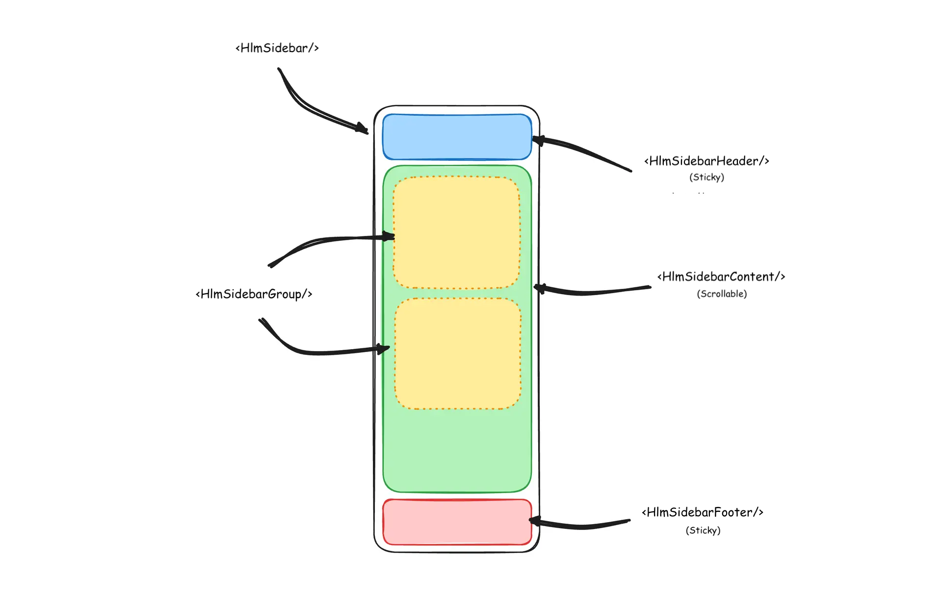
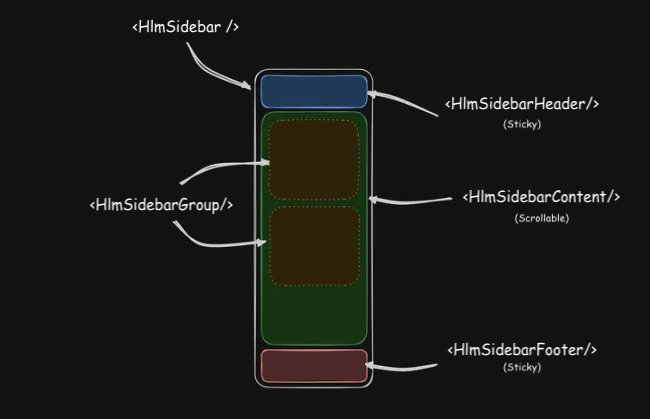
Usage
import { Component } from '@angular/core';
import { AppSidebar } from './app-sidebar';
import { HlmSidebarImports } from '@spartan-ng/helm/sidebar';

@Component({
  imports: [AppSidebar, HlmSidebarImports],
  selector: 'app-root',
  template: `<app-sidebar>
    <main>
      <button hlmSidebarTrigger><span class="sr-only"></span></button>
    </main>
  </app-sidebar>`,
})
export class App {}import { Component } from '@angular/core';
import { HlmSidebarImports } from '@spartan-ng/helm/sidebar';
@Component({
selector: 'app-sidebar',
imports: [
HlmSidebarImports,
],
template: `
<div hlmSidebarWrapper>
<hlm-sidebar>
<div hlmSidebarHeader></div>
<div hlmSidebarContent>
<div hlmSidebarGroup></div>
<div hlmSidebarGroup></div>
</div>
<div hlmSidebarFooter></div>
</hlm-sidebar>
<ng-content />
</div>
`,
})
export class AppSidebar {}Your First Sidebar
Let's start with the most basic sidebar. A collapsible sidebar with a menu.
Add a HlmSidebarTrigger at the root of your application.
import { Component } from '@angular/core';
import { AppSidebar } from './app-sidebar';
import { HlmSidebarImports } from '@spartan-ng/helm/sidebar';
import { RouterOutlet } from '@angular/router';

@Component({
  imports: [AppSidebar, HlmSidebarImports, RouterOutlet],
  selector: 'app-root',
  template: `<app-sidebar>
    <main hlmSidebarInset>
      <header class="flex h-12 items-center justify-between px-4">
        <button hlmSidebarTrigger><span class="sr-only"></span></button>
        <router-outlet/>
      </header>
    </main>
  </app-sidebar>`,
})
export class App {}
Create a new sidebar component at src/app/app-sidebar.ts
import { Component } from '@angular/core';
import { HlmSidebarImports } from '@spartan-ng/helm/sidebar';

@Component({
  selector: 'app-sidebar',
  imports: [HlmSidebarImports],
  template: `
    <div hlmSidebarWrapper>
      <hlm-sidebar>
        <div hlmSidebarContent></div>
      </hlm-sidebar>
      <ng-content />
    </div>
  `,
})
export class AppSidebar {}
Now, let's add a HlmSidebarMenu to the sidebar.
We'll use the HlmSidebarMenu component in a HlmSidebarGroup .
import { Component } from '@angular/core';
import { HlmSidebarImports } from '@spartan-ng/helm/sidebar';
import { lucideCalendar, lucideHouse, lucideInbox, lucideSearch, lucideSettings } from '@ng-icons/lucide';
import { NgIcon, provideIcons } from '@ng-icons/core';


@Component({
  selector: 'app-sidebar',
  imports: [
    HlmSidebarImports,
    NgIcon,

  ],
  template: `
    <div hlmSidebarWrapper>
      <hlm-sidebar>
        <div hlmSidebarContent>
          <div hlmSidebarGroup>
            <div hlmSidebarGroupLabel>Application</div>
            <div hlmSidebarGroupContent>
              <ul hlmSidebarMenu>
                @for(item of _items; track item.title){
                <li hlmSidebarMenuItem>
                  <a hlmSidebarMenuButton>
                    <ng-icon  [name]="item.icon" />
                    <span>{{ item.title }}</span>
                  </a>
                </li>
                }
              </ul>
            </div>
          </div>
        </div>
      </hlm-sidebar>
      <ng-content />
    </div>
  `,
  providers: [
    provideIcons({
      lucideHouse,
      lucideInbox,
      lucideCalendar,
      lucideSearch,
      lucideSettings,
    }),
  ],
})
export class AppSidebar {
  protected readonly _items = [
    {
      title: 'Home',
      url: '#',
      icon: 'lucideHouse',
    },
    {
      title: 'Inbox',
      url: '#',
      icon: 'lucideInbox',
    },
    {
      title: 'Calendar',
      url: '#',
      icon: 'lucideCalendar',
    },
    {
      title: 'Search',
      url: '#',
      icon: 'lucideSearch',
    },
    {
      title: 'Settings',
      url: '#',
      icon: 'lucideSettings',
    },
  ];
}
You've created your first sidebar.
You should see something like this:
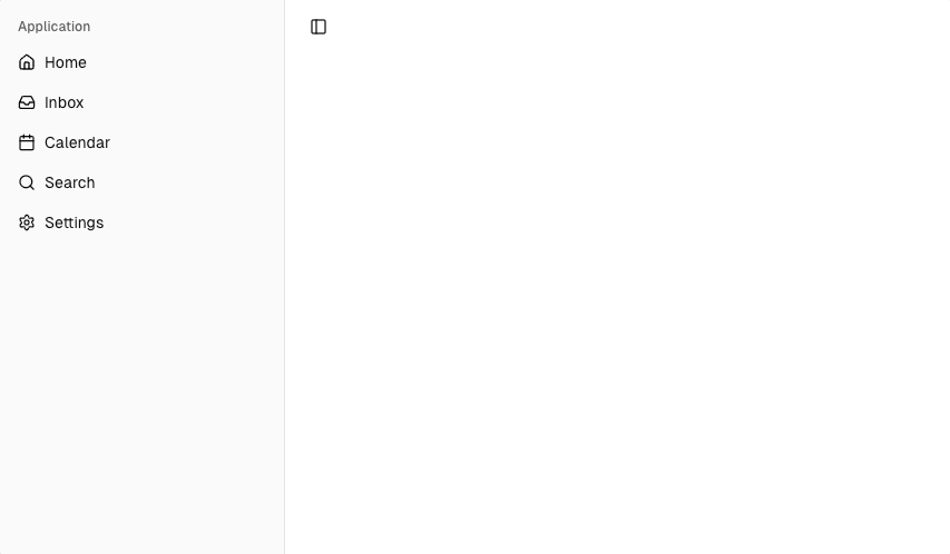
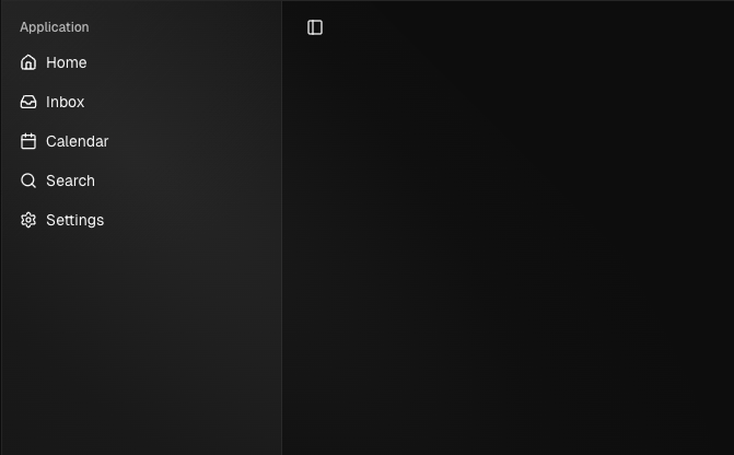
SidebarService
The HlmSidebarService manages the state, persistence, and responsive behavior of the sidebar. It ensures the sidebar works consistently across devices, remembers user preferences, and provides developer APIs for customization.
Core Responsibilities
- State Management – Tracks whether the sidebar is expanded or collapsed.
- Mobile Responsiveness – Detects screen size and manages a separate mobile overlay state.
- Persistence – Stores sidebar state in cookies for 7 days.
- Variants – Supports sidebar , floating , and inset display styles.
- Keyboard Shortcuts – Toggle with Ctrl / ⌘ + B .
- Cleanup – Removes event listeners on destroy.
Signals & Computed
- open – Whether the desktop sidebar is open.
- openMobile – Whether the mobile sidebar is open.
- isMobile – Whether the viewport is below 768px.
- variant – Current sidebar style ( sidebar , floating , or inset ).
- state – Computed: 'expanded' or 'collapsed' .
Public API
- setOpen(open: boolean) – Opens or closes the desktop sidebar (persists state in a cookie).
- setOpenMobile(open: boolean) – Opens/closes the mobile sidebar.
- setVariant(variant) – Sets the sidebar style.
- toggleSidebar() – Toggles the sidebar depending on desktop/mobile mode.
Keyboard Shortcut
The SIDEBAR_KEYBOARD_SHORTCUT variable defines the keyboard shortcut used to open and close the sidebar.
- On macOS, use ⌘ + B to toggle the sidebar.
- On Windows/Linux, use Ctrl + B to toggle the sidebar.
To change the shortcut, update the value of SIDEBAR_KEYBOARD_SHORTCUT in the HlmSidebarService source. By default it is set to 'b' .
Width
The HlmSidebarWrapper directive controls the width of the sidebar and its icon-only collapsed state . It applies styles, sets CSS variables, and ensures consistent layout across different sidebar variants.
Inputs
- [class] – Pass custom classes to extend styling.
- [sidebarWidth] – Override default sidebar width (e.g. 280px ).
- [sidebarWidthIcon] – Override collapsed width (e.g. 72px ).
Defaults
- sidebarWidth – 16rem
- sidebarWidthMobile – 18rem
- sidebarWidthIcon – 3rem
- sidebarCookieName – sidebar_state
- sidebarCookieMaxAge – 60 * 60 * 24 * 7
- sidebarKeyboardShortcut – b
- mobileBreakpoint – 768px
Config
To override defaults, provide a custom configuration in your application config using provideHlmSidebarConfig .
import { ApplicationConfig } from '@angular/core';
import { provideHlmSidebarConfig } from '@spartan-ng/helm/sidebar';

export const appConfig: ApplicationConfig = {
    providers: [
        provideHlmSidebarConfig({
            ...
            sidebarWidth: '16rem',
            sidebarWidthMobile: '18rem',
            sidebarWidthIcon: '3rem',
            sidebarCookieName: 'sidebar_state',
            sidebarCookieMaxAge: 60 * 60 * 24 * 7,
            sidebarKeyboardShortcut: 'b',
            mobileBreakpoint: '768px',
        }),
    ],
};
HlmSidebarHeader
Use the HlmSidebarHeader component to add a sticky header at the top of your sidebar. This is useful for branding, application titles, or quick-access navigation.

import { Component } from '@angular/core';
import { HlmSidebarImports } from '@spartan-ng/helm/sidebar';
import { HlmDropdownMenuImports } from '@spartan-ng/helm/dropdown-menu';
import { NgIcon, provideIcons } from '@ng-icons/core';

import { lucideChevronDown } from '@ng-icons/lucide';

@Component({
  selector: 'app-sidebar',
  imports: [
    HlmSidebarImports,
    HlmDropdownMenuImports,
    NgIcon,

  ],
  template: `
    <div hlmSidebarWrapper>
      <hlm-sidebar>
        <div hlmSidebarHeader>
          <ul hlmSidebarMenu>
            <li hlmSidebarMenuItem>
              <button hlmSidebarMenuButton [hlmDropdownMenuTrigger]="menu" side="right" align="start">
                Select Workspace
                <ng-icon  name="lucideChevronDown" class="ml-auto" />
              </button>
              <ng-template #menu>
                <hlm-dropdown-menu class="w-60">
                  <hlm-dropdown-menu-label>Acme Inc</hlm-dropdown-menu-label>
                  <hlm-dropdown-menu-label>Acme Corp.</hlm-dropdown-menu-label>
                </hlm-dropdown-menu>
              </ng-template>
            </li>
          </ul>
        </div>
      </hlm-sidebar>
      <ng-content />
    </div>
  `,
  providers: [
    provideIcons({
      lucideChevronDown,
    }),
  ],
})
export class AppSidebar {}
HlmSidebarFooter
Use the HlmSidebarFooter component to add a sticky footer at the bottom of your sidebar. This is useful for secondary actions, user profile information, or app settings.
import { Component } from '@angular/core';
import { NgIcon, provideIcons } from '@ng-icons/core';
import { lucideChevronUp } from '@ng-icons/lucide';


import { HlmDropdownMenuImports } from '@spartan-ng/helm/dropdown-menu';
import { HlmSidebarImports } from '@spartan-ng/helm/sidebar';

@Component({
    selector: 'app-sidebar',
    imports: [HlmSidebarImports, BrnMenuImports, NgIcon, ],
    template: `
        <div hlmSidebarWrapper>
            <hlm-sidebar>
                <div hlmSidebarHeader></div>
                <div hlmSidebarContent></div>
                <div hlmSidebarFooter>
                    <ul hlmSidebarMenu>
                        <li hlmSidebarMenuItem>
                            <button hlmSidebarMenuButton [hlmDropdownMenuTrigger]="menu">
                                Select Workspace
                                <ng-icon  name="lucideChevronUp" class="ml-auto" />
                            </button>
                            <ng-template #menu>
                                <hlm-dropdown-menu class="w-60">
                                    <button hlmDropdownMenuItem>Account</button>
                                    <button hlmDropdownMenuItem>Billing</button>
                                    <button hlmDropdownMenuItem>Sign out</button>
                                </hlm-dropdown-menu>
                            </ng-template>
                        </li>
                    </ul>
                </div>
            </hlm-sidebar>
            <ng-content />
        </div>
    `,
    providers: [
        provideIcons({
            lucideChevronUp,
        }),
    ],
})
export class AppSidebar {}
HlmSidebarContent
The HlmSidebarContent component is used to wrap the main content of the sidebar. This is where you add your HlmSidebarGroup components, navigation links, or menus. The content inside is scrollable , while the header and footer remain sticky.
import { Component } from '@angular/core';
import { HlmSidebarImports } from '@spartan-ng/helm/sidebar';

@Component({
  selector: 'app-sidebar',
  imports: [HlmSidebarImports],
  template: `
    <div hlmSidebarWrapper>
      <hlm-sidebar>
        <div hlmSidebarContent>
          <div hlmSidebarGroup></div>
          <div hlmSidebarGroup></div>
        </div>
      </hlm-sidebar>
      <ng-content />
    </div>
  `,
})
export class AppSidebar {}
HlmSidebarGroup
Use the HlmSidebarGroup component to create a section within the sidebar. A SidebarGroup is composed of:
- HlmSidebarGroupLabel – the section label or title.
- HlmSidebarGroupContent – the main body of the group, usually containing links or menu items.
- HlmSidebarGroupAction (optional) – a button or action element associated with the group, e.g. "Add" or "Settings".

import { Component } from '@angular/core';
import { NgIcon, provideIcons } from '@ng-icons/core';
import { lucideLifeBuoy, lucideSend } from '@ng-icons/lucide';

import { HlmSidebarImports } from '@spartan-ng/helm/sidebar';

@Component({
    selector: 'app-sidebar',
    imports: [HlmSidebarImports, NgIcon, ],
    template: `
        <div hlmSidebarWrapper>
            <hlm-sidebar>
                <div hlmSidebarContent>
                    <div hlmSidebarGroup>
                        <div hlmSidebarGroupLabel>Help</div>
                        <div hlmSidebarGroupContent>
                            <ul hlmSidebarMenu>
                                <li hlmSidebarMenuItem>
                                    <a hlmSidebarMenuButton>
                                        <ng-icon  name="lucideLifeBuoy" />
                                        <span>Support</span>
                                    </a>
                                </li>
                                <li hlmSidebarMenuItem>
                                    <a hlmSidebarMenuButton>
                                        <ng-icon  name="lucideSend" />
                                        <span>Feedback</span>
                                    </a>
                                </li>
                            </ul>
                        </div>
                    </div>
                </div>
            </hlm-sidebar>
            <ng-content />
        </div>
    `,
    providers: [
        provideIcons({
            lucideLifeBuoy,
            lucideSend,
        }),
    ],
})
export class AppSidebar {}
Collapsable HlmSidebarGroup
To make a HlmSidebarGroup collapsible, wrap it in a HlmCollapsible
import { Component } from '@angular/core';
import { HlmSidebarImports } from '@spartan-ng/helm/sidebar';
import { NgIcon, provideIcons } from '@ng-icons/core';

import {
  lucideChevronDown,
  lucideLifeBuoy,
  lucideSend,
} from '@ng-icons/lucide';
import { HlmCollapsibleImports } from '@spartan-ng/helm/collapsible';

@Component({
  selector: 'app-sidebar',
  imports: [ NgIcon, HlmCollapsibleImports, HlmSidebarImports],
  template: `
    <div hlmSidebarWrapper>
      <hlm-sidebar>
        <div hlmSidebarContent>
          <hlm-collapsible [expanded]="true" class="group/collapsible">
            <div hlmSidebarGroup>
              <button
                hlmCollapsibleTrigger
                hlmSidebarGroupLabel
                class="hover:bg-sidebar-accent hover:text-sidebar-accent-foreground text-sm"
              >
                Help
                <ng-icon
                  hlm
                  name="lucideChevronDown"
                  class="ml-auto transition-transform group-data-[state=open]/collapsible:rotate-180"
                />
              </button>
              <hlm-collapsible-content>
                <div hlmSidebarGroupContent>
                  <ul hlmSidebarMenu>
                    <li hlmSidebarMenuItem>
                      <a hlmSidebarMenuButton>
                        <ng-icon  name="lucideLifeBuoy" />
                        <span>Support</span>
                      </a>
                    </li>
                    <li hlmSidebarMenuItem>
                      <a hlmSidebarMenuButton>
                        <ng-icon  name="lucideSend" />
                        <span>Feedback</span>
                      </a>
                    </li>
                  </ul>
                </div>
              </hlm-collapsible-content>
            </div>
          </hlm-collapsible>
        </div>
      </hlm-sidebar>
      <ng-content />
    </div>
  `,
  providers: [
    provideIcons({
      lucideLifeBuoy,
      lucideSend,
      lucideChevronDown,
    }),
  ],
})
export class AppSidebar {}
HlmSidebarGroupAction
Use the HlmSidebarGroupAction component to add an action button to the HlmSidebarGroup .
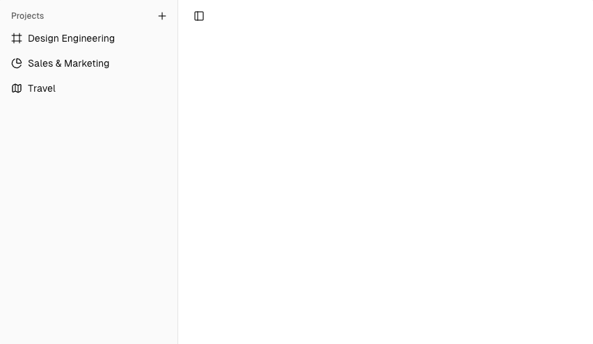
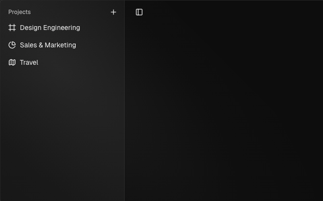
import { Component } from '@angular/core';
import { HlmSidebarImports } from '@spartan-ng/helm/sidebar';
import { NgIcon, provideIcons } from '@ng-icons/core';

import {
  lucideChartPie,
  lucideFrame,
  lucideMap,
  lucidePlus,
} from '@ng-icons/lucide';
import { toast } from '@spartan-ng/brain/sonner';
import { HlmToasterImports } from '@spartan-ng/helm/sonner';

@Component({
  selector: 'app-sidebar',
  imports: [HlmSidebarImports, NgIcon,  HlmToasterImports],
  template: `
    <hlm-toaster />
    <div hlmSidebarWrapper>
      <hlm-sidebar>
        <div hlmSidebarContent>
          <div hlmSidebarGroup>
            <div hlmSidebarGroupLabel>Projects</div>
            <button
              hlmSidebarGroupAction
              title="Add Project"
              (click)="_onAddProject()"
            >
              <ng-icon  name="lucidePlus" />
              <span class="sr-only">Add Project</span>
            </button>
            <div hlmSidebarGroupContent>
              <ul hlmSidebarMenu>
                <li hlmSidebarMenuItem>
                  <a hlmSidebarMenuButton href="#">
                    <ng-icon  name="lucideFrame" />
                    <span>Design Engineering</span>
                  </a>
                </li>
                <li hlmSidebarMenuItem>
                  <a hlmSidebarMenuButton href="#">
                    <ng-icon  name="lucideChartPie" />
                    <span>Sales & Marketing</span>
                  </a>
                </li>
                <li hlmSidebarMenuItem>
                  <a hlmSidebarMenuButton href="#">
                    <ng-icon  name="lucideMap" />
                    <span>Travel</span>
                  </a>
                </li>
              </ul>
            </div>
          </div>
        </div>
      </hlm-sidebar>
      <ng-content />
    </div>
  `,
  providers: [
    provideIcons({
      lucideFrame,
      lucideChartPie,
      lucideMap,
      lucidePlus,
    }),
  ],
})
export class AppSidebar {
  protected _onAddProject(): void {
    toast.info('You clicked the group action!');
  }
}
HlmSidebarMenu
The HlmSidebarMenu component is used for building a menu inside a HlmSidebarGroup . It is composed of the following parts:
- HlmSidebarMenuItem – A single menu entry within the menu.
- HlmSidebarMenuButton – A clickable button or link inside a menu item.
- HlmSidebarMenuAction – An optional action (e.g., context menu, settings) for the menu item.
- HlmSidebarMenuSub – A nested submenu within a menu item.
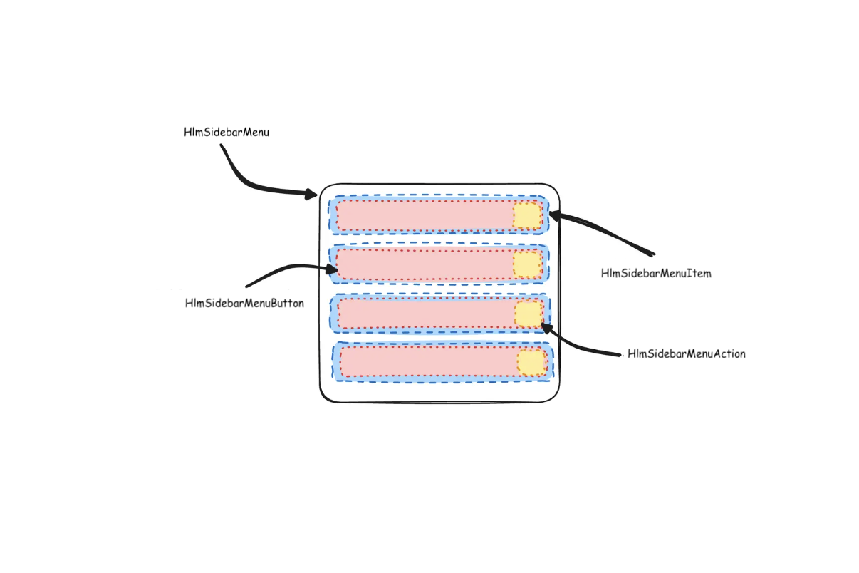
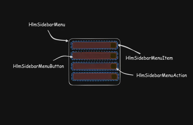
Here's an example of a HlmSidebarMenu component rendering a list of projects.
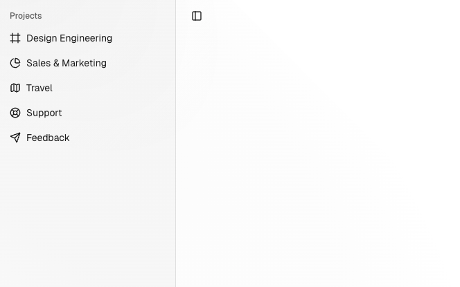
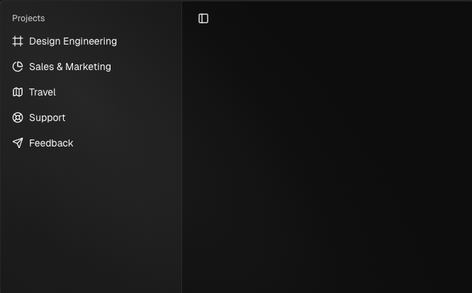
import { Component } from '@angular/core';
import { HlmSidebarImports } from '@spartan-ng/helm/sidebar';
import { NgIcon, provideIcons } from '@ng-icons/core';

import {
  lucideChartPie,
  lucideFrame,
  lucideLifeBuoy,
  lucideMap,
  lucideSend,
} from '@ng-icons/lucide';

@Component({
  selector: 'app-sidebar',
  imports: [HlmSidebarImports, NgIcon, ],
  template: `
    <div hlmSidebarWrapper>
      <hlm-sidebar>
        <div hlmSidebarContent>
          <div hlmSidebarGroup>
            <div hlmSidebarGroupLabel>Projects</div>
            <div hlmSidebarGroupContent>
              <ul hlmSidebarMenu>
                @for (project of _projects; track project){
                    <li hlmSidebarMenuItem>
                      <a hlmSidebarMenuButton [href]="project.url">
                        <ng-icon  [name]="project.icon" />
                        <span>{{ project.name }}</span>
                      </a>
                    </li>
                }
              </ul>
            </div>
          </div>
        </div>
      </hlm-sidebar>
      <ng-content />
    </div>
  `,
  providers: [
    provideIcons({
      lucideFrame,
      lucideChartPie,
      lucideMap,
      lucideLifeBuoy,
      lucideSend,
    }),
  ],
})
export class AppSidebar {
  protected readonly _projects = [
    { name: 'Design Engineering', url: '#', icon: 'lucideFrame' },
    { name: 'Sales & Marketing', url: '#', icon: 'lucideChartPie' },
    { name: 'Travel', url: '#', icon: 'lucideMap' },
    { name: 'Support', url: '#', icon: 'lucideLifeBuoy' },
    { name: 'Feedback', url: '#', icon: 'lucideSend' },
  ];
}
HlmSidebarMenuButton
The HlmSidebarMenuButton component is used to render a menu button within a HlmSidebarMenuItem .
Link or Anchor
h-6 underline text-base px-0.5Button
<li hlmSidebarMenuItem>
  <button hlmSidebarMenuButton>
    Send
  </button>
</li>
Icon and Label
<li hlmSidebarMenuItem>
  <a hlmSidebarMenuButton href="#">
    <ng-icon  name="lucideHouse" />
    <span>Home</span>
  </a>
</li>
You can render an icon and a truncated label inside the button. Remember to wrap the label in a .
isActive
Use the isActive prop to mark a menu item as active.
<li hlmSidebarMenuItem>
  <a hlmSidebarMenuButton href="#" isActive>
    Home
  </a>
</li>
HlmSidebarMenuAction
The HlmSidebarMenuAction component is used to render a menu action within a HlmSidebarMenuItem .
This button works independently of the HlmSidebarMenuButton . For example, you can have a SidebarMenuButton as a clickable link, while the SidebarMenuAction provides a secondary action, such as editing, deleting, or opening a context menu.
<li hlmSidebarMenuItem>
  <a hlmSidebarMenuButton href="#">
    <ng-icon  name="lucideHouse" />
    <span>Home</span>
  </a>
  <button hlmSidebarMenuAction>
    <ng-icon  name="lucidePlus" />
    <span class="sr-only">Add Project</span>
  </button>
</li>
DropdownMenu
Here's an example of a HlmSidebarMenuAction component rendering a HlmMenu .
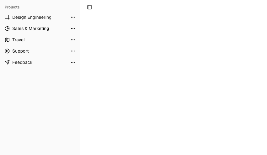
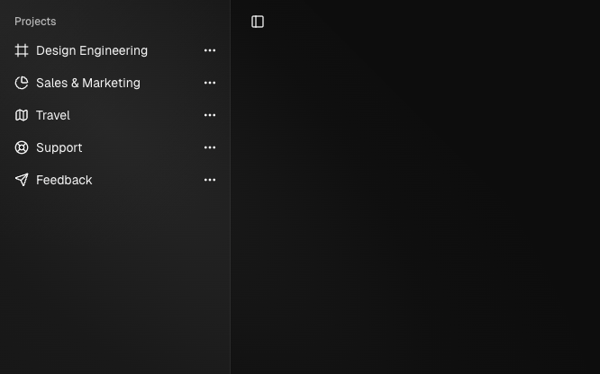
import { Component } from '@angular/core';
import { HlmSidebarImports } from '@spartan-ng/helm/sidebar';

import { NgIcon, provideIcons } from '@ng-icons/core';

import {
  lucideChartPie,
  lucideEllipsis,
  lucideFrame,
  lucideLifeBuoy,
  lucideMap,
  lucideSend,
} from '@ng-icons/lucide';
import { HlmDropdownMenuImports } from '@spartan-ng/helm/dropdown-menu';

@Component({
  selector: 'app-sidebar',
  imports: [HlmSidebarImports, NgIcon,  HlmDropdownMenuImports],
  template: `
    <div hlmSidebarWrapper>
      <hlm-sidebar>
        <div hlmSidebarContent>
          <div hlmSidebarGroup>
            <div hlmSidebarGroupLabel>Projects</div>
            <div hlmSidebarGroupContent>
              <ul hlmSidebarMenu>
                @for (project of projects; track project){
                <li hlmSidebarMenuItem>
                  <a hlmSidebarMenuButton [href]="project.url">
                    <ng-icon  [name]="project.icon" />
                    <span>{{ project.name }}</span>
                  </a>
                  <button hlmSidebarMenuAction [hlmDropdownMenuTrigger]="menu">
                    <ng-icon  name="lucideEllipsis" />
                    <span class="sr-only">More</span>
                  </button>

                  <ng-template #menu>
                    <hlm-dropdown-menu>
                      <button hlmDropdownMenuItem>Edit Project</button>
                      <button hlmDropdownMenuItem>Delete Project</button>
                    </hlm-dropdown-menu>
                  </ng-template>
                </li>
                }
              </ul>
            </div>
          </div>
        </div>
      </hlm-sidebar>
      <ng-content />
    </div>
  `,
  providers: [
    provideIcons({
      lucideFrame,
      lucideChartPie,
      lucideMap,
      lucideLifeBuoy,
      lucideSend,
      lucideEllipsis,
    }),
  ],
})
export class AppSidebar {
  projects = [
    { name: 'Design Engineering', url: '#', icon: 'lucideFrame' },
    { name: 'Sales & Marketing', url: '#', icon: 'lucideChartPie' },
    { name: 'Travel', url: '#', icon: 'lucideMap' },
    { name: 'Support', url: '#', icon: 'lucideLifeBuoy' },
    { name: 'Feedback', url: '#', icon: 'lucideSend' },
  ];
}
HlmMenuSub
The HlmSidebarMenuSub component is used to render a submenu within a HlmSidebarMenu .
Use HlmSidebarMenuSubItem and HlmSidebarMenuSubButton to render a submenu item.
import { Component } from '@angular/core';
import { HlmSidebarImports } from '@spartan-ng/helm/sidebar';

@Component({
  selector: 'app-sidebar',
  imports: [HlmSidebarImports],
  template: `
    <div hlmSidebarWrapper>
      <hlm-sidebar>
        <div hlmSidebarContent>
          <div hlmSidebarGroup>
            <div hlmSidebarGroupContent>
              <ul hlmSidebarMenu>
                @for (item of _items; track item.title) {
                  <li hlmSidebarMenuItem>
                    <button hlmSidebarMenuButton>
                      <span>{{ item.title }}</span>
                    </button>
                    <ul hlmSidebarMenuSub>
                      @for (subItem of item.items; track subItem.title) {
                        <li hlmSidebarMenuSubItem>
                          <button hlmSidebarMenuSubButton class="w-full">
                            <span>{{ subItem.title }}</span>
                          </button>
                        </li>
                      }
                    </ul>
                  </li>
                }
              </ul>
            </div>
          </div>
        </div>
      </hlm-sidebar>
      <main hlmSidebarInset>
        <header class="flex h-12 items-center justify-between px-4">
          <button hlmSidebarTrigger><span class="sr-only"></span></button>
        </header>
      </main>
    </div>
  `,
})
export default class AppSidebar {
  protected readonly _items = [
    {
      title: 'Getting Started',
      items: [{ title: 'Installation' }, { title: 'Project Structure' }],
    },
    {
      title: 'Building Your Application',
      items: [
        { title: 'Routing' },
        { title: 'Data Fetching', isActive: true },
        { title: 'Rendering' },
        { title: 'Caching' },
        { title: 'Styling' },
        { title: 'Optimizing' },
        { title: 'Configuring' },
        { title: 'Testing' },
        { title: 'Authentication' },
        { title: 'Deploying' },
        { title: 'Upgrading' },
        { title: 'Examples' },
      ],
    },
    {
      title: 'API Reference',
      items: [
        { title: 'Components' },
        { title: 'File Conventions' },
        { title: 'Functions' },
        { title: 'next.config.js Options' },
        { title: 'CLI' },
        { title: 'Edge Runtime' },
      ],
    },
    {
      title: 'Architecture',
      items: [
        { title: 'Accessibility' },
        { title: 'Fast Refresh' },
        { title: 'Next.js Compiler' },
        { title: 'Supported Browsers' },
        { title: 'Turbopack' },
      ],
    },
  ];
}
Collapsable HlmSidebarSubMenu
To make a HlmSidebarMenu component collapsible, wrap it and the HlmSidebarMenuSub components in a HlmCollapsible .


import { Component } from '@angular/core';
import { NgIcon, provideIcons } from '@ng-icons/core';
import { lucideChevronRight } from '@ng-icons/lucide';
import { HlmCollapsibleImports } from '@spartan-ng/helm/collapsible';

import { HlmSidebarImports } from '@spartan-ng/helm/sidebar';

@Component({
  selector: 'app-sidebar',
    imports: [HlmSidebarImports, HlmCollapsibleImports, NgIcon, ],
  template: `
    <div hlmSidebarWrapper>
            <hlm-sidebar>
                <div hlmSidebarContent>
                    <div hlmSidebarGroup>
                        <div hlmSidebarGroupContent>
                            <ul hlmSidebarMenu>
                                @for (item of _items; track item.title) {
                                    <hlm-collapsible [expanded]="item.defaultOpen" class="group/collapsible">
                                        <li hlmSidebarMenuItem>
                                            <button
                                                hlmCollapsibleTrigger
                                                hlmSidebarMenuButton
                                                class="flex w-full items-center justify-between"
                                            >
                                                <span>{{ item.title }}</span>
                                                <ng-icon
                                                    name="lucideChevronRight"
                                                    class="ml-auto transition-transform group-data-[state=open]/collapsible:rotate-90"
                                                    hlm
                                                />
                                            </button>
                                            <hlm-collapsible-content>
                                                <ul hlmSidebarMenuSub>
                                                    @for (subItem of item.items; track subItem.title) {
                                                        <li hlmSidebarMenuSubItem>
                                                            <button hlmSidebarMenuSubButton class="w-full">
                                                                <span>{{ subItem.title }}</span>
                                                            </button>
                                                        </li>
                                                    }
                                                </ul>
                                            </hlm-collapsible-content>
                                        </li>
                                    </hlm-collapsible>
                                }
                            </ul>
                        </div>
                    </div>
                </div>
            </hlm-sidebar>
      <main hlmSidebarInset>
        <header class="flex h-12 items-center justify-between px-4">
          <button hlmSidebarTrigger><span class="sr-only"></span></button>
        </header>
      </main>
    </div>
  `,
  providers: [provideIcons({ lucideChevronRight })],
})
export default class AppSidebar {
  protected readonly _items = [
    {
      title: 'Getting Started',
      defaultOpen: true,
      items: [{ title: 'Installation' }, { title: 'Project Structure' }],
    },
    {
      title: 'Building Your Application',
      defaultOpen: false,
      items: [
        { title: 'Routing' },
        { title: 'Data Fetching', isActive: true },
        { title: 'Rendering' },
        { title: 'Caching' },
        { title: 'Styling' },
        { title: 'Optimizing' },
        { title: 'Configuring' },
        { title: 'Testing' },
        { title: 'Authentication' },
        { title: 'Deploying' },
        { title: 'Upgrading' },
        { title: 'Examples' },
      ],
    },
    {
      title: 'API Reference',
      defaultOpen: false,
      items: [
        { title: 'Components' },
        { title: 'File Conventions' },
        { title: 'Functions' },
        { title: 'next.config.js Options' },
        { title: 'CLI' },
        { title: 'Edge Runtime' },
      ],
    },
    {
      title: 'Architecture',
      defaultOpen: false,
      items: [
        { title: 'Accessibility' },
        { title: 'Fast Refresh' },
        { title: 'Next.js Compiler' },
        { title: 'Supported Browsers' },
        { title: 'Turbopack' },
      ],
    },
  ];
}
HlmSidebarMenuBadge
The HlmSidebarMenuBadge component is used to render a badge within a HlmSidebarMenuItem .
import { Component } from '@angular/core';
import { NgIcon, provideIcons } from '@ng-icons/core';
import { lucideChartPie, lucideFrame, lucideLifeBuoy, lucideMap, lucideSend } from '@ng-icons/lucide';

import { HlmSidebarImports } from '@spartan-ng/helm/sidebar';

@Component({
    selector: 'app-sidebar',
    imports: [HlmSidebarImports, NgIcon, ],
    template: `
        <div hlmSidebarWrapper>
            <hlm-sidebar>
                <div hlmSidebarContent>
                    <div hlmSidebarGroup>
                        <div hlmSidebarGroupLabel>Projects</div>
                        <div hlmSidebarGroupContent>
                            <ul hlmSidebarMenu>
                                @for (project of _projects; track project) {
                                    <li hlmSidebarMenuItem>
                                        <button hlmSidebarMenuButton>
                                            <ng-icon  [name]="project.icon" />
                                            <span>{{ project.name }}</span>
                                        </button>
                                        <div hlmSidebarMenuBadge>{{ project.info }}</div>
                                    </li>
                                }
                            </ul>
                        </div>
                    </div>
                </div>
            </hlm-sidebar>
            <ng-content />
        </div>
    `,
    providers: [
        provideIcons({
            lucideFrame,
            lucideChartPie,
            lucideMap,
            lucideLifeBuoy,
            lucideSend,
        }),
    ],
})
export class AppSidebar {
    protected readonly _projects = [
        { info: 24, name: 'Design Engineering', url: '#', icon: 'lucideFrame' },
        { info: 12, name: 'Sales & Marketing', url: '#', icon: 'lucideChartPie' },
        { info: 3, name: 'Travel', url: '#', icon: 'lucideMap' },
        { info: 21, name: 'Support', url: '#', icon: 'lucideLifeBuoy' },
        { info: 8, name: 'Feedback', url: '#', icon: 'lucideSend' },
    ];
}
HlmSidebarMenuSkeleton
The HlmSidebarMenuSkeleton component is used to render a skeleton for a SidebarMenu. You can use this to show a loading state while fetching data.
<ul hlmSidebarMenu>
    @for (project of _projects; track project) {
        <li hlmSidebarMenuItem>
            <div hlmSidebarMenuSkeleton></div>
        </li>
    }
</ul>
HlmSidebarMenuSeparator
The HlmSidebarMenuSeparator component is used to render a separator within a Sidebar .
<hlm-sidebar>
  <div hlmSidebarContent>
    <div hlmSidebarGroup></div>
        <div hlmSidebarSeparator></div>
    <div hlmSidebarGroup></div>
  </div>
</hlm-sidebar>
Theming
We use dedicated CSS variables for theming the sidebar, separate from the rest of the application.
@layer base {
  :root {
    --sidebar: oklch(0.985 0 0);
    --sidebar-foreground: oklch(0.145 0 0);
    --sidebar-primary: oklch(0.205 0 0);
    --sidebar-primary-foreground: oklch(0.985 0 0);
    --sidebar-accent: oklch(0.97 0 0);
    --sidebar-accent-foreground: oklch(0.205 0 0);
    --sidebar-border: oklch(0.922 0 0);
    --sidebar-ring: oklch(0.708 0 0);
  }

  .dark {
    --sidebar: oklch(0.205 0 0);
    --sidebar-foreground: oklch(0.985 0 0);
    --sidebar-primary: oklch(0.985 0 0);
    --sidebar-primary-foreground: oklch(0.205 0 0);
    --sidebar-accent: oklch(0.269 0 0);
    --sidebar-accent-foreground: oklch(0.985 0 0);
    --sidebar-border: oklch(1 0 0 / 10%);
    --sidebar-ring: oklch(0.439 0 0);
  }
}
We intentionally use different variables for the sidebar and the rest of the application to make it easy to have a sidebar that is styled differently from the rest of the application. Think a sidebar with a darker shade from the main application.
Responsive behavior
The sidebar is responsive by default. It collapses to a minimal state on smaller screens and expands on larger screens. This behavior can be customized by overriding the default CSS variables or wrapping in media queries.
Accessibility
The sidebar and its components follow WAI-ARIA best practices. Ensure you provide appropriate labels for buttons and landmarks to improve screen reader support.
RTL
To enable RTL support in spartan-ng, see the RTL configuration guide.